Save the date! Join us on October 16 for our Product Ops launch event. Register here.
May 11, 2023 02:10 AM
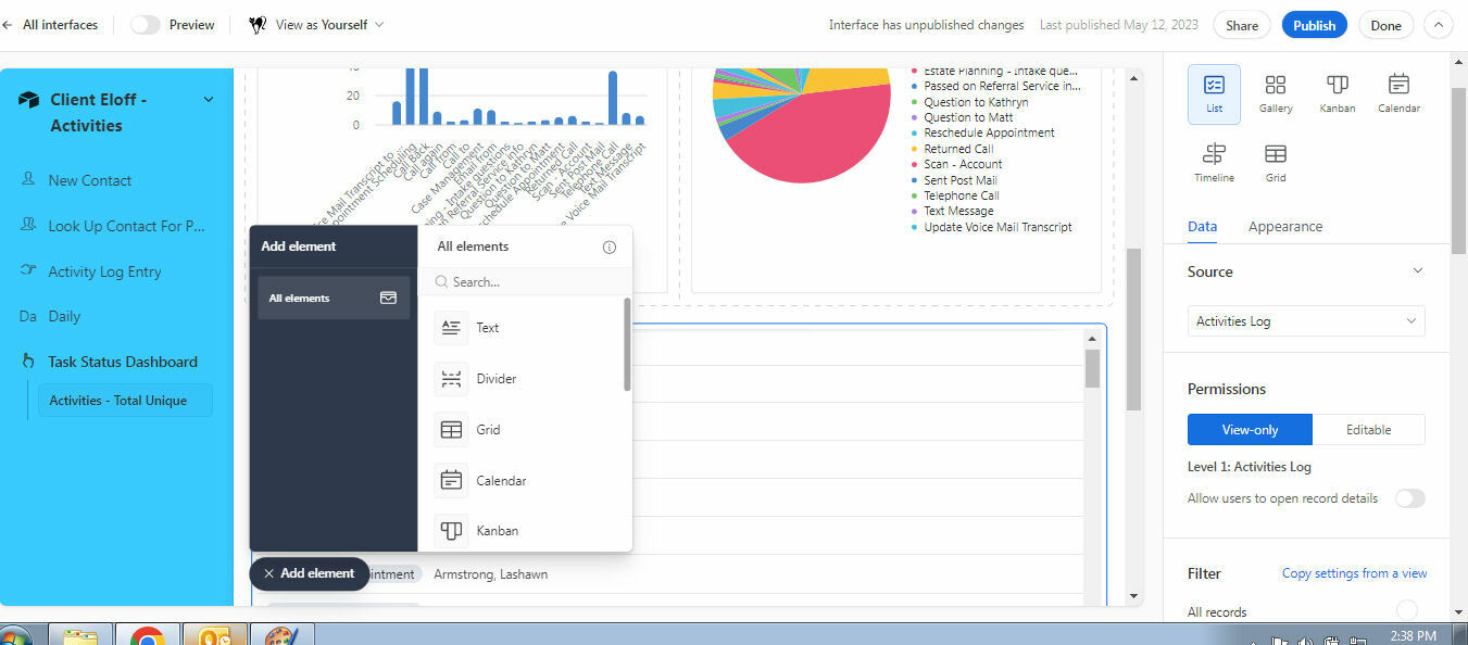
I'm afraid I don't love the new lefthand sidebar menu which is due to be rolled out next week. It takes up valuable space which would be better used for interface elements and data. The reduction in available space means that we'd need to redesign some interfaces, as data and field names are now truncated and don't display correctly.
Perhaps it could be adjusted so the sidebar rolls out when the user hovers over the far left of the screen, or similar?
Solved! Go to Solution.
May 23, 2023 02:29 AM
In case anyone hasn't spotted it - Airtable have now added an option to collapse the sidebar: https://community.airtable.com/t5/announcements/introducing-new-ways-to-harness-the-power-of-ai-buil...
May 11, 2023 03:04 AM
Agree to this +1
maybe there can a way to swith back to the previous design?
May 11, 2023 05:06 AM
Going to have to agree on this as well - for users who are using smaller screens, this side bar is a downgrade to the space designers need. It would be great if we could please have the option to switch between different sidebars before this is released to all users.
May 11, 2023 06:49 AM
Please allow us to hide that sidebar, it takes up 15-20% of valuable work space - for no added value!
May 11, 2023 08:11 AM
Agreed! Can we please revert? Not only does it take up valuable space for smaller screens, when we already have a high number of fields needed in some of our grid views, but also:
Please let us know if we can turn this off, thanks!
May 11, 2023 11:14 AM
Adding my two cents into this. I don't like the side bar, especially trying to figure out where the dang Edit is for the interface I am working on. More so, it looks ugly when you get a lot of interfaces. I make my own custom interface for what to include which interfaces to access for the team. Now it shows EVERYTHING including dashboards that I really have no need to be in the daily view.
It was bad enough to mess with the workflow (which did not improve my workflow) but to take up so much space it's unnecessary.
May 11, 2023 11:54 AM
What brain trust thought it was a good idea to steal valuable screen space and how do we revert to the original layout or at least close the side view like in the main data table views? I have multiple people in the office ranting at me right now because we all work with smaller screens and I'm the one that had us start using Airtable.
May 11, 2023 12:03 PM
I have to agree, this is a disaster. There has to be a way to at least use the suggestion made by Chris_Luc and only have the sidebar appear when the person using the interface hovers over the far left.
May 12, 2023 04:26 AM
Not a fan of the sidebar. Its taking up value space, my interfaces look rubbish now and its harder to use as we have to scroll on everything and cant see what we need on one screen. If it pops up over the top of the interface not affecting the interface, when you hover to the side with your mouse that would be fine. As is, this is a terrible change.
May 12, 2023 05:34 AM
Airtable have now addressed this in their announcement post.
"To start with, we are actively working to make the left navigation collapsible. Please keep your eyes out for that update coming soon."
https://community.airtable.com/t5/announcements/introducing-new-ways-to-harness-the-power-of-ai-buil...