The Community will be undergoing maintenance from Friday February 21 - Friday, February 29 and will be "read only" during this time. To learn more, check out our Announcements blog post.
- Airtable Community
- Discussions
- Ask A Question
- Interface Designer
- Re: Suggestion: Tabs/Pages for Record review
- Subscribe to RSS Feed
- Mark Topic as New
- Mark Topic as Read
- Float this Topic for Current User
- Bookmark
- Subscribe
- Mute
- Printer Friendly Page
Re: Suggestion: Tabs/Pages for Record review
- Mark as New
- Bookmark
- Subscribe
- Subscribe to RSS Feed
- Permalink
- Report Inappropriate Content
Dec 07, 2021 11:37 AM
Airtable,
Please consider adding tabs/pages to the Record review area. There are workflows were you do not want to be scrolling up and down. Tabs would allow “pages” for other fields, text descriptions, etc. This would be similar to using the Description app.
Thanks,
Jonathan
- Mark as New
- Bookmark
- Subscribe
- Subscribe to RSS Feed
- Permalink
- Report Inappropriate Content
Dec 07, 2021 12:32 PM
You can currently do this by creating a new interface page for each tab, and using button fields for navigation. The button field use the “open url” action and the formula combines the url for the interface page with a query parameter that sets the record id for the record selector.
Of course, it would be nice if there were an easier way to create these layouts and the corresponding navigation.
- Mark as New
- Bookmark
- Subscribe
- Subscribe to RSS Feed
- Permalink
- Report Inappropriate Content
Dec 07, 2021 12:55 PM
Thank you Kuovonne for the idea! Jonathan
- Mark as New
- Bookmark
- Subscribe
- Subscribe to RSS Feed
- Permalink
- Report Inappropriate Content
Dec 08, 2021 07:00 AM
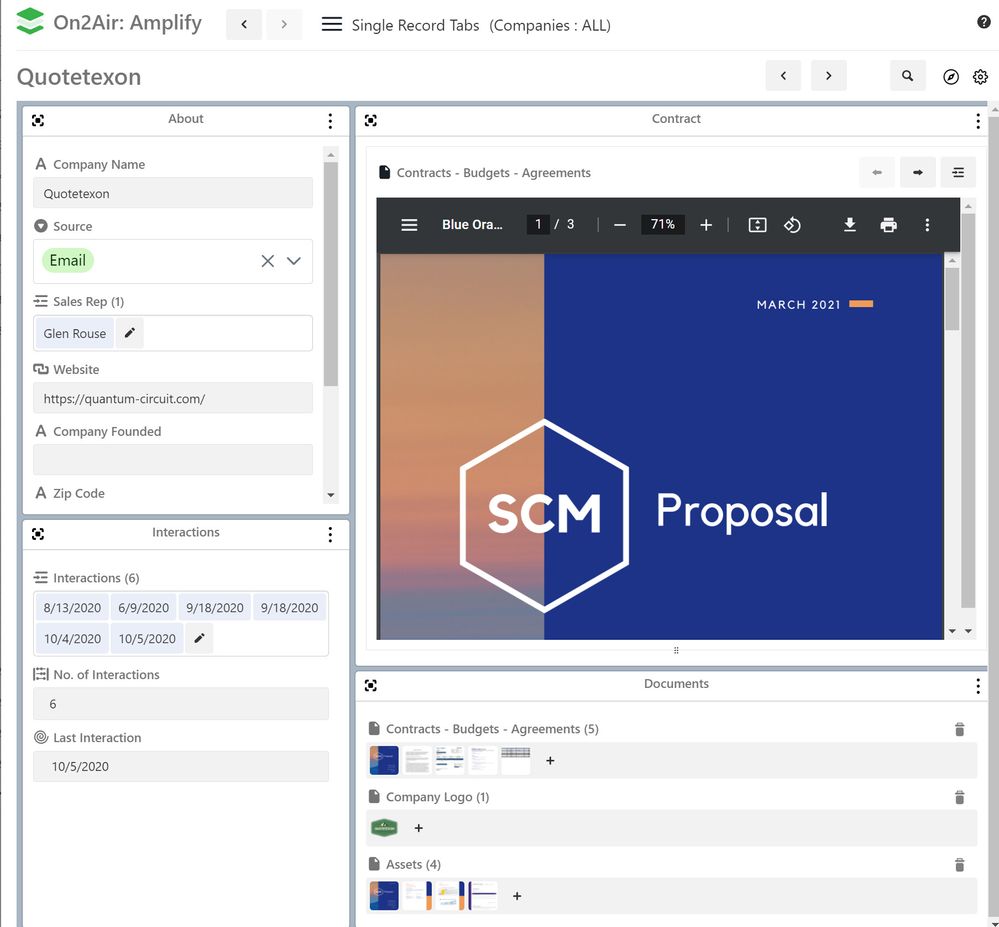
You could do something similar to this in On2Air Amplify with the record layout dashboard. You can create various block sections, then display/hide specific fields in each one. You can then browse through each record with the arrow at the top.
If you want to go further, you could then create multiple layouts for specific areas you need - example: a documents only layout, an interactions layout.
Hannah - On2Air.com - Automated Backups for Airtable
- Mark as New
- Bookmark
- Subscribe
- Subscribe to RSS Feed
- Permalink
- Report Inappropriate Content
Dec 08, 2021 01:26 PM
Airtable - Here is another idea for tabs/pages that I have seen in other CRMs for workflows. This would be easier for the user to work through the flow rather than using the dropdown menu.
Thanks,
Jonathan
- Mark as New
- Bookmark
- Subscribe
- Subscribe to RSS Feed
- Permalink
- Report Inappropriate Content
Dec 08, 2023 12:04 PM
This is a great idea! Are you able to show how we would pass the query parameter to select the record?


