- Airtable Community
- Discussions
- Ask A Question
- Other questions
- Re: Calendar View with Short Time-frame Records
- Subscribe to RSS Feed
- Mark Topic as New
- Mark Topic as Read
- Float this Topic for Current User
- Bookmark
- Subscribe
- Mute
- Printer Friendly Page
Re: Calendar View with Short Time-frame Records
- Mark as New
- Bookmark
- Subscribe
- Subscribe to RSS Feed
- Permalink
- Report Inappropriate Content
Sep 11, 2018 08:23 AM
Hi,
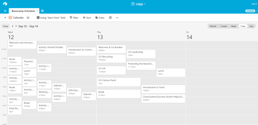
I have a daily schedule that’s broken down into 15 - 60 minute modules. The calendar view works great when I’m looking at records for entire days, but when I want to visualize more detailed days it ends up looking like this:
Is there any way to alter the vertical axis to allow a more detailed view? I tried using the timeline blocks but even that ends up looking like a jumbled mess.
Is there something i’m missing or does the calendar view/timeline blocks just not work when records are for such short time frames?
- Mark as New
- Bookmark
- Subscribe
- Subscribe to RSS Feed
- Permalink
- Report Inappropriate Content
Sep 11, 2018 09:56 AM
Is the issue the fact that in the shorter boxes your title text is truncated so that you can’t see the full text? Is that what you mean by a “more detailed view” - the ability to see all the text?
- Mark as New
- Bookmark
- Subscribe
- Subscribe to RSS Feed
- Permalink
- Report Inappropriate Content
Sep 11, 2018 10:20 AM
Hi Jeremy,
No i mean the boxes overlap even though the times don’t overlap. So it’s a bit confusing to see overlap.
- Mark as New
- Bookmark
- Subscribe
- Subscribe to RSS Feed
- Permalink
- Report Inappropriate Content
Sep 11, 2018 10:40 AM
Ah, I see.
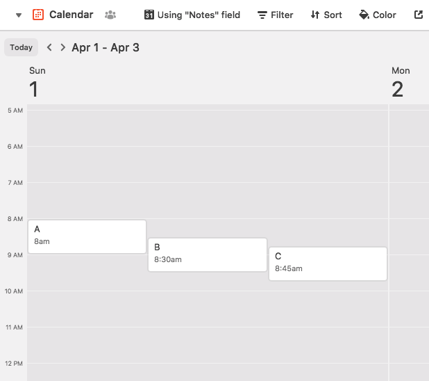
It looks like when you only have a start time, Airtable shows 1hr size blocks by default. So if you have an event that starts 15 minutes or 30 minutes after another, it’s going to create overlap:
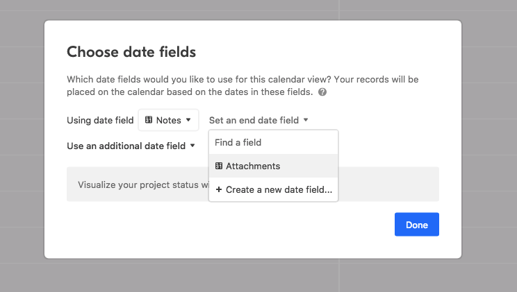
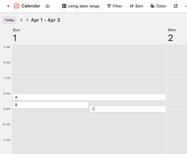
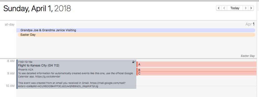
If you use an additional field to set an ending time (which requires a pro subscription), you can get Airtable to show 30 minute blocks at the smallest, it looks like. So a 15 minute difference between event start times is still going to cause an overlap:
(“B” and “C” are 15 minute events in this image)
There does not appear to be any way to change this. It may not be helpful in your situation, but an option would be to try subscribing to the iCal with your calendar application of choice (Google Calendar, iOS Calendar, Outlook, BusyCal, Fantastical, etc…) and view your days worth of events that way. Create in Airtable, view somewhere else?
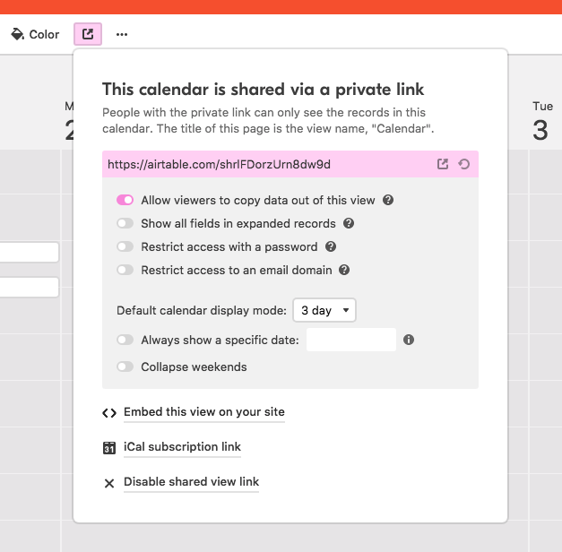
Click on the “Share” menu, and click “iCal Subscription Link”:
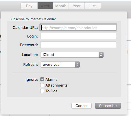
Then subscribe in your Calendar app:
Just a thought for a potential work around.
- Mark as New
- Bookmark
- Subscribe
- Subscribe to RSS Feed
- Permalink
- Report Inappropriate Content
Jun 10, 2019 05:32 PM
Hi there, What template is this? This is what I am looking for
- Mark as New
- Bookmark
- Subscribe
- Subscribe to RSS Feed
- Permalink
- Report Inappropriate Content
Jun 10, 2019 07:28 PM
Welcome to the community, Jennifer! :grinning_face_with_big_eyes: This isn’t a template. It’s Airtable’s default calendar view behavior. With a free account, event lengths default to one hour. With a Pro account, you can specify both a start and end time for events, thereby controlling their size on the calendar.
