itoldusoandso

10 - Mercury
Comment Post Options
- Subscribe to RSS Feed
- Mark as New
- Mark as Read
- Bookmark
- Subscribe
- Printer Friendly Page
- Report Inappropriate Content
May 10, 2021
06:48 PM
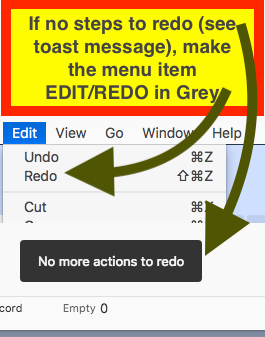
If there are no more redo’s to re-do then make the menu item REDO in grey color to show there are no more redo’s. Otherwise, it makes me keep clicking there thinking there is something to redo.
Yes I get that toast message, but I still keep clicking one more time, just to make sure 😉 heh.
If you make the menu grey, one gets the satisfaction of being at the “end”. That’s how any other application such as document and spreadsheet processor works.
It should be no problem to do at least in the native Airtable app on MacOS and Windows (don’t know how would a browser menu behave in respect to this).
Here is what I mean:
See more ideas labeled with:


