Help

This Product Ideas board is currently undergoing updates, but please continue to submit your ideas.

Petition for the attention of the (wonderful) Airtable Product Team - Please decouple the Add Field and Add Record buttons from a Table ๐Ÿ™

cancel
Showing results forย 
Search instead forย 
Did you mean:ย 
andywingrave
10 - Mercury
10 - Mercury

Hey there,

I want to first off note that I donโ€™t want this to sound like a complaint. :pray:

I love Airtable, and I have used it now for 3 years across countless large organisations and medium-sized clients. Heart

I use it for everything I do. But there was always one part of the UX that I always saw stressing users out, and that was the way you can just click and accidentally add a brand new record at the bottom without ever meaning to. The process to create a record was so easy it was overwhelming, because to non-experienced, pressing command + z is often not learned, so theyโ€™d see Airtable as a place where it wasnโ€™t safe to click anywhere (A problem later solved, in part for teams, by restricting peopleโ€™s ability to add records in a base, or just using a sync so nobody can create records), and letโ€™s not even talk about creating a record which is part of a filtered view because thatโ€™s just madness squared โ€ฆ But when teaching Airtable, all Iโ€™ve ever heard for 3 years now is a lot of โ€œWhoopsโ€โ€ฆโ€œDidnโ€™t mean to do thatโ€โ€ฆโ€œWhoops, where did that go?โ€, โ€œWhoops, how do I?โ€/โ€ฆ etc etc etc

And even to experienced users, the daily mini-frustrations I, myself, have when accidentally creating a record and having to command + z was one thing I was sure that Airtable would fix sooner or later, so I didnโ€™t let it bug me, and went on my merry wayโ€ฆ Loving pretty much everything else about Airtable, creating thousands of accidental records along the wayโ€ฆโ€œWhoops, command+zโ€

CleanShot 2021-02-10 at 11.39.54

Then August 2020 hit, and they let a team mess around with the record creation flow, causing mayhem among my clients, and colleagues alike, creating, what I think is one of the longest threads on this community yet.

We all had a little moan, a little joke, and I think for the most part they changed the functionality back - even though, itโ€™s still, in my opinion, clunkier than it was before it was messed with.

But then something happened about a month backโ€ฆ Whereby Airtable have given the field creation process the record treatment and made all sides of their app complete and utter minefields. So today, as I created my 10th accidental field of the day, I decided to write a polite petition to ask the UX designer and Product teamโ€ฆnay, BEG them to fix this!

Hereโ€™s my suggestion as an alternative:

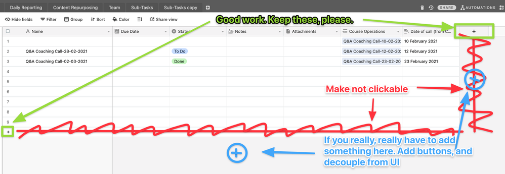
  1. Keep the Plus signs. Theyโ€™re nice and clear. Everyone is happy :green_circle:
  2. Please for the love of god stop messing with this empty space - This is important space that doesnโ€™t need to be clickable ๐Ÿ”ด

CleanShot 2021-02-10 at 11.49.09

and โ€ฆ

  1. If you really, REALLY have toโ€ฆWhy not add a little friendly round button that a user can click on, so that we can all be very comfortable that this behaviour was intentional :large_blue_circle:

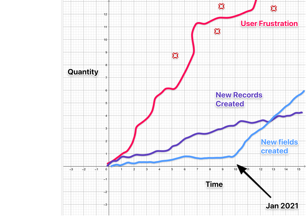
It feels like this decision was made to increase field creation, which just seems mad to me. I typically want less fieldsโ€ฆNot more! This is the graph of user frustration that I imagine the analytics doesnโ€™t show:

funtimes with graphs

Please say itโ€™s not just me :cry:

As a side note, Iโ€™ve actually been building my bases in Google Sheets recently, and my stress levels have been decreasing as a consequence, but it still feels a little like this

And as another side noteโ€ฆAirtable Product team - Sorry for the rant. I rant because I care :crazy_face: โ€ฆ You all rock :metal: !

67 Comments
ScottWorld
18 - Pluto
18 - Pluto

Iโ€™m also taking wagers that we will never again hear from an Airtable employee in this thread.

Tim_Sullivan
7 - App Architect
7 - App Architect

Quoted for Posterity:

Databaser
12 - Earth
12 - Earth

Like in all good relationships, communication is key. If they start with that, it will at least take away the biggest frustration of all: talking to walls in this community.

Letโ€™s hope for the bestโ€ฆ

I want to emphasise โ€œyearsโ€ hereโ€ฆ YEARS!

+1

Just everything that @ScottWorld says.

kuovonne
18 - Pluto
18 - Pluto

@ScottWorld I think you and I have different experiences.

While I still create fields accidentally, I probably donโ€™t do it quite as often as you, and it doesnโ€™t seem to bother me as much as it bothers you. I am not accidentally creating 10 new fields in one day. Maybe it is because we do slightly different work. Maybe it is the arrangement of our screens. Maybe it is something else. I also rarely do development work on an iPad anymore.

When I click to the right of the grid in Airtable, 99.99% of the time it is to clear the focus. However, When I am in a spreadsheet that percentage goes way down, because I also click to the right of existing data to add new data.

I still think you are overestimating the learning and forgetting curve for creating new fields. I have seen multiple users of Airtable who have been using Airtable for over a year who still donโ€™t remember how to create a field, even though they have done it multiple times before. Configuring Airtable is such a tiny portion of their time that how to create a new field simply isnโ€™t important enough to remember. They figuring it out (or hire me) and then forget a month later when they want a new field again.

As for taking time to delete extraneous fields in a clientโ€™s base, that is a personal business decision. As annoying as they are, the extraneous fields do not prevent users from using the base as intended.

I agree that Airtable should not try to cater to spreadsheet users by recreating aspects of the spreadsheet experience that do not make sense in a database environment. However, I think that Airtable should cater to spreadsheet users to ease them in the mental shift between spreadsheet and database.

Maybe the user experience researchers that Airtable wants to hire will be able to do research into how often people create records by clicking to the right of the grid, but donโ€™t actually follow through on configuring the field. Hopefully the researchers will be perceptive enough to tell when creating the field was done in error versus users needing more guidance on configuring the field.

As for bosses and managers being creatorsโ€“yeah, it would be nice if there were a quicker, easier method to set permissions for using a base.

ScottWorld
18 - Pluto
18 - Pluto

Thank you for reminding @Christy_Roach that you are also NOT in favor of this design decision.

And I appreciate you playing devilโ€™s advocate here, so I can respond to your comments:

This is totally true. A database system is never truly finished.

But 2 important things to note here:

  1. Creating new fields is only a small part of continually evolving a database system. There are so many other things that have nothing to do with creating new fields: Automations, views, scripts, external tools, apps, etc. The amount of times that we are now accidentally prompted with creating a new field is absolutely disproportionate to the amount of times that we actually NEED to create a new field.
  2. Anybody who is actually developing the system knows how to create new fields. When people are clicking to the right of the grid with their mouse, they are always doing it to clear their cursor from being inside one of the fields. They are doing it to clear the drop-down menu in a single-select field, or they are doing it to clear the drop-down choices in a linked record fields, or they are doing it to clear the drop-down choices in a multi-select field. etc. etc.

Even people who are using Microsoft Excel are accustomed to the same behavior: When a dropdown menu appears in Excel, they click into an empty area of the screen to clear the dropdown menu.

It concerns me that Christy and her team are not actually watching how people are using their mouse throughout their experience with Airtable. As @Bill.French said above, if Airtable was paying attention to their usersโ€™ behaviors, Airtable would see how many dozens of times per day users create & then cancel out of creating a new field.

A surprise interface element should never pop up on their screen, when all the user wanted to do was clear their cursor from a field.

Sure, but people are only a new user once. On their very first day of using the product. Even if it takes them 5 minutes to figure out how to create a new field, I donโ€™t believe that the entire interface should then be ruined from that point forward into the future, simply because we wanted to help a brand new user on their very first day of using Airtable who doesnโ€™t want to spend a few moments to learn a new platform.

In my personal case: I use Airtable on both a Mac web browser & an iPad web browser (where Airtable finally works properly with scrolling!), and the hundreds of times I have now accidentally created new fields in the last 2 months is mind-boggling.

Itโ€™s especially difficult on the iPad, where thereโ€™s not much screen space to begin with. All I want to do is clear my cursor out of a single-select field, or clear my cursor out of a multi-select field, etcโ€ฆ but nope, the new field dialog box pops up every time I accidentally tap to the right of the grid.

What Christy and the Airtable Team donโ€™t seem to understand is that every time I log into a clientโ€™s Airtable database to help them with their system, I have to clean up all of the extraneous fields that my client has created in their system.

How is this making peopleโ€™s lives easier?

What Airtable fails to understand is that users instinctively want to click to the right of the grid to clear the mouse from a field.

Even people who come from a spreadsheet background instinctively click to the right of their fields (or in any blank area of the screen) to clear a drop-down list in their Excel spreadsheet. Where else would a user go to clear a drop-down list?

Yes, but we shouldnโ€™t debilitate our product for ALL users in order to cater to NEW users in order to โ€œbaby themโ€ into a new product. They should simply do what everyone else has done: learn the new product. Creating a field is easy.

We canโ€™t damage an entire platform to cater to new users who donโ€™t want to spend a few minutes learning how the brand new platform works. It makes no sense.

If Steve Jobs wanted to cater to people who were accustomed to having a keyboard on their phones, he never wouldโ€™ve invented the iPhoneโ€™s touch screen keyboard.

Steve Ballmer tried to cater to people who were accustomed to having a keyboard on their phones, and we know what happened to him & the Windows phone. He got fired, and the Windows phone got discontinued.

Hereโ€™s Steve Ballmer in 2007, acting very similarly to the Airtable team in 2021:

I think that the video above is the best analogy that I could give to Airtable, and unfortunately, Christyโ€™s comments above do not inspire confidence that anything has changed internally.

Perhaps. But I was just using that as an example. I work with the bosses & managers directly โ€” who are the actual โ€œcreatorsโ€ (not โ€œeditorsโ€) of their own database systems โ€” and they are also frustrated by accidentally creating new fields throughout the day.

Bill_French
17 - Neptune
17 - Neptune

Agreed.

We canโ€™t assume they have such capacity to monitor for metrics the likes of which I have suggested, but they should. Any team that is quick to call out metrics (of ANY type) concerning useability outcomes must be very careful about confirmation bias and I think the metrics they have mentioned thus far fall into this trap. The only way to eliminate confirmation bias is to gather metrics from many perspectives to craft a true picture of user behaviours. Uncharacteristically, product managers must seek out the perspectives that provide the worst possible outcomes.

The data will tell you precisely how to shape the product - you just need to acquire the data and the data Iโ€™ve seen suggests the current UI/UX has some downsides like non-trivial spikes schema alterations as reported by Sync Inc.

andywingrave
10 - Mercury
10 - Mercury

Iโ€™ve never seen a product transition from such a delight to use to an absolute catastrophe, and Iโ€™ve never experienced such abject nonchalance from a product team either.

This has led to really disappointing outcomes for me, and I will admit Iโ€™m now using other software wherever I can.

:broken_heart:

ScottWorld
18 - Pluto
18 - Pluto

I totally agree 1,000%. Thatโ€™s 10 times more than 100%!

And, as all of us predicted (and I even offered a wager on it), we have never again heard from @Christy_Roach nor any Airtable employees in this thread. :man_shrugging:

:tumbleweeds:

I would argue that you & I are sharing the exact same experience. When I click to the right of the grid in Airtable, 99.99% of the time it is to clear the focus.

Which is why this change is so detrimental.

There is nothing subjective about this. It is objectively a bad UI decision.

I would love for @Christy_Roach (or any other Airtable employee) to let us know where we are supposed to click to clear the focus.

@Christy_Roach: Where should we click to clear our focus?

Lol! Good job! We can see how well the โ€œpromisesโ€ have held up! :roll_eyes:

Iโ€™m still waiting for all of my questions to be answered, both in this message and my previous messages.

Jeremy_Oglesby
14 - Jupiter
14 - Jupiter
Databaser
12 - Earth
12 - Earth

So, my posts are being flagged faster than I can click reply, but this gets through? :rofl: