ScottWorld

18 - Pluto
Comment Post Options
- Subscribe to RSS Feed
- Mark as New
- Mark as Read
- Bookmark
- Subscribe
- Printer Friendly Page
- Report Inappropriate Content
Aug 19, 2020
04:38 PM
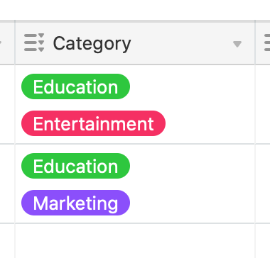
If you take a look at the screenshot below, it looks like 2 options have been selected for each record.
However, there are actually 4 options selected for each record.
It would be great if Airtable gave us a little ellipsis symbol to let us know that more options have been selected.
Ironically, if you click into the cell with your mouse, Airtable actually DOES show the ellipsis symbol. But then the symbol disappears when you leave the cell.
it would be great for this ellipsis to show up at all times. 🙂
Thanks! 🙂
See more ideas labeled with:

