Turn on suggestions
Auto-suggest helps you quickly narrow down your search results by suggesting possible matches as you type.
Showing results for
This Product Ideas board is currently undergoing updates, but please continue to submit your ideas.
- Airtable Community
- Product Ideas
- Product Suggestion: Please stop cutting off import...
Idea Options
- Subscribe to RSS Feed
- Mark as New
- Mark as Read
- Bookmark
- Subscribe
- Printer Friendly Page
- Report Inappropriate Content
Product Suggestion: Please stop cutting off important text
Turn on suggestions
Auto-suggest helps you quickly narrow down your search results by suggesting possible matches as you type.
Showing results for
ScottWorld

18 - Pluto
Comment Post Options
- Subscribe to RSS Feed
- Mark as New
- Mark as Read
- Bookmark
- Subscribe
- Printer Friendly Page
- Report Inappropriate Content
Jun 04, 2020
10:34 AM
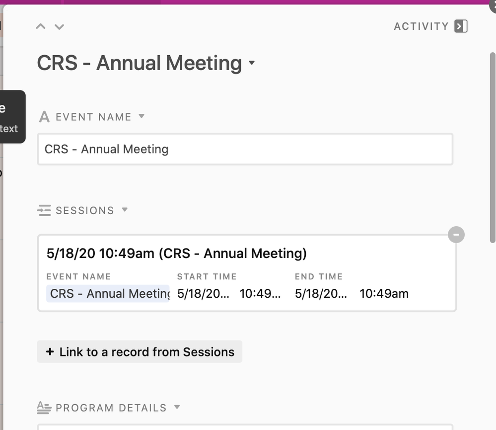
In many different areas of Airtable, important fields have their information completely cut off.
You can see this with calendar views, gallery views, kanban views, forms, and linked records.
Below is an example of a cut-off linked record. What year is the linked record? Is the time of the linked record AM or PM?
What makes this kind of absurd is that Airtable actually KNOWS that these are date & time fields, but Airtable itself doesn’t even give enough room for its own date & time fields to display properly.
See more ideas labeled with:
1 Comment
Idea Statuses
- New Ideas 790
- Already in product 11
- Considering 0
- In development 0
- Not on the roadmap 2
- Launched 26

