itoldusoandso

10 - Mercury
Comment Post Options
- Subscribe to RSS Feed
- Mark as New
- Mark as Read
- Bookmark
- Subscribe
- Printer Friendly Page
- Report Inappropriate Content
Dec 21, 2020
08:48 PM
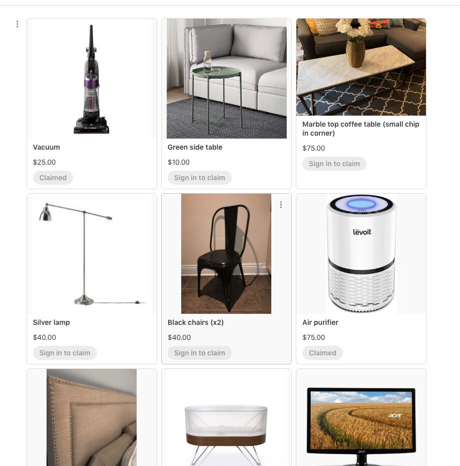
Here is a gallery view I would like to offer as an example of how Airtable could improve its gallery view design. The gallery view in Airtable looks great, don’t get me wrong, but there are at least a couple of things that need to be looked after e.g.
- Multi-line title (or other fields)
- Clean look (the less colours in the template the better, I want the content to stand out, not the template
- I know Airtable gallery design is adaptive and reduces number of columns depending on the screen size. However, it doesn’t mean I would want it to show the gallery view from left to right on the page. The reason is because humans only pay so much attention and its unreasonable to expect looking from left to right is the natural way of browsing.
- Allow hiding field names – all of them or individually … I know this was mentioned here before but I just like to repeat things a little.
Here is what I mean - take a look at the gallery view of one of Airtable (not-really) competitor - Koda.
.
I know there are 3rd party tools for Airtable allowing to customize the published pages but to stay as native within Airtable as possible.
1 Comment

