- Airtable Community
- Discussions
- Ask A Question
- Base Design
- Amounts At Top of Tables
- Subscribe to RSS Feed
- Mark Topic as New
- Mark Topic as Read
- Float this Topic for Current User
- Bookmark
- Subscribe
- Mute
- Printer Friendly Page
Amounts At Top of Tables
- Mark as New
- Bookmark
- Subscribe
- Subscribe to RSS Feed
- Permalink
- Report Inappropriate Content
Apr 27, 2022 12:11 AM
Hi everyone,
Okay this may be a confusing question, but hopefully not.
Basically I work as a freelancer so it’s really beneficial for me to see how much money I have in completed/ projects I am working on compared to how much money to date I need to have made.
I have these number on a table of mine by using an automation to add in each day the amount of money I need to make to pay my bills for the month in as a negative number. In addition to all of the various projects I have worked on/ am working on for the current year.
Both of these “money in” & “money out” type records are grouped so I can have the totals from those groups showing as a sum which at the bottom of the table shows me the difference so I know if I am behind or ahead for the year money wise.
The only issue is that it’s graphically so small and at the bottom of the screen that I literally never look at it.
Is there like anyway I can have this number be at the top left hand conner of my table as like a banner? Ugh I know that this is probably not a possibility, but that would literally be iconic.
I tried organizing everything in interfaces but it’s just to clunky for something I access daily with my workflow.
I also thought maybe somehow I can get the number to show up as the title of a group so it can be at the top and colored, but I have no idea/ dont think that is possible.
Any suggestions would be greatly appreciated!
- Mark as New
- Bookmark
- Subscribe
- Subscribe to RSS Feed
- Permalink
- Report Inappropriate Content
Apr 27, 2022 10:57 AM
Hey Jeffrey,
One way to get what you’re after is to create a new table called Reports and link it to your income table.
Then, say you want to calculate a months worth of income, you add all that months records to a single record in the Reports table. Then you use rollups to calculate the total.
You could take that further and add that new field as a Number app or in an Interface
Hannah - On2Air.com - Automated Backups for Airtable
- Mark as New
- Bookmark
- Subscribe
- Subscribe to RSS Feed
- Permalink
- Report Inappropriate Content
Apr 27, 2022 10:02 PM
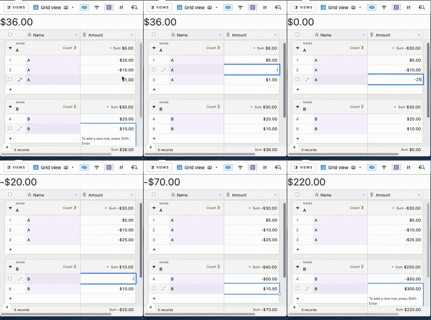
Hi Jeffrey, as far as I can tell what you’re looking for can’t be achieved within Airtable. I had a similar issue and was able to achieve a solution via tampermonkey though. Here’s how it looks:
I’m not sure what the Airtable forum rules are for non-Airtable related solutions though, so let me know if you’re interested and we can talk about it via DMs!
- Mark as New
- Bookmark
- Subscribe
- Subscribe to RSS Feed
- Permalink
- Report Inappropriate Content
Apr 29, 2022 12:00 PM
That’s a great idea, thank you!
- Mark as New
- Bookmark
- Subscribe
- Subscribe to RSS Feed
- Permalink
- Report Inappropriate Content
Apr 29, 2022 12:01 PM
Okay YES, that is exactly what I am talking about, I will dm you!

