Help

Improvements to expand and edit records

cancel
Showing results for 
Search instead for 
Did you mean: 
Jordan_Scott1
Airtable Alumni (Retired)

Hi all!

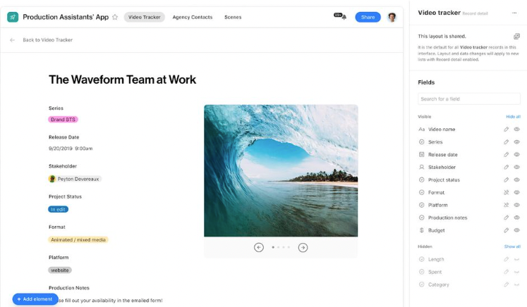
We are excited to share that as of today, we’ve made it easier for you - and your team - to expand and edit records in Airtable.

  • We’re making it easier to edit records while in the expanded view. We’ve increased the area around fields (including moving the field label to the left to save vertical space) in the expanded view for each record and made improvements to the activity pane.
  • We’ve also made it clear when a field is editable in expanded view so your collaborators can easily make edits.
  • We’ve added a persistent action bar so that common actions like changing between records, turning on comments, and the record title all stay in the same place, even as you scroll through the details.

You can expect these updates to be reflected in your bases in the next two days. We’d love to hear feedback from you about this change, so please leave your feedback below!
115 Comments
kuovonne
18 - Pluto
18 - Pluto

It could be either one. I don’t know. I agree with you that more communication from Airtable would be most welcome.

Bill_French
17 - Neptune
17 - Neptune

Or, likely - it’s the third either. :slightly_smiling_face: Nothing has changed.

Lynda_Albertson
5 - Automation Enthusiast

I got a copy-paste of this same formula email. Not feeling very hopeful we are getting anywhere.

DamonH
6 - Interface Innovator

@Jordan_Scott1 - Thank you for sharing the work that was done, and for working on issues that folks have requested. While I agree with the users above who have pointed out issues with the new UI, and that some simple shading, icons and ease-of-use/ease-of-reading are critical improvements (and yea, would be nice if we didn’t have to live through this evolution in real time) - I DO REALLY APPRECIATE the extra space. I wrote a post on it here and submitted support ticket requesting same a while ago - there is so much real estate on the screen not being used by the record view, and a step in that direction, even if not loved by folks, is still at its base a step in a direction that I and likely others have suggested.

I compared screen shots of the last version from that post above with current - showing the gain in field size. I’d LOVE to be able to expand more/control record view with, but for this specific category, I think its a gain. I really hope the UI stuff that is the theme of these responses above does catch up very soon. I too have been apologizing to team members and new users saying ‘I’m sure this will improve soon, but hey, we have more space!’.

Capture 4

Jordan_Scott1
Airtable Alumni (Retired)

Hi all -

Thank you for all the thoughtful feedback you have shared, it’s very much appreciated. Our hope is that these changes improve your Airtable experience, and we’re actively looking into solutions with your feedback in mind. If you have any solutions you’d like to propose to the team for consideration as we kick off this process, we’d love to have you submit them here. This form will be open for submissions until February 15, 2022.

UPDATE: If you have previously submitted feedback via this discussion, there is no need to resubmit via the form. Rather, if you have proposed solutions to any of the pain points that have been outlined that you think could help the team in their evaluation of this feedback, we would love to hear from you.

I also did want to clarify, these updates were not rolled back over the weekend. We looked into this today and if you haven’t refreshed or closed your browser the old experience will still appear—sorry for any confusion that may have caused.

Again, thank you for taking the time to not only share your feedback with us but for brainstorming potential solutions with us as well. Personally, I can’t wait to see what’s next for expanded record view :slightly_smiling_face:

riotonthebay
4 - Data Explorer
4 - Data Explorer

@Jordan_Scott1 Just a quick heads up that the link you posted seems to have permissions set to limit it only to those with a certain email.

Jordan_Scott1
Airtable Alumni (Retired)

Thank you!! This is now updated

Katerie
6 - Interface Innovator

I have this issue as well. My bases have a lot of (very) long text fields that summarize information from other fields. When scrolling through them, it looks really weird now.

If they don’t want to revert this change, they can at least make the content part of the window wider, so that it didn’t all look quite so squished.

kuovonne
18 - Pluto
18 - Pluto

Thank you for providing a formal method for people to provide additional feedback. Thank you also for the clear deadine. That deadline also means that many of us will be hoping to hear an update immediately following the deadline. I understand that we cannot expect to see actual changes as soon as the deadline passes, however, some sort of update would be nice.

I hope that you also take into account all of the feedback and suggestions previously provided in this thread. Some people took a lot of effort to provide their feedback, and some of them may not frequent this forum enough to see your update. These people’s inputs should be taken into account, even if they do not fill out the form.

I also prefer if feedback and suggestions are made on the open forum. This lets other people read and react to those suggestions. Sometimes the best suggestions come to mind when processing different ideas from other people.

I know that it would be much easier for Airtable to evaluate information provided in a tidy form versus reading through a long forum thread. However, I think there are benefits of keeping the suggestions in this thread. Plus, the wording for the form smacks slightly of Airtable asking the users to design for free what Airtable’s employees are being paid to do.

I have seen Airtable’s designers come up with beautiful designs after dealing with an uproar of complaints on these forums. I firmly believe that they can do it again. (It would be even nicer if it could happen without the uproar of complaints to begin with.)

ScottWorld
18 - Pluto
18 - Pluto

Personally, I think it’s disrespectful of Airtable to now require everybody to go through a form to submit the exact same opinions that they have already expressed in this thread.

Many people took a lot of time to submit their opinions here, plus many of these people might no longer be following this thread to even know about the form’s existence.

A form also hides community critiques of Airtable by shifting discussions from public to private.

Furthermore, the very first question on the form starts off on an extremely disappointing note, because it indicates that Airtable doesn’t even understand what the big deal is. The questions are coming from a place of confusion, as if Airtable is confused by the community feedback.

This is what the big deal is: the expanded view was usable before, and now it is bordering on unusable. People have outlined their thoughts clearly in this thread.

And to think that all of this could have been avoided by just giving people the option to opt in or opt out of this experimental new feature, and collecting feedback along the way from the people who opted in.