Help

Welcome to the new Airtable Community ๐Ÿš€

cancel
Showing results forย 
Search instead forย 
Did you mean:ย 
Jordan_Scott1
Airtable Alumni (Retired)

Welcome to the new Airtable Community Experience! We are so excited to welcome you back.

Whether you've been a member of the Airtable Community since day one or you joined us a few clicks ago, thank you for being part of the community - you all bring Airtable to life in a way that inspires us every single day.

A few things to explore:

  • Join a group. If you're looking to connect with like-minded individuals who are using Airtable for marketing or product operations, we've got you covered. If you're looking to help us shape the future of the Airtable Platform, we now have a Research Opportunities group and our product team can't wait to connect with you.
  • Introduce yourself to the rest of the community. We were all new once, let's celebrate one another.
  • Events. We now have a dedicated events calendar so you can keep a pulse on all the opportunities to connect with like-minded creators and the Airtable team.
  • Product Ideas. Take a look at our updated product ideas area. The team will be working hard over the next few weeks to get everything existing tagged with appropriate statuses, but we are looking forward to streamlining our ideas process with you all!
  • New and improved search functionality. Find the right answer to your question, faster, and in one place. The new Airtable Community search will provide results against the community, Airtable Help Center, and Developer Documentation at the same time.
  • Community Code of Conduct. In addition to our Community Guidelines, make sure to review our new Community Code of Conduct.
  • A note about private messages: DM's were not able to be migrated to the new platform - thank you for your understanding and we apologize for the inconvenience.

Thank you for your patience as we've been offline the last few days. I also want to assure everyone that this migration is just the first step of many improvements we are looking into and we can't wait to iterate on this experience with all of you. That being said, change is hard and there are things that won't be the same or are a bit of an adjustment, but I am incredibly excited about the new programs we are going to be able to build utilizing this new technology as the community grows. As always, feel free to send me a message with your thoughts - lots more to come!

With gratitude,
Jordan

22 Comments
Michael_Lever
7 - App Architect
7 - App Architect

we can't wait toโ€ฆ

but obviously you can or else you wouldn't !

how about we're impatient to

๐Ÿ˜€

Pedro_Pais
6 - Interface Innovator

I may be suffering from resistance to change, but this new community platform doesnโ€™t seem to match Discordโ€™s ease of use and friendliness, and any possible benefits of the new platform, which I have not yet discovered, seem to be obscured by a more difficult approach to do the more common things, such as reading, keeping tack and writing posts. 

Bill_French
17 - Neptune
17 - Neptune

I may be suffering from resistance to change ...

@Pedro_Pais, you aren't. I have similar trepidations. I believe community users mistakenly (but naturally) assume this platform is suited for bilateral conversational exchanges, but as you can see in the UI - "posts" are "blogs", and we get to comment on them. It's a unilateral publishing model that attempts to feel like the more familiar Discourse model that Airtable used for almost a decade.

In addition to the general "blog" flavour of the underlying architecture, ease-of-use, or as I like to say, "friction-free conversation" features, this platform tries to be a whole lot more at the expense of disoptimizing the efficient and productive conversational exchange of insights and knowledge.

In my opinion, this is worse than a swing and a miss; it's a strike-out with bases loaded in the bottom of the ninth. But we have to give them some time to polish and address these concerns; it's still early.

Furst_Name
5 - Automation Enthusiast

"but as you can see in the UI - "posts" are "blogs", and we get to comment on them."

Well shoot, that ends the 2 way conversation.

Bill_French
17 - Neptune
17 - Neptune

>>> Well shoot, that ends the 2 way conversation.

It certainly creates a more frictioned engagement. Blogs + comments have struggled since the early 2000's. It was a fine Web 2.0 advancement, but the model never produced the engagement that everyone thought it would. Discourse and a few other platforms have discovered that they need to establish a conversation as equal parts of a common messaging format orbiting a single topic - i.e., the initial "message". In contrast, blogs subtly create an imbalance and the UX (here at least) seems to lock in comments to the original post. Ergo - no "quote" feature that allows users to identify or refer to specific passages in the comment threads. Lacking this, it rules out direct banter about the topic.

This comment, for instance, is not directed at @Jordan_Scott1; rather, it is directed at @Furst_Name. However, there are no productive ways to shape a comment to do that easily.

Pervasive terms such as "blog", "permalink", and "comment" are throwbacks to the advent of Web 2.0 in 2003. It's almost as if Khoros took a "blogging platform", added a number of outbound marketing features and decided to compete with Discourse. I don't think it's serving Airtable well.

Bill_French
17 - Neptune
17 - Neptune

I'm feeling a bit grumpy today because I learned that the "permalink" feature is neither permanent nor a discrete link. I learned that despite a permalink option for every post, no single post is discretely addressable. I wanted to share this post with a colleague, but no luck. It appears that permalinks are not backwards compatible with the historical posts in the community. The current ones work it seems.

Bill_French_0-1671201106451.png


Nathaniel_Grano
8 - Airtable Astronomer

Having worked in software design and been involved with product launches, I try to be very aware of my own resistance to change about updates and remember that change takes time and things that seemed uncomfortable and awful become normal and comfortable. Maybe that will still happen for me here, but if anything it's been trending in the opposite direction.

I loved the Discourse-based community. I had used it many times over the years to find information and in the past few months had begun to visit to contribute solutions when I had some spare time during the workday. It seemed to me like the Airtable community was a thriving place where people were getting tons of helpful answers quickly. It gave me confidence that Airtable was a great platform to use for my projects by letting me hear from other people who had chosen to use it too. It would help to understand from the product team why they made this change. What metrics were they hoping to move? Has that happened?

Unfortunately, even though I still navigate here from force of habit, I tend to close the page as soon as I've opened it. 

  • Information density is a problem. In a couple seconds of landing on the homepage in Discourse I could have a sense of all the activity since my last visit and quickly skim through topics to see what was of interest and where I might be able to lend a hand with answers. On the new site I can see zero posts when the page loads. After I scroll down a full browser-height (desktop; or 2-3 browser heights on mobile), I can see one or two posts. If those are not of interest I can keep scrolling one by one until I get bored or tired. It might take me a couple minutes before finding a post I'm interested in. This took *seconds* in Discourse. My time is valuable! The old community was a place where I could visit between tasks and quickly find a problem of interest to work before my next meeting or task. I can't do that here, which is why I have contributed barely anything since the changeover.

  • This new community feels unpolished. There are obvious fit and finish issues right on the front page (as @Bill_French has shown. Even trying to @-mention Bill was an unpleasant experience as other "Bill" names popped in after the initial pop-up loaded making it difficult to select Bill's name from the dropdown). My username (which was automatically created the first time I clicked "login" on the Discourse site") is truncated in this new app. There is a lot of white space that diminished information density, but also is irregular so things don't feel balanced and beautiful, just chaotic and random. The numbers in the paging buttons are off-center and when you click on one the outline that appears is misshapen. Etc. These little things don't matter so much individually but as a whole they make the community less usable and less pleasant to spend time in.

Discourse does a large number of things very well. From the editing experience to searching, browsing, notifications, settings, badges, etc. I'm struggling to identify a *single* feature area where this new platform is better for my experience as a user.

I know it is unlikely that the team would consider reverting back to the old platform, but I truly believe that would be the best thing for the community (and for the product).

Bill_French
17 - Neptune
17 - Neptune

>>> Even trying to @-mention Bill was an unpleasant experience ...

LOL! This is a sentiment that has often popped up even outside the Interwebs. Another story for another time.

>>> Discourse does a large number of things very well.

And as we will learn in the future, the Discourse architecture plays a role in the advancement of GPT-3 and zero-shot inferencing. Yet another story for another time.

Great assessment @Nathaniel_Grano!

ChrisShernaman
Airtable Alumni (Retired)

Hi @Bill_French@Nathaniel_Grano@Furst_Name@Pedro_Pais, thank you all for your feedback regarding the new Community platform. The team and I are diligently reviewing your experiences and feedback while we are working towards resolving many of these bugs/UI issues. 

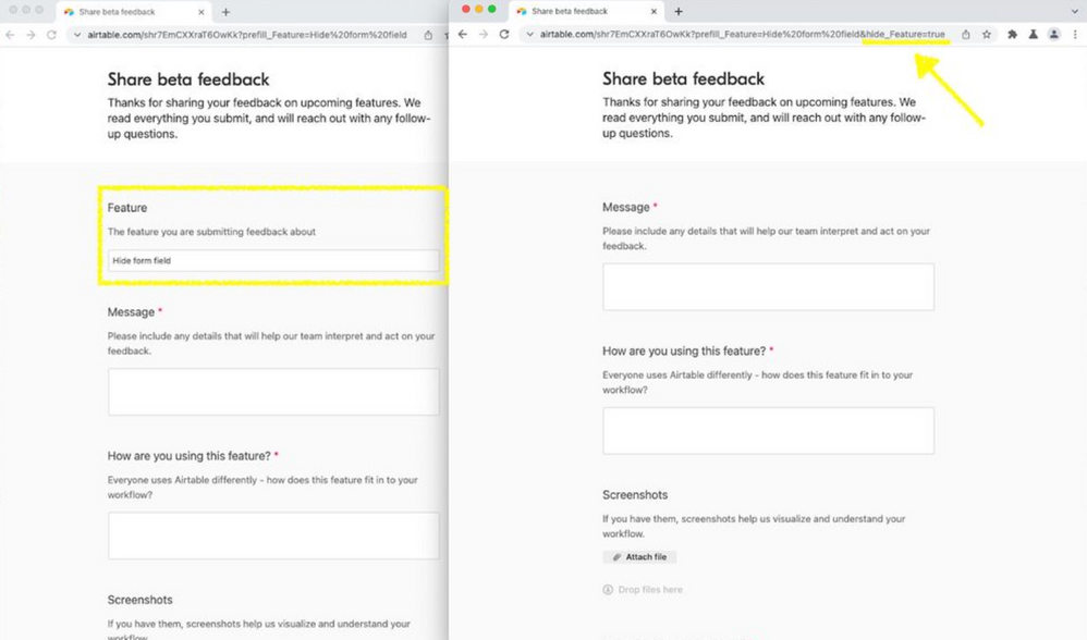
In the meantime, please continue to share your thoughts and recommendation regarding the platform and your experiences. To better help us prioritize improvements, we encourage you to submit them through our feedback form:

Airtable Community Feedback

We are committed to improving your experience and fostering a world class community. 

Thank you for again your flexibility during this platform transition period ๐Ÿ™!

Bill_French
17 - Neptune
17 - Neptune

Thanks Chris! And thanks for popping in!

>>> We are committed to improving your experience and fostering a world class community. 

This is great news, but I share the concerns of many who have concluded that the underlying architecture seems to represent a blog + comments which is very different from a Discourse-like model where all comments are first class citizens. Thoughts?

>>> ... we encourage you to submit them through our feedback form:

Yep. Not gonna' do it. ๐Ÿ˜‰ Here's why...

  1. If we [each] quietly submit issues through this form, the community has no sense about that has been called to your attention. They will most certainly call out the same issues repeatedly, thus wasting more valuable time.
  2. Capturing in this manner rules out the possibility that an experienced Khoros user may be able to show us what we're missing, or expose valuable workarounds.

>>> The team and I are diligently reviewing your experiences and feedback while we are working towards resolving many of these bugs/UI issues.

This is great to hear, but it means you are already capturing these issues in a bug-tracking database. I assume it's Airtable, so why not host that list so we don't waste energy reporting the same issue repeatedly?