- Airtable Community
- Discussions
- Ask A Question
- Interface Designer
- Re: Changes to Sidesheet Behavior
- Subscribe to RSS Feed
- Mark Topic as New
- Mark Topic as Read
- Float this Topic for Current User
- Bookmark
- Subscribe
- Mute
- Printer Friendly Page
Re: Changes to Sidesheet Behavior
- Mark as New
- Bookmark
- Subscribe
- Subscribe to RSS Feed
- Permalink
- Report Inappropriate Content
Jul 14, 2023 12:24 PM
I'm not sure who to direct this to, so I hope one of you can help.
I need to get some idea of what is going on with the changes that seem to be going on. I have a interface designed for a client, and finally have reached the point were I am getting to have them upgrade their production account. To get ready I needed to make some final changes based on their feedback using my test account.
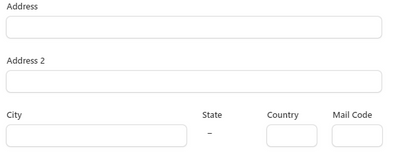
I needed to add some list pages with sidesheets that are where some fields are made editable. The ones I have on the existing test interface were easy to format and allowed resizing of the fields as well as positioning several on a line. A partial section looks like
With the changes that have been made all I can do is stack the fields with the labels to the left
This is totally unacceptable. I know it looks like a minor thing, but this was only the simplest example. When you multiply the issue over the number of fields and pages it's much more serious.
It's taken months to get everyone in agreement on how this is to look and behave, and now I can't deliver what they agreed upon.
Please let me know that you will be rolling back these changes.
- Mark as New
- Bookmark
- Subscribe
- Subscribe to RSS Feed
- Permalink
- Report Inappropriate Content
Jul 25, 2023 04:11 PM - edited Jul 27, 2023 05:40 AM
What about the disastrous changes that Airtable has made to the home page? It has completely destroyed EVERYONE'S usability, and there is not a single customer on the entire planet who is happy about it.
I have never heard from so many of my clients that they are considering leaving Airtable for other products.
When Airtable engineers unilaterally roll out destructive changes to the product that we have been begging them & pleading them to never roll out, this says that Airtable shuns its customers and hates its customers.
Similarly, when Airtable engineers unilaterally roll out destructive changes to the product and then ignores our begging & pleading to fix the rollout, it shows a similar level of disrespect towards us.
Equally as bad, when we try to improve the product by pointing out inconsistencies or critical missing features, we are also ignored by the product engineers.
This has not just happened once or twice or three times or four times, but has happened dozens of times over the last 6 years.
It doesn’t feel like we are valued humans — especially all of us Airtable consultants who are supposed to be "partners" to Airtable -- if our voices are collectively ignored and collectively shutdown 24/7/365 by the engineers who make changes to the product.
Currently, we are in the middle of the 10th crisis of the year because Airtable engineers do not listen to their customers nor consultants. The new home screen rollout has been disastrous for everybody, and I’ve never seen this many people talking about leaving the product as they are now. This is just one example out of dozens.
What is the point of being a consultant or customer if the product team ignores us, shuns us, and disrespects us?
- Mark as New
- Bookmark
- Subscribe
- Subscribe to RSS Feed
- Permalink
- Report Inappropriate Content
Jul 27, 2023 09:14 AM
Here we are, once again; Airtable users are understandably upset and the lack of communication is deafening. I agree with many of the points made here, the pros, and the cons of these features. I understood back in 2019 when I started using the software that I needed to remain agile; that things change all the time. This new feature has reminded me that I really need to set aside time each week to do a quick sense check on how the software tools I use with my clients are updating/changing, and how I need to address those with my clients.
With no notice from Airtable, I am surprised to hear about these new changes here and GRATEFUL to all of you working hard to explain the changes, since Airtable isn't. If a client sees these changes first, then I look unprepared and am left with egg on my face when I don't have the answers.
What concerns me most of all is that Airtable is singularly responsible for the income I make. As a freelancer, Airtable is where my skills are focused. When Airtable makes these changes, it is affecting my livelihood. Because of this, I wish they respected this community more. The lack of respect is the most difficult.
- Mark as New
- Bookmark
- Subscribe
- Subscribe to RSS Feed
- Permalink
- Report Inappropriate Content
Jul 28, 2023 10:27 AM
Agreed, trying this out right now and it totally sucks!
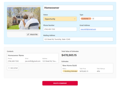
My previous contact details page:
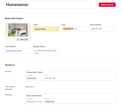
Closest possible recreation with the new system. Just hideous:
- Mark as New
- Bookmark
- Subscribe
- Subscribe to RSS Feed
- Permalink
- Report Inappropriate Content
Jul 30, 2023 03:43 AM - edited Jul 30, 2023 03:44 AM
Well our system has finally updated which led me to finding this thread. Like many of you, this absolutely destroys our workflow. Which is doubly disappointing, because we had been working closely 1:1 with staff, innovating and iterating on our workflow, and getting asked specifically what they could develop to help strengthen our workflow. Seems sort of strange that even the reps that were involved with our team didn't even know this change was going live.
Unfortunately for us, if the change is not reverted or the new version isn't iterated on to provide the original customizability, Airtable simply will no longer work as a solution for our team.
- Mark as New
- Bookmark
- Subscribe
- Subscribe to RSS Feed
- Permalink
- Report Inappropriate Content
Jul 30, 2023 10:01 PM
Just wanted to add on that my workflow has also been destroyed by this. Airtable Interfaces are no longer usable for me with this change. Just awful.
- Mark as New
- Bookmark
- Subscribe
- Subscribe to RSS Feed
- Permalink
- Report Inappropriate Content
Aug 01, 2023 03:28 PM
I am writing to express my concerns and frustrations regarding the recent interface update introduced by Airtable. As a loyal customer and advocate of Airtable, I have invested a considerable amount of time and effort in understanding and implementing the platform within my company.
The flexibility and visual appeal of Airtable's interfaces were crucial factors that convinced my team and management to adopt this platform. We appreciated the freedom to design interfaces tailored to our specific needs and preferences, making it intuitive and efficient for our users.
However, the recent update has significantly impacted our ability to create aesthetically pleasing and user-friendly interfaces. The forced transition to the new interface has limited our options, causing confusion and frustration among our team members. Unfortunately, this update has not only affected our workflow but also the overall user experience.
I strongly believe that providing customers with the ability to choose between interface versions would be a fair approach. Allowing us to revert to the previous interface or continue using the new one based on our preferences and needs would be highly appreciated.
Our team has invested significant time and resources in adapting to Airtable, and we want to continue using this platform to its fullest potential. We kindly request that Airtable considers reevaluating this decision and offers customers the option to choose their preferred interface.
I also encourage you to listen to the feedback from your user community and consider their needs and concerns when making such fundamental changes to the platform.
Thank you for your attention to this matter. We sincerely hope that Airtable remains committed to empowering its customers by providing them with the flexibility they need to create seamless workflows and interfaces.
Looking forward to hearing from you soon.
- Mark as New
- Bookmark
- Subscribe
- Subscribe to RSS Feed
- Permalink
- Report Inappropriate Content
Aug 02, 2023 12:14 PM
To echo - this decision is a complete disaster on all accounts. Being an enterprise customer I can assure you we aren't best pleased.
- Mark as New
- Bookmark
- Subscribe
- Subscribe to RSS Feed
- Permalink
- Report Inappropriate Content
Aug 04, 2023 11:53 AM
@Phil_Rose wrote:Along with valuable conversations we continue to have with customers (including some in this thread), it is directly informing short-term changes we’ll make to allow more customisation and restore missing functionality to these layouts that you can expect to see very soon.
Thank you very much for restoring the missing functionality!
I am seeing this change two weeks after your post, and three weeks after the initial change was rolled out.
- Mark as New
- Bookmark
- Subscribe
- Subscribe to RSS Feed
- Permalink
- Report Inappropriate Content
Aug 04, 2023 12:20 PM
I'm still not seeing the change. Was it only rolled out on enterprise? I lost the last project because of the "lack of stability of the platform", but still might be able to keep some others going.
- Mark as New
- Bookmark
- Subscribe
- Subscribe to RSS Feed
- Permalink
- Report Inappropriate Content
Aug 04, 2023 12:42 PM
@kuovonne wrote:
@Phil_Rose wrote:Along with valuable conversations we continue to have with customers (including some in this thread), it is directly informing short-term changes we’ll make to allow more customisation and restore missing functionality to these layouts that you can expect to see very soon.
Thank you very much for restoring the missing functionality!
I am seeing this change two weeks after your post, and three weeks after the initial change was rolled out.
Thank you for pointing it out. I'm not sure I would have seen it otherwise.
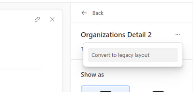
Keeping the desktop flexible with elements-based interface building, while also offering the streamlined mobile approach makes me much more optimistic about how interfaces develop.
