- Mark as New
- Bookmark
- Subscribe
- Subscribe to RSS Feed
- Permalink
- Report Inappropriate Content
Nov 14, 2021 08:45 AM
I believe this will be a fairly common request and it’s something I noticed right off the bat when designing a dashboard interface for one of my “aggregation tables” for an e-commerce store that’s being fed data from Shopify.
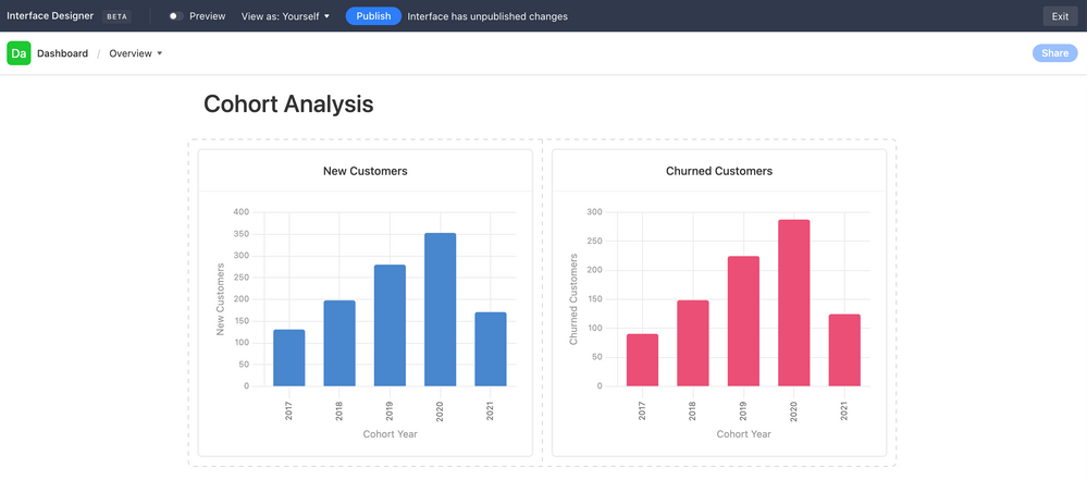
Use Case: New Customers vs. Churned Customers in a given Cohort Year
Currently, it seems I have to create two separate charts, like so…
Ideally, I would like to lay these two charts “on top of each other.” They’re both drawing data from the same table, so the X-Axis is the same. The Y-Axis is just 2 different columns’ values in the same table & rows.
- Mark as New
- Bookmark
- Subscribe
- Subscribe to RSS Feed
- Permalink
- Report Inappropriate Content
Aug 03, 2023 08:31 PM
I am also needing this!
+1
- Mark as New
- Bookmark
- Subscribe
- Subscribe to RSS Feed
- Permalink
- Report Inappropriate Content
Sep 05, 2023 08:53 AM
+1 for this!
- Mark as New
- Bookmark
- Subscribe
- Subscribe to RSS Feed
- Permalink
- Report Inappropriate Content
Dec 01, 2023 05:35 AM
Another vote for this feature. It is stopping me from using interfaces to solve my reporting problems.
- Mark as New
- Bookmark
- Subscribe
- Subscribe to RSS Feed
- Permalink
- Report Inappropriate Content
Mar 21, 2024 06:32 PM
Adding my name to the mix here. Echoing all the previous comments. This is really basic (and valuable) functionality that makes me reconsider even using AirTable. Dashboards was one of the features that sold me on AT initially. But this limitation is making me reconsider.
- Mark as New
- Bookmark
- Subscribe
- Subscribe to RSS Feed
- Permalink
- Report Inappropriate Content
Mar 22, 2024 04:02 PM
Really need this!
- Mark as New
- Bookmark
- Subscribe
- Subscribe to RSS Feed
- Permalink
- Report Inappropriate Content
Apr 29, 2024 11:30 AM
+1 multiple Ys would mean so much!
- Mark as New
- Bookmark
- Subscribe
- Subscribe to RSS Feed
- Permalink
- Report Inappropriate Content
Jun 05, 2024 05:38 AM
While we await the aggregation feature, I wanted to share my workaround. I created a separate table linked to the primary data source, containing a record for each X/Y axis combination with a summary column.
- Mark as New
- Bookmark
- Subscribe
- Subscribe to RSS Feed
- Permalink
- Report Inappropriate Content
Sep 19, 2024 10:41 AM - edited Sep 19, 2024 10:52 AM
I really want this solution as well.
Whats confusing about this is that in their releases, Airtable claims to have released features for this but I'm not seeing them. Look at "Multiple series and dual y-axes in charts" in July 2024. Maybe it needs to be under a newer interface page type but I'm not able to take a standard chart and do this.
https://www.airtable.com/whatsnew
EDIT: I figured it out! You have to select "Dashboard" type when generating a new page. It works!
- Mark as New
- Bookmark
- Subscribe
- Subscribe to RSS Feed
- Permalink
- Report Inappropriate Content
Oct 01, 2024 01:58 AM
Thanks for sharing! Much appreciated,
- Mark as New
- Bookmark
- Subscribe
- Subscribe to RSS Feed
- Permalink
- Report Inappropriate Content
Oct 30, 2024 12:36 PM
Thanks for this. SUPER helpful. Was trying to get this feature in the "Blank" slate interface. Using "Dashboard" as a template makes this a lot easier.


