- Mark as New
- Bookmark
- Subscribe
- Subscribe to RSS Feed
- Permalink
- Report Inappropriate Content
Nov 14, 2021 08:45 AM
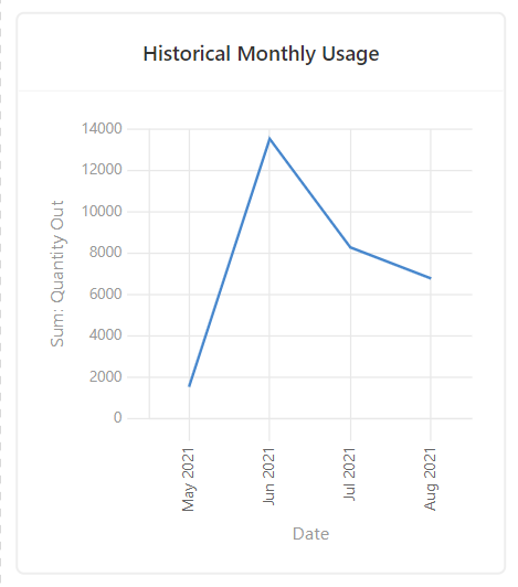
I believe this will be a fairly common request and it’s something I noticed right off the bat when designing a dashboard interface for one of my “aggregation tables” for an e-commerce store that’s being fed data from Shopify.
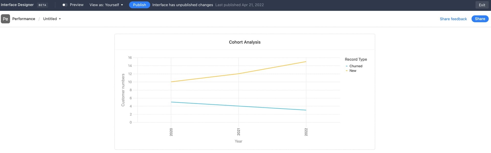
Use Case: New Customers vs. Churned Customers in a given Cohort Year
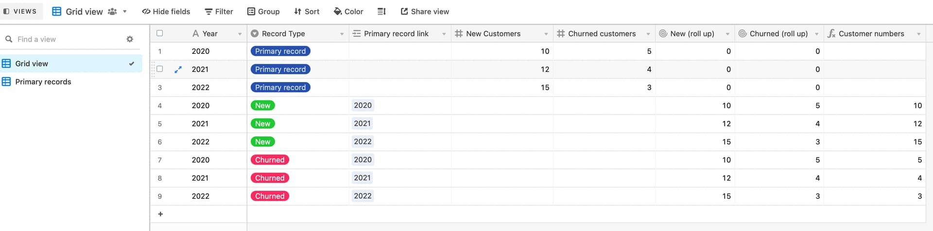
Currently, it seems I have to create two separate charts, like so…
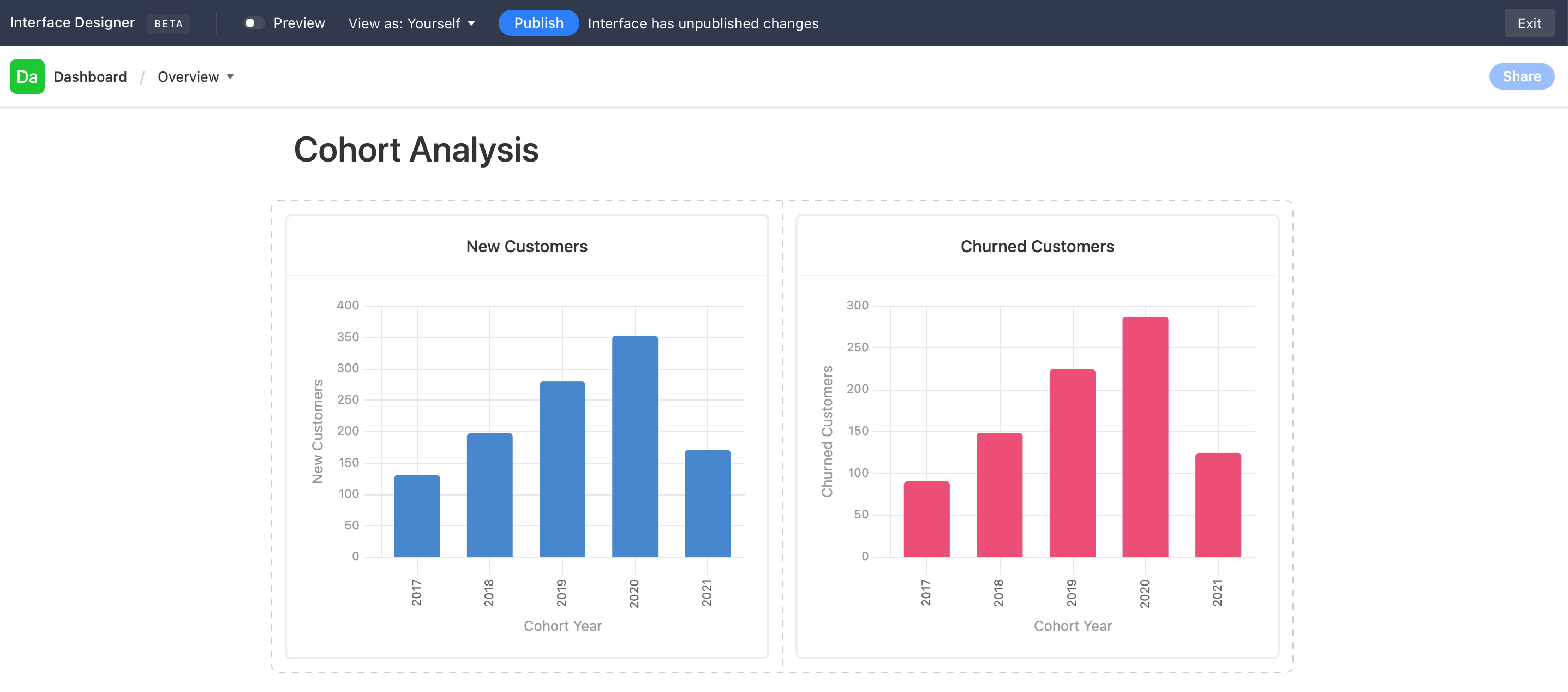
Ideally, I would like to lay these two charts “on top of each other.” They’re both drawing data from the same table, so the X-Axis is the same. The Y-Axis is just 2 different columns’ values in the same table & rows.
- Mark as New
- Bookmark
- Subscribe
- Subscribe to RSS Feed
- Permalink
- Report Inappropriate Content
Feb 11, 2023 01:36 AM
Yes, Airtable, please, get this rolling.
- Mark as New
- Bookmark
- Subscribe
- Subscribe to RSS Feed
- Permalink
- Report Inappropriate Content
Feb 15, 2023 01:17 AM
AT please do this, it's a basic function, we need it
- Mark as New
- Bookmark
- Subscribe
- Subscribe to RSS Feed
- Permalink
- Report Inappropriate Content
Feb 17, 2023 01:13 PM
+1 on this ask, we aren't able to fully roll out our reporting in Airtable until this is a feature. I love so much about Airtable as a user and creator; however, the interface is the only part of Airtable that our leadership really sees, so it needs to have this functionality.
- Mark as New
- Bookmark
- Subscribe
- Subscribe to RSS Feed
- Permalink
- Report Inappropriate Content
Mar 10, 2023 12:56 AM
+1 on this!
- Mark as New
- Bookmark
- Subscribe
- Subscribe to RSS Feed
- Permalink
- Report Inappropriate Content
Mar 16, 2023 09:23 AM
Is there not a work around for thi? it seems such a standard option from a reporting point of view
- Mark as New
- Bookmark
- Subscribe
- Subscribe to RSS Feed
- Permalink
- Report Inappropriate Content
Apr 06, 2023 02:13 PM
Big time need this. Charting right now is just... too basic.
+1 on adding this feature!
- Mark as New
- Bookmark
- Subscribe
- Subscribe to RSS Feed
- Permalink
- Report Inappropriate Content
May 02, 2023 11:00 AM
+1... seems pretty obvious that this functionality would help transition entire data dashboards from other solutions like power BI, tableau, etc. to AT Interfaces. I've dabbled a lot with data these last 5 years but I love the ease of use & automations that AT provides.
Unfortunately, this limitation forces me to download the data through AT's API with python,
then either inject it in a google sheet or build a custom streamlit app in python to visualize it the way I want.
More EDA features would definitely give AT an extra edge I believe... nothing their engineers can't tackle.
- Mark as New
- Bookmark
- Subscribe
- Subscribe to RSS Feed
- Permalink
- Report Inappropriate Content
May 25, 2023 02:13 PM
+1, can't believe this is not a thing yet
- Mark as New
- Bookmark
- Subscribe
- Subscribe to RSS Feed
- Permalink
- Report Inappropriate Content
May 26, 2023 08:34 AM
Another +1 for this... I'm loving AT for so many reasons, and this is the BIGGEST hole in the capabilities. Please, do a sprint for this and give us multi-series charts, please please please!
- Mark as New
- Bookmark
- Subscribe
- Subscribe to RSS Feed
- Permalink
- Report Inappropriate Content
Jul 28, 2023 06:32 AM
I have wanted this feature for a while now. The charts are not nearly advanced enough. The functionality hasn’t been touched since they launched extensions years ago.
I like Airtable, but it seems as though they do something new, usually quite polished, but then move onto another new thing rather than refine what they’ve already got.
