Help

Re: Request: Multiple Y-Axis data sources in Charts

1826 0
cancel
Showing results for 
Search instead for 
Did you mean: 
Brian_Gumm2
4 - Data Explorer
4 - Data Explorer

I believe this will be a fairly common request and it’s something I noticed right off the bat when designing a dashboard interface for one of my “aggregation tables” for an e-commerce store that’s being fed data from Shopify.

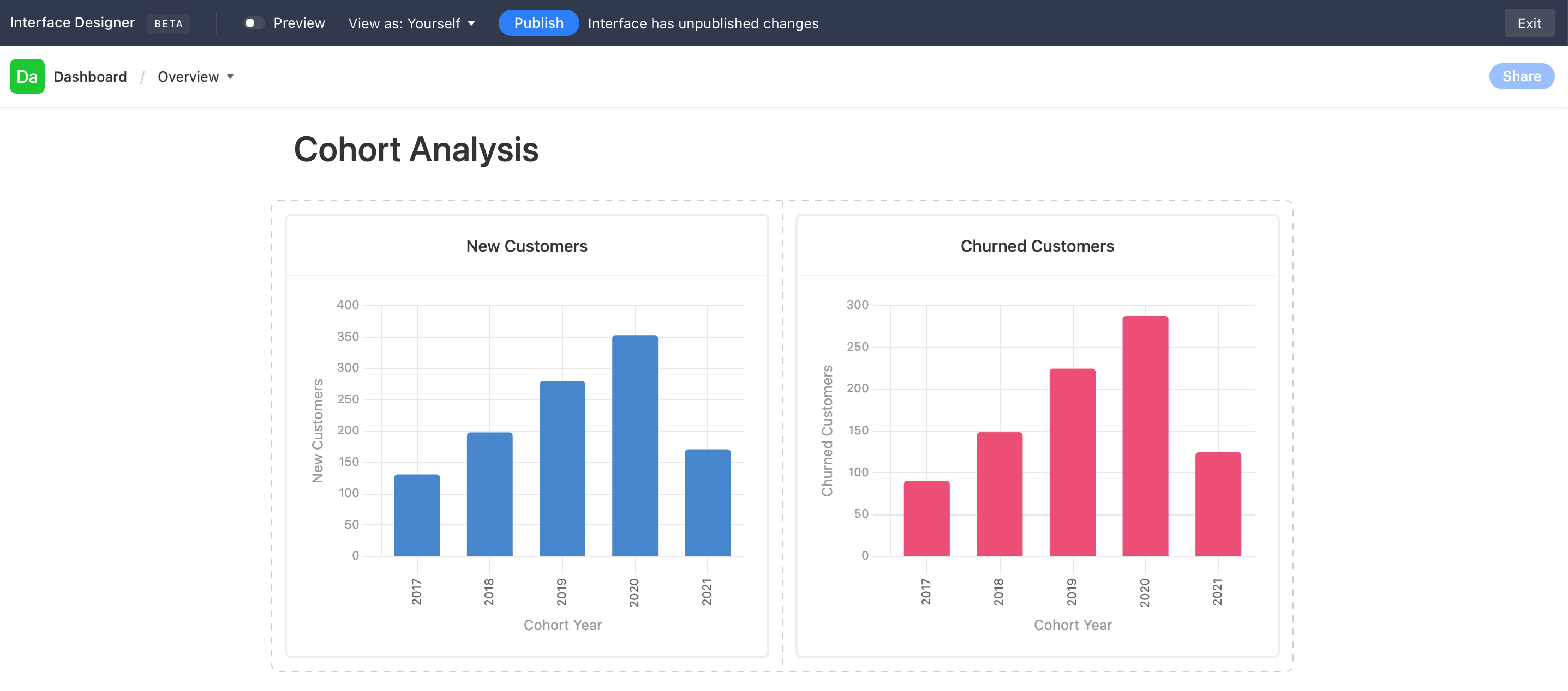
Use Case: New Customers vs. Churned Customers in a given Cohort Year
Currently, it seems I have to create two separate charts, like so…
Screen Shot 2021-11-14 at 10.41.56 AM

Ideally, I would like to lay these two charts “on top of each other.” They’re both drawing data from the same table, so the X-Axis is the same. The Y-Axis is just 2 different columns’ values in the same table & rows.

39 Replies 39
Tristan-ARG
6 - Interface Innovator

I am also needing this!

+1

shemeka
4 - Data Explorer
4 - Data Explorer

+1 for this!

Jason_Rosoff
4 - Data Explorer
4 - Data Explorer

Another vote for this feature. It is stopping me from using interfaces to solve my reporting problems.

David_O_Leary
5 - Automation Enthusiast

Adding my name to the mix here. Echoing all the previous comments. This is really basic (and valuable) functionality that makes me reconsider even using AirTable. Dashboards was one of the features that sold me on AT initially. But this limitation is making me reconsider. 

laurenb
4 - Data Explorer
4 - Data Explorer

Really need this!

Markus_
4 - Data Explorer
4 - Data Explorer

+1 multiple Ys would mean so much!

laurenb
4 - Data Explorer
4 - Data Explorer

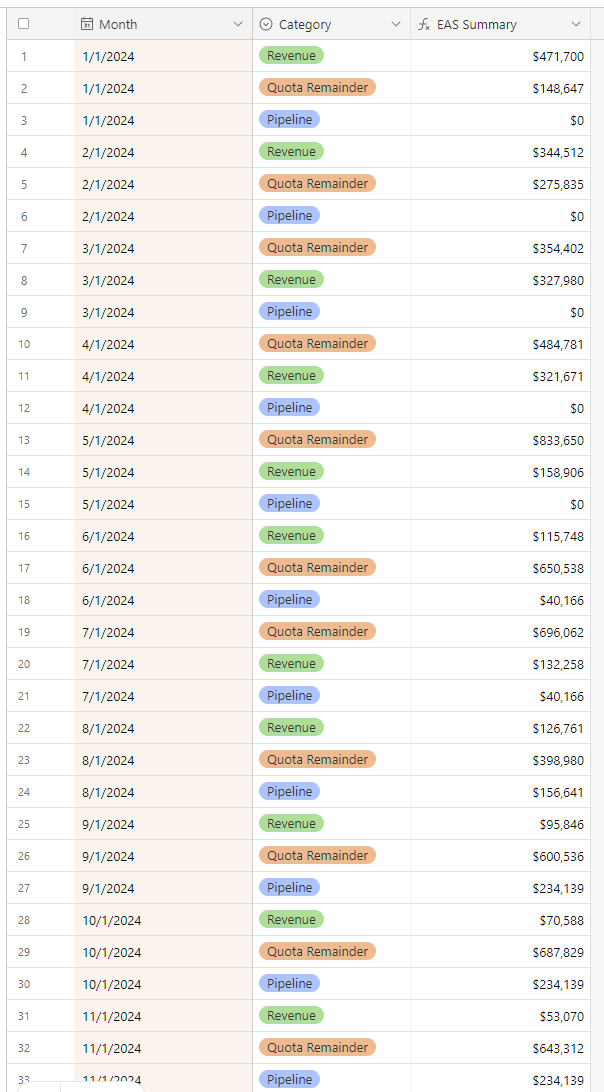
While we await the aggregation feature, I wanted to share my workaround. I created a separate table linked to the primary data source, containing a record for each X/Y axis combination with a summary column.

laurenb_0-1717590608126.png

laurenb_1-1717590720999.png


JeremyK
5 - Automation Enthusiast

I really want this solution as well.

Whats confusing about this is that in their releases, Airtable claims to have released features for this but I'm not seeing them. Look at "Multiple series and dual y-axes in charts" in July 2024. Maybe it needs to be under a newer interface page type but I'm not able to take a standard chart and do this.

https://www.airtable.com/whatsnew


EDIT: I figured it out! You have to select "Dashboard" type when generating a new page. It works!

Thanks for sharing! Much appreciated,

Thanks for this. SUPER helpful. Was trying to get this feature in the "Blank" slate interface. Using "Dashboard" as a template makes this a lot easier.