- Airtable Community
- Discussions
- Ask A Question
- Other questions
- Give us our old home page back! New layout is AWFU...
- Subscribe to RSS Feed
- Mark Topic as New
- Mark Topic as Read
- Float this Topic for Current User
- Bookmark
- Subscribe
- Mute
- Printer Friendly Page
Give us our old home page back! New layout is AWFUL!
- Mark as New
- Bookmark
- Subscribe
- Subscribe to RSS Feed
- Permalink
- Report Inappropriate Content
Oct 27, 2022 09:28 AM
Continuing the discussion from Please, please tell me the home screen won't be updated like the free account:
- Mark as New
- Bookmark
- Subscribe
- Subscribe to RSS Feed
- Permalink
- Report Inappropriate Content
Mar 13, 2023 07:21 AM
It's even worse now...
It looks more similar to Monday.com which I hate.
AirTable keeps getting more and more confusing and all these services that do similar things are starting to look the same -- having terrible UI.
The workpaces and being able to drag bases between everything and have the huge icons was so unique and had such a comfortable workflow. Ruined now. And no way to go back.
- Mark as New
- Bookmark
- Subscribe
- Subscribe to RSS Feed
- Permalink
- Report Inappropriate Content
Mar 29, 2023 10:48 AM
For me this is a complete and utter disaster for work flor.
I color code my clients. I organized them in a specific layout. I had a workflow pattern on how to manage the flow, and could move things about.
This new 'Layout' really is horrible, constricting and more so, unusable for me in managing multiple clients.
Why did you force us into having to go by 'Last used/dates' for priority.
Even starring isn't going to help since I manage multiple clients.
PLEASE let us have the old style back for those of us that were using it as work flow management.
- Mark as New
- Bookmark
- Subscribe
- Subscribe to RSS Feed
- Permalink
- Report Inappropriate Content
Apr 17, 2023 12:44 PM
I also am not a fan of the home page, but I wasn't a big fan of the old home page either...
I posted a method to create a Base Directory using Google Drive, if anyone would like to try that method. Please read my comments below to make this work for more than one Airtable user. Feel free to DM me if my instructions were confusing. I'll try to create a Tango workflow document and share that here.
https://community.airtable.com/t5/show-tell/workspace-organization-creating-an-index-or-directory-us...
- Mark as New
- Bookmark
- Subscribe
- Subscribe to RSS Feed
- Permalink
- Report Inappropriate Content
Apr 18, 2023 04:58 PM
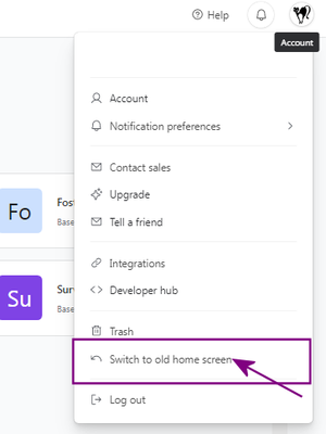
So I found - the old Home Interface setup
Select your Avatar in the upper right corner
Pull the menu down - Find the option called Switch to Old Home Screen. (see image below)
Mind you - you will have to keep changing it if you use anything on the left side menu because it will go back to the 'new look'
- Mark as New
- Bookmark
- Subscribe
- Subscribe to RSS Feed
- Permalink
- Report Inappropriate Content
Apr 25, 2023 06:33 AM
Honestly, whomever who decided to do this should just be fired. This is what i call amateur product designs which are regressive. IN the old layout, i could move and group bases next to each other, which is critical when you have multiple basis. Please can we have the old layout back? This is a no brainer, its a stupid change, not well thought through!
- Mark as New
- Bookmark
- Subscribe
- Subscribe to RSS Feed
- Permalink
- Report Inappropriate Content
Jul 13, 2023 01:43 AM
new home page sucks
Option to use the old one removed
Good morning AT...
- Mark as New
- Bookmark
- Subscribe
- Subscribe to RSS Feed
- Permalink
- Report Inappropriate Content
Jul 19, 2023 01:27 PM
I HATE the new interface. Makes me want to poke my eyes out. My entire business is run through airtable and I now feel so disorganized. SWITCH IT BACK!
- Mark as New
- Bookmark
- Subscribe
- Subscribe to RSS Feed
- Permalink
- Report Inappropriate Content
Jul 20, 2023 08:10 AM
The new interface (and other glitches, frankly) is leading our group to reconsider our decision to get the enterprise plan and move our data to airtable. This is a reconfiguration of the basic table of contents for the whole data architecture, but there are no improvements and considerable headaches. The main function I see added here is that many of our bases are obscured and require extra clicks to access. Nor are we able to configure this according to our needs. So, basically a top down decision to make it look pretty by hiding the multiplicity of bases -- please allow us to revert back.
- Mark as New
- Bookmark
- Subscribe
- Subscribe to RSS Feed
- Permalink
- Report Inappropriate Content
Jul 20, 2023 12:47 PM
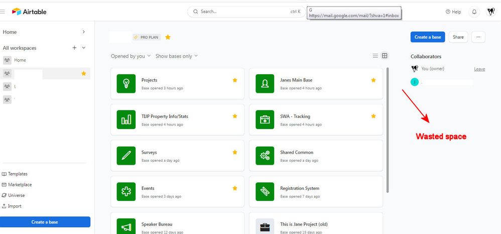
As a consultant - I must say the amount of WASTED SPACE for prime real estate usage is beyond me.
I can't even close down either side of this space to hide it, so I can work.
This is very frustrating. AIRTABLE please - if you are going to introduce side bars in your Homepage UI - make sure they can be closed or hidden...just like you do with the Interface and Airtables themselves.
- « Previous
-
- 1
- 2
- Next »


