- Airtable Community
- Discussions
- Ask A Question
- Other questions
- In Stacked Charts - keeping consistent order and c...
- Subscribe to RSS Feed
- Mark Topic as New
- Mark Topic as Read
- Float this Topic for Current User
- Bookmark
- Subscribe
- Mute
- Printer Friendly Page
In Stacked Charts - keeping consistent order and colour of categories across chart types
- Mark as New
- Bookmark
- Subscribe
- Subscribe to RSS Feed
- Permalink
- Report Inappropriate Content
Dec 03, 2020 04:46 PM
Hi,
Hope all reading this are well and staying safe.
I’m creating a Business Dashboard with a range of graphs for different purposes. Some of these are stacked charts.
My need is to achieve consistent order and colour of category groupings in charts, in two ways:
-
Consistent order and colour of category groupings when changing a stacked bar chart to a stacked line chart.
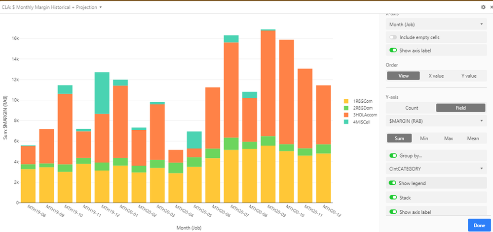
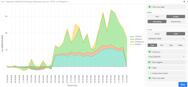
Airtable seems to take control and change the order and colour (see screenshots below). Please note: in creating the stacked line chart I simply copied/duplicated the stacked bar chart, and made one adjustment: changed the chart type from bar to line. This automatically changed the order and colour of the category groupings.
Stacked bar:
Note the order and the coour of the grouping categories in the above.
And here is the stacked line chart that is a result of simply transforming the copied chart type to stacked line:
Note the order and colour of those categories has been changed.
Can I control this? -
Consistent order and colour of categories across two different charts which use Views of the same table that are virtually identical, and where the order of the data presented in the charts is identical. Airtable again seems to take control of the colour and arbitrarily applies new order and colour to a new chart regardless of the fact that the order of data in the Table Views are the same.
Is there something simple I have missed? If so, would you please help me to control the order and colour of the groups across a range of charts regardless of the chart type?
Thanking you,
Carol
- Mark as New
- Bookmark
- Subscribe
- Subscribe to RSS Feed
- Permalink
- Report Inappropriate Content
Dec 03, 2020 06:09 PM
Hi Carol and welcome to the community.
By the looks of your charts, you are obviously skilled in creating good visuals. Unfortunately, the Chart Block has some limitations, mostly regarding simple nuances like sorting and colour control.
I’m not sure that you can’t achieve your objectives with it, but long ago I sorta gave up on the Chart Block and decided to use the new Vega-Lite Block which is in beta, but you can get access to it with a single click.
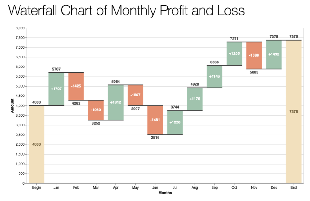
There are almost no limits to what you can build with Vega, but it does require a little technical understanding of the grammars and you need to edit JSON declarations. There are some good tutorials though and the dividends are huge if you master it. For example, this is simply out of reach for most charting tools -
- Mark as New
- Bookmark
- Subscribe
- Subscribe to RSS Feed
- Permalink
- Report Inappropriate Content
Dec 03, 2020 08:58 PM
Hi Bill,
Thank you for your welcome and for your time and energy on my question, and the feedback that I’ll need to look elsewhere – such as Vega-Lite – for controlling order and colour for consistency across multiple charts.
I’ll download and have a good “play” with it :grinning_face_with_smiling_eyes: Your waterfall chart would be out of reach for most charting tools.
cheers
Carol
- Mark as New
- Bookmark
- Subscribe
- Subscribe to RSS Feed
- Permalink
- Report Inappropriate Content
Dec 04, 2020 05:31 AM
To be clear, you don’t need to download anything or really learn a whole lot to get some traction with the Vega-Lite block. You simply install it into your Airtable account with a single click and then start to use it like any other plugin component (i,.e., “app”) in Airtable.
And the Vega-Lite block will generate a basic grammar for you to select tables and fields, so you can get a feel for it right away. It’s all the little nuances of shape, form, and style that will require more learning. But as you can see from this thread, there’s a way to do almost any type of refined rendering.
One of the biggest advantages of Vega-Lite is extensibility. If you invest in developing charts using Vega grammars, and you need to apply the same or similar renderings in other places - like a website, or a portal, or another Airtable block, the JSON code is transportable without modification.

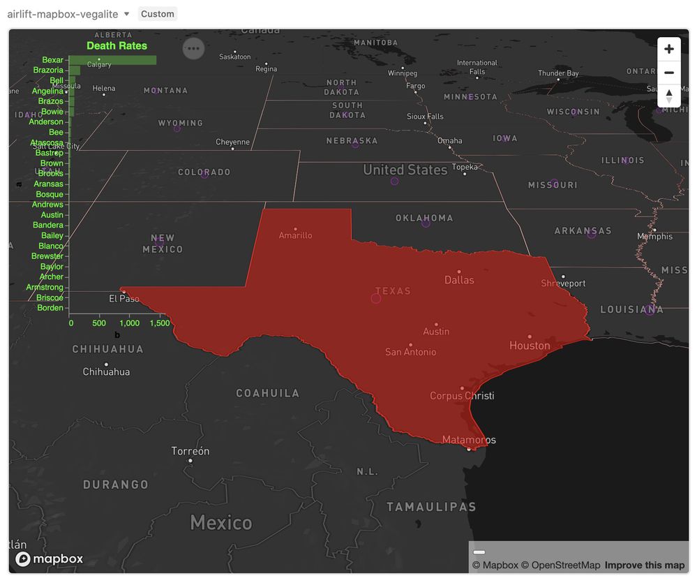
And here’s an example where I use Vega-Lite as an overlay of COVID death rates in a custom mapping app. This is made possible by building your own custom apps with the Airtable Blocks SDK. The Vega grammar used to create the overlay was initially developed by my client as a Vega block - we simply copied it into the custom app and added an opacity level.
- Mark as New
- Bookmark
- Subscribe
- Subscribe to RSS Feed
- Permalink
- Report Inappropriate Content
Jul 20, 2023 10:27 AM
Hi Carol,
Your graphs look amazing!! What extension are you using? I am trying to replicate the stacked line graph for my business dashboard in the interface, but I can't seem to figure out how to create a stacked line graph. Is your field a single select field?
Thank you
