Hi there!
I work for a nonprofit that sends frozen meals to families with children with cancer in British Columbia.
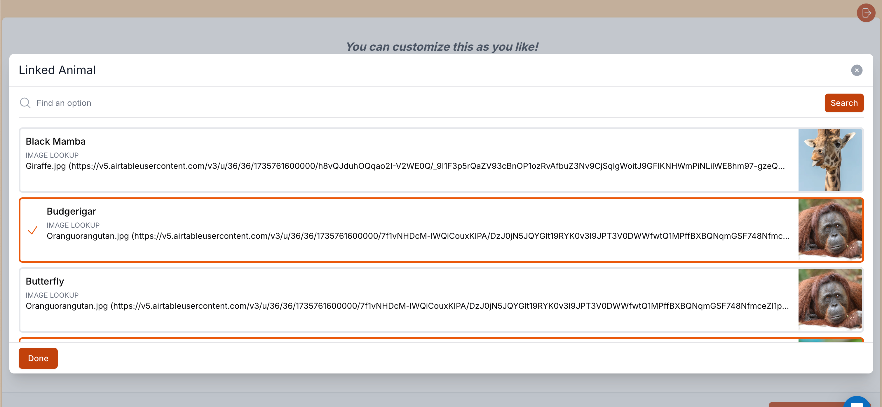
We've leveraged Airtable to run our inventory and order management, but we've gotten some feedback that families are having a hard time with seeing the dietary restrictions for a specific item on our order form.
The order form is set up so that it pulls products from a specific view that categorizes the product into a main, side, etc.
Does anyone know of any way to make it so that the families could see the whole text?
A workaround is that when they actually add the product it shows all of the information - if they saw something concerning and wanted to remove the product they would just have to remove it and then add another, but this is counter-intuitive and confusing to many people.
You can see a video of the cut off text at the following link:
https://www.loom.com/share/0e8339922c2043938cf0be2cb86e8732?sid=514be784-1b55-4290-b40a-be013a01027b
This view is on a desktop, but most of our families order on their phones so it's even worse.
Thanks for any insights or help!


