Continuing the discussion from Please, please tell me the home screen won't be updated like the free account:
It is pretty unhelpful. Took me longer than it should have to find Bases shared with me. Cant see all bases on one screen. All I ever heard anyone ask for on the home page is better grouping, and they just made it worse.
@Vivid-Squid Can you drag-and-drop bases around into a custom order?
I totally agree that this is a misguided decision by Airtable.
You can try to email support@airtable.com or contact @Jordan_Scott1 about this.
@Vivid-Squid Can you drag-and-drop bases around into a custom order?
I totally agree that this is a misguided decision by Airtable.
You can try to email support@airtable.com or contact @Jordan_Scott1 about this.
@ScottWorld I can Star an item and rearrange the Starred Items list.
The 5 min of heart racing panic when I could not find bases shared with me did add a few years and grey hairs.
I am unsure why resources were spent on this change, I am not finding any improvements.
@ScottWorld I can Star an item and rearrange the Starred Items list.
The 5 min of heart racing panic when I could not find bases shared with me did add a few years and grey hairs.
I am unsure why resources were spent on this change, I am not finding any improvements.
That’s good to hear — a baby step in the right direction! However, not having the ability to rearrange bases in workspaces is a huge mistake (in my opinion). The best feature of the homepage is the ability to move bases (and workspaces) into the order that you need them in.
Can you still rearrange workspaces, or are they forced to be in alphabetical order?
In a private preview screening of this, I specifically asked Airtable to keep “bases shared with me” clearly visibly, but they didn’t implement my feedback. :man_shrugging:
@ScottWorld I can Star an item and rearrange the Starred Items list.
The 5 min of heart racing panic when I could not find bases shared with me did add a few years and grey hairs.
I am unsure why resources were spent on this change, I am not finding any improvements.
When will a $12bn company learn how to do this?

Thank you!!! I was hoping I wasn’t the only person who was REALLY missing the old layout, I had it all organized and now can’t find anything. I adore airtable, and am hoping that if they get enough comments about this they will go back to the way it was, this is SOOOOO not an improvement at all. I sent a message to the support team, maybe if we all do they’ll realize we prefer the way we had before… I asked them to plleeaassseeee even add the option 'old layout" or “new layout” if possible, I see that sometimes, that way we can have our old one if we liked it that way.
That’s good to hear — a baby step in the right direction! However, not having the ability to rearrange bases in workspaces is a huge mistake (in my opinion). The best feature of the homepage is the ability to move bases (and workspaces) into the order that you need them in.
Can you still rearrange workspaces, or are they forced to be in alphabetical order?
In a private preview screening of this, I specifically asked Airtable to keep “bases shared with me” clearly visibly, but they didn’t implement my feedback. :man_shrugging:
Hi,
I am currently very busy alone on 2 big projects that do not leave me any brain available to analyze and solve much else but here, I add my modest thoughts to the situation that is very disturbing I feel !
Yes it really is !
I don’t really understand AIRTABLE when the UX/UI that was quite satisfying is so messed up and imposed.
The only thing I missed in the old interface was the decoupling between the Workspace and a Payment Plan.
This did not allow me to consider the Workspace as a Folder in which I could keep some of my Bases, for example: private / job 1 / job 2 / lab…, and it is also essential to pay attention to be able to continue to SYNC a table from one Database to another,
even if the Bases were hypothetically stored in different Folders, but this does not exist.
I have already been helped by the Support, very well and very quickly, when I reported a real issue.
But when I count the Requests, the ones that do not go against the good professional practices justified and explained by the best Experts, the most repeated Requests from the Community that have never been encountered for years, I too feel that this unwanted and unappreciated change is energy and time misused by Airtable.
oLπ
I agree, and am relieved that others feel the same way. The new layout is hard to navigate and takes way more time to deal with than the old layout. It detracts from the whole user experience and is making me rethink using the platform. Also if this is an “improvement” I’m hoping they don’t try and “improve” anything else.
I absolutely despise the new layout. I use Airtable for personal use and for work, and share my screen half the day in meetings. I do not need my coworker seeing my other bases up at the top when I open another tab of Airtable... Worst "upgrade" ever and I just want them to give us the option to revert back to the old screen. Please. They'd probably see 100% of users with more than 10 bases doing just that.
It's even worse now...
It looks more similar to Monday.com which I hate.
AirTable keeps getting more and more confusing and all these services that do similar things are starting to look the same -- having terrible UI.
The workpaces and being able to drag bases between everything and have the huge icons was so unique and had such a comfortable workflow. Ruined now. And no way to go back.
For me this is a complete and utter disaster for work flor.
I color code my clients. I organized them in a specific layout. I had a workflow pattern on how to manage the flow, and could move things about.
This new 'Layout' really is horrible, constricting and more so, unusable for me in managing multiple clients.
Why did you force us into having to go by 'Last used/dates' for priority.
Even starring isn't going to help since I manage multiple clients.
PLEASE let us have the old style back for those of us that were using it as work flow management.
I also am not a fan of the home page, but I wasn't a big fan of the old home page either...
I posted a method to create a Base Directory using Google Drive, if anyone would like to try that method. Please read my comments below to make this work for more than one Airtable user. Feel free to DM me if my instructions were confusing. I'll try to create a Tango workflow document and share that here.
https://community.airtable.com/t5/show-tell/workspace-organization-creating-an-index-or-directory-using/m-p/144741/thread-id/2755/highlight/true
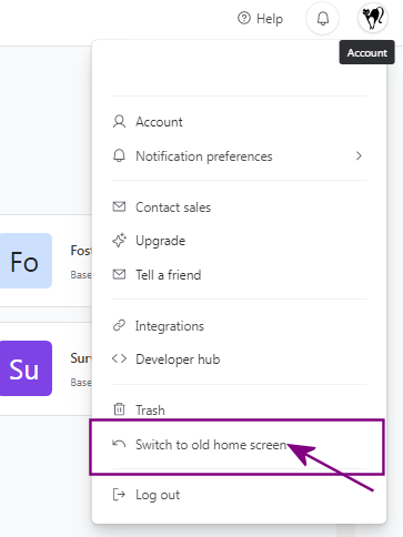
So I found - the old Home Interface setup
Select your Avatar in the upper right corner
Pull the menu down - Find the option called Switch to Old Home Screen. (see image below)
Mind you - you will have to keep changing it if you use anything on the left side menu because it will go back to the 'new look'

Honestly, whomever who decided to do this should just be fired. This is what i call amateur product designs which are regressive. IN the old layout, i could move and group bases next to each other, which is critical when you have multiple basis. Please can we have the old layout back? This is a no brainer, its a stupid change, not well thought through!
new home page sucks
Option to use the old one removed
Good morning AT...
I HATE the new interface. Makes me want to poke my eyes out. My entire business is run through airtable and I now feel so disorganized. SWITCH IT BACK!
The new interface (and other glitches, frankly) is leading our group to reconsider our decision to get the enterprise plan and move our data to airtable. This is a reconfiguration of the basic table of contents for the whole data architecture, but there are no improvements and considerable headaches. The main function I see added here is that many of our bases are obscured and require extra clicks to access. Nor are we able to configure this according to our needs. So, basically a top down decision to make it look pretty by hiding the multiplicity of bases -- please allow us to revert back.

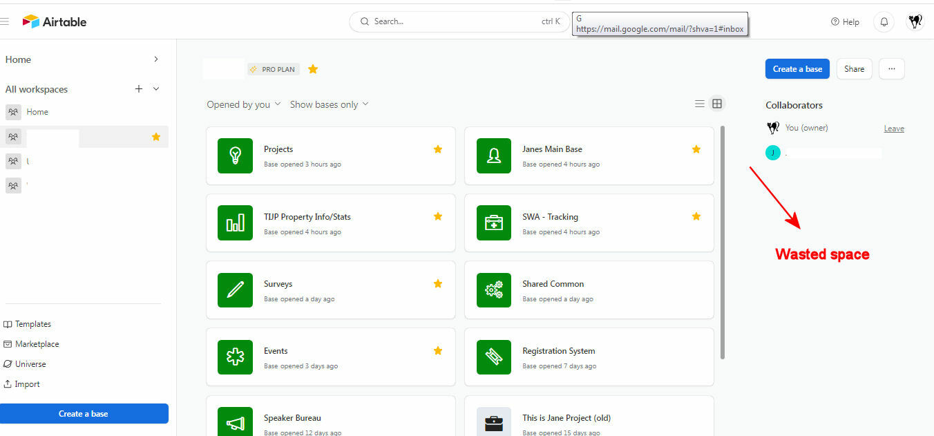
As a consultant - I must say the amount of WASTED SPACE for prime real estate usage is beyond me.
I can't even close down either side of this space to hide it, so I can work.
This is very frustrating. AIRTABLE please - if you are going to introduce side bars in your Homepage UI - make sure they can be closed or hidden...just like you do with the Interface and Airtables themselves.
Enter your E-mail address. We'll send you an e-mail with instructions to reset your password.
