Danarone

6 - Interface Innovator
Comment Post Options
- Subscribe to RSS Feed
- Mark as New
- Mark as Read
- Bookmark
- Subscribe
- Printer Friendly Page
- Report Inappropriate Content
Feb 16, 2024
10:48 AM
Status:
New Ideas
What is the proposed idea/solution?
This idea proposes more dynamic options for scaling, rotating or providing 'hovering information' for text in Field Headings so they are readable when columns are narrow in Grid View and List Views.
Currently text very easily becomes truncated and unreadable. Row height helps with field contents but not Field Headings. Hovering only works if there is a Description in the Field.
Note: this idea is essentially requesting behavior that you see in most spreadsheet programs.
- Here is a typical Grid view...
- When you shrink the columns it looks like this which is too easily truncated and unreadable...
Proposed Idea A:
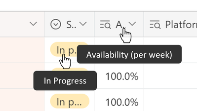
- Enable hovering context information for all text whether there is a Description in the Field or not.
- If there is a Field Description it would be displayed underneath the Field Name in the floating context window.
Proposed Idea B:
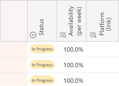
- Field Names can be rotated (similar to spreadsheets). Maybe 45 and 90 (as shown below)
- Field Names and all other text scales down to ~6 point before it begins truncating. Like the 'In Progress' text below
- Overall make the margins in all fields super tight.
- Field Row Height can be changed so the text wraps and stacks. (Not shown below but you get the idea)
...
How does is solve the user problems?
Keeps information readable when trying to conserve screen real-estate.
...
How was this validated?
Not validated yet.
...
Who is the target audience?
Creators who are trying to show as much information as possible on the screen while keeping information readable.
...
See more ideas labeled with:
6 Comments


