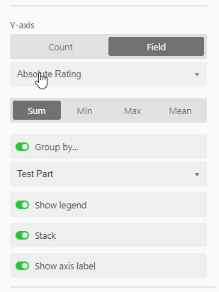
Hey all! I’m trying to find a way to change the colors of a bar graph. Is there a simple way to do this that I’m missing??
Use Case: I have a graph showing the number of students enrolled in a program each day of the week, grouped by gender (using a 2-gender structure). In every other gender comparison graph I’ve made, it’s defaulted to pink and blue for the colors, but this graph insists on being yellow and green.
Any ideas?


