Hi everyone,
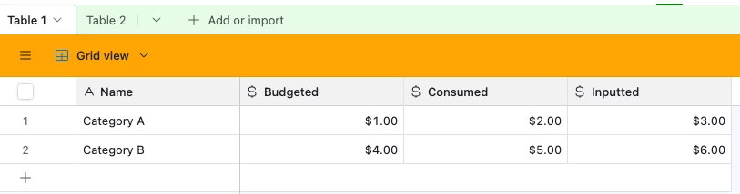
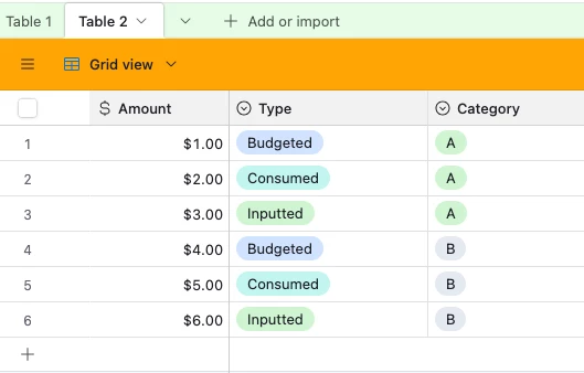
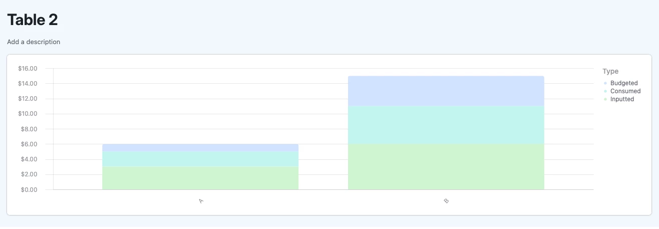
I’m trying to build a chart in Airtable Interfaces to compare three values for the same category:
-
Budgeted amount
-
Consumed amount
-
Imputed amount
Right now, in Interfaces I can only create basic charts (bar, line, pie, donut, scatter), but I haven’t found a way to display these three values together as grouped series in a single chart.
Ideally, I’d like to have something like a grouped bar chart or a pivot-style view, where for each budget item I can quickly see the three numbers side by side.
Is there any way to do this directly in Interfaces? Or maybe through a workaround (extensions, pivot table, or calculated fields) that can then be brought into the Interface view?
Thanks a lot for any tips or examples!