
Hi there,

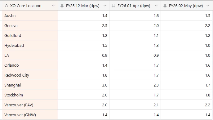
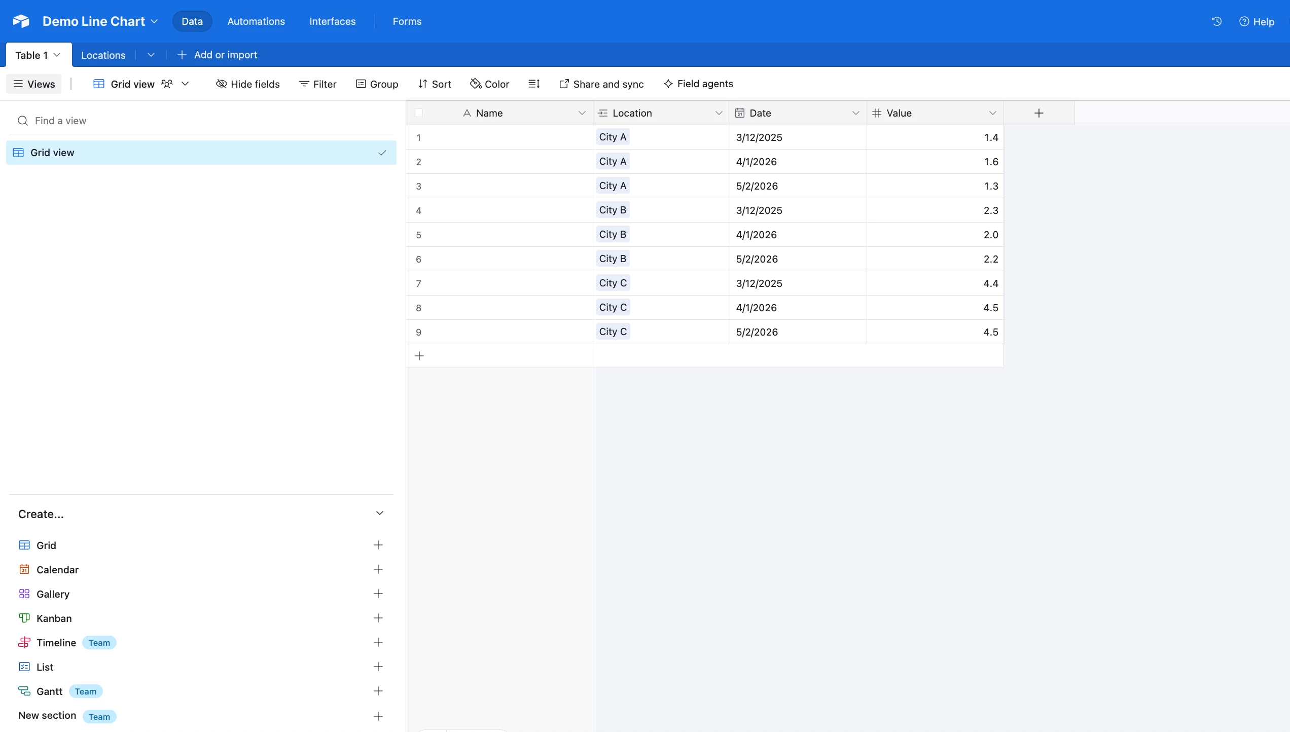
 If this is my data (which I think needs to be set up differently), on my interface I am using a blank canvas so I can use images and other information.  But how can I get this data to show as a line graph where the month is the X axis and the Y axis is the amount of days and each line would be the location? 


@ohoward 

You would need to “flatten” your data so that your X axis would pull from only one field (column) and your Y axis would pull from only one field (column).

So in your case, you need to add a brand new column for “month/year”, and instead of having one record for each city, you would have multiple records for each city.

So, for example, instead of having one record for Austin, you would have many different records for Austin — one record for each month/year.

Then, all of your number fields need to be reduced to simply one number field. So there would only be one number field per record.

Once you setup all of that, then your X axis can pull from your new “month/year” field, and your Y axis can pull from your one remaining “number” field.

Hope this helps!

If you have a budget and you’d like to hire the best Airtable consultant to help you with this or anything else that is Airtable-related, please feel free to contact me through my website: Airtable consultant — ScottWorld


Hey ​@ohoward,

For further reference, ​@ScottWorld is suggesting to build something like this (see screenshot below).


I’m not 100% sure how you are handling dates, but that should give you an idea. As you can see I have locations on it’s own table. I’ve linked locations to the “KPIs” table (Table 1), and I have multiple KPI records per Location.

Feel free to schedule a call if you need additional help!

Mike, Consultant @ Automatic Nation


Thank you that is exactly how I have it setup now and it has worked perfectly 


Reply