Double Click on Field Name - Restore Customize Field Functionality!
Hello Airtable, Please, please please reverse this change!
Double-clicking on the field name now only modifies the name of the field. It is a pain to have to right-click to access this menu. I don’t want to be overdramatic and claim this will totally ruin Airtable, but it’s much less efficient than the old method.
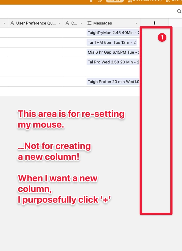
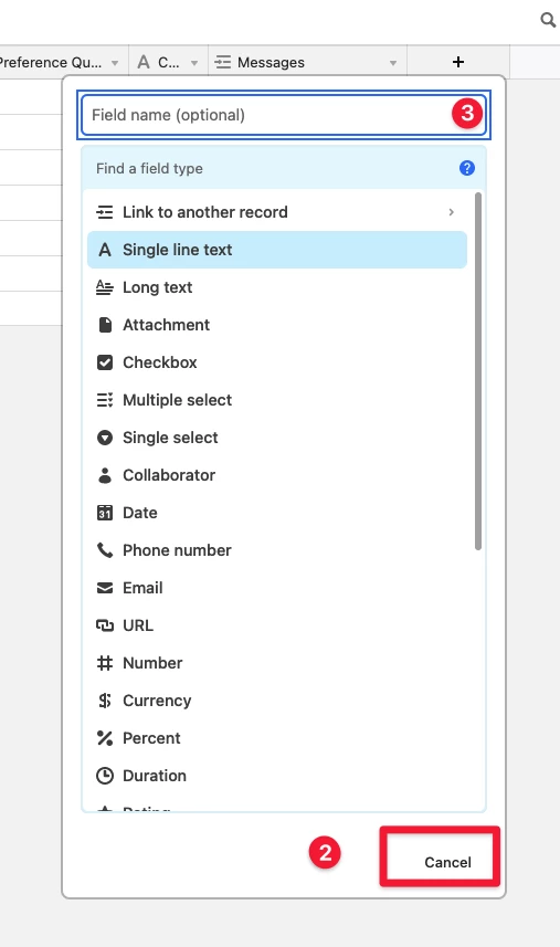
I also noticed that when creating a new field, the field type is now the first dialog. Then we are prompted to put in a name. This is fine and I can get used to the new workflow. I understand that this reduces the number of times I use “Tab” to move between dialog boxes.
I love Airtable and hope it continues to make progress! Just not the progress I don’t like
Page 5 / 5
4 months gone and Airtable is at it again. I have no idea why they keep messing with this - Of all the features of the app…This was maybe the lowest priority to be changed. (It didn’t need changed at all)
I have grown to really dislike Airtable’s cavalier approach to messing with process critical pieces of a user flow.
I’ve yet again been pushed a set up that, (yet again), tries to force me to choose field type upon creating a field.
I honestly only have rage in me right now, as I type - and rage + forums tends not to end well for anyone… But I do honestly hope the UX designer of this feature, packs in their experiments, changes field creation back to how it was in August 2020, and actually goes to work on something useful. Because this is infuriating!
Here’s what’s wrong with it… On the off chance that UX team is interested
This area is for re-setting my mouse. …Not for creating a new column! When I want a new column! , I purposefully click ‘+’
Why do I need to explain that this should be a “Create Field” button and not a cancel button. Why on earth are you making it more difficult for me to create a field? This is the most outrageous and arrogant UX decision I’ve ever encountered. I’ve just clicked create a field - AND YOU LITERALLY HIDE THE BUTTON THAT ALLOWS ME TO DO THAT!!! Is your assumption that I did this by accident? Are you that insecure about your UX that you assume I don’t just actually want to create a field
Why does “Enter” create a field here, but “Command + Enter” does nothing. Just using general UX conventions…“Command+Enter” should create the field, and “Enter” should take the user to the next stage in the menu (if Enter, really needs to do anything at all)
I’m so, sorry for the rage, but I am just so exhausted with this. I spend 80% of my day in Airtable, and as a hugfe champion of your software, I feel alienated and ignored while you experiment with the wrong things. There are a million things you can go tinker with…Stop messing with the one thing that did not need changed… Please
In software engineering, users should never be surprised unless it’s a magical feature that helps them do their work.
No user would ever expect …
… a grey area of a UI - seemingly without any UI controls - to magically transform on hover into a grid.
… a hover-induced display of cells to create a new field when any one of thousands of possible cells are clicked.
What were you guys thinking? And how did this escape into the wild?
The 2 things I posted above are just about causing me to pull my hair out in frustration.
I don’t think that Airtable realizes that we are their biggest cheerleaders, yet they are alienating us.
Hi everyone,
First and foremost, I’m sorry for the frustration that this is causing. It’s never our intention to roll out any functionality that would disrupt a workflow or cause frustration.
I’m going to work with our product team to understand more about what we were aiming to accomplish with this and communicate that back to everyone in this thread.
Thank you, @Jason! While you’re talking to the product team, can you please ask them about the “view name / hover menu” problem too?
This is causing me & my clients sooo much frustration — literally hundreds of times of frustration per day, because we are always switching views in Airtable, and now we can only approach the “view name” from underneath.
It has really made Airtable way less usable for us.
(I’ve been promising to post a video of this, and will do that tomorrow.)
@Justin_Barrett. Sorry if it was unclear - When I wrote that “I’m being forced to choose a field”, I’m not referring to the option to choose a field being there - I’m referring to the overt reconfiguration of the UI to make me have to commit to a field type before creating it before showing the “Create a field” button…So my intro rant was actually referring to point 2, if that makes sense.
I’m absolutely a big fan of having the option there as it always was, but what I was referring to was the fact that the “Create field” button is now missing, and I’m forced instead to actually choose a text field before I’m allowed to create (see point 2).
@Jason Thank you! I really appreciate that! It’s very frustrating
My 3 big user interface complaints right now are:
This new behavior (discussed in this thread) where fields always get created, even when you don’t want them to get created.
@Justin_Barrett. Sorry if it was unclear - When I wrote that “I’m being forced to choose a field”, I’m not referring to the option to choose a field being there - I’m referring to the overt reconfiguration of the UI to make me have to commit to a field type before creating it before showing the “Create a field” button…So my intro rant was actually referring to point 2, if that makes sense.
I’m absolutely a big fan of having the option there as it always was, but what I was referring to was the fact that the “Create field” button is now missing, and I’m forced instead to actually choose a text field before I’m allowed to create (see point 2).
@Jason Thank you! I really appreciate that! It’s very frustrating
Ah, now I get it. I thought you were referring to something else. Thanks for the clarification. Frankly, though, I never even noticed that “Create field” was there before and that it only recently became “Cancel” until a field type is chosen. Maybe that’s because I tend to use the keyboard to navigate that dialog instead of the mouse.
One pet peeve of mine about that dialog (which I haven’t yet reported) is that if my mouse happens to be over the field type list while I’m typing in the “Find a field type” area, the list will highlight the entry where my mouse sits instead of the one that best matches what I type.
The new “Create Field” dialog box works fine for me, but it’s the accidental click in the right margin thing which is a huge problem for me.
My clients are accidentally creating fields in their bases, because they’re accidentally clicking in the area to the right of the fields.
I was just talking to a client yesterday who couldn’t understand why all of these new fields had shown up on their grid view. And it was because they were simply clicking in the empty area to the right of the grid, and they kept creating new fields.
Airtable Team: I can guarantee you that users do not need to create new fields as often as you think they do. Please don’t allow us to accidentally click & suddenly create a new field. It’s really poor user design, and it shows a lack of understanding of how people move their mouse & how people click their mouse.
@andywingrave@ScottWorld @Bill.French I’ve shared your feedback on this with our product team, and also learned more about this feature.
Our team just completed testing this feature where people found it significantly easier to discover and add fields in Airtable (particularly among new and non-power users). For example, we found it took people fewer clicks to find the fields they needed and we’ve seen people use a greater diversity of field types compared to the previous version.
We recognize that people have different needs when using Airtable, and understand this is disruptive for power users who are most familiar with our current interface. I appreciate you sharing the feedback and for understanding how we’re trying to balance the different needs across customers.
We would like to understand more about the scenarios when you need to clear/deselect cell or expanded record. Could you share some more about when that action is needed? That would help us look more into other solutions (such as better keyboard shortcuts) to help with those scenarios.
I hope this provides a little more context around this feature!
Hi @Jason,
Thank you so much for your follow-up on this!
To reiterate my 4 points that I mentioned above:
Personally, I have absolutely ZERO PROBLEMS with the currently-revamped dialog box for creating new fields. The currently-revamped dialog box to create new fields works perfectly fine, it makes perfect sense, it is quick, logical, and easy. This revamped dialog box is no longer an issue for me nor my clients, and I sincerely hope that the Airtable engineers please stop messing with it from this point forward. Let’s please lock this in as a “finished feature”. I think it has reached 100% perfection. I pray that they please stop messing with this. It even works on an iPad mobile web browser, which is a miracle. So please, no more messing with this. I am truly begging them to please stop messing with this.
However, what I do have a major gigantic problem with is that the Airtable engineers decided to make the entire right margin of the entire screen clickable to create a new field. This is absolutely horrible interface design. It has caused my clients to continuously create new fields throughout the day, and everyone is completely overwhelmed with frustration by the sudden decision to take over the entire screen and make it the “clickable region” to create a new field. This really needs to be reverted as of yesterday — maybe 3 days ago. :winking_face:
Also, I have a major problem with the “View Name” hover menu not working under all circumstances. I created an entire video to showcase this problem here:
I also have a major problem with the column headers not allowing their height to be adjusted. My clients are forced to extend their columns super-wide, just to see the names of their fields.
Thanks again for your attention to all of this, Jason!
Best,
Scott
@andywingrave@ScottWorld @Bill.French I’ve shared your feedback on this with our product team, and also learned more about this feature.
Our team just completed testing this feature where people found it significantly easier to discover and add fields in Airtable (particularly among new and non-power users). For example, we found it took people fewer clicks to find the fields they needed and we’ve seen people use a greater diversity of field types compared to the previous version.
We recognize that people have different needs when using Airtable, and understand this is disruptive for power users who are most familiar with our current interface. I appreciate you sharing the feedback and for understanding how we’re trying to balance the different needs across customers.
We would like to understand more about the scenarios when you need to clear/deselect cell or expanded record. Could you share some more about when that action is needed? That would help us look more into other solutions (such as better keyboard shortcuts) to help with those scenarios.
I hope this provides a little more context around this feature!
Of course it is easier to create new fields this way. Just like it is easier to create a new row by clicking the entire bar under the last record.
But making design choices based on the easiest way to create fields/rows has serious flaws. It makes creating fields easier at the expense of using and maintaining the base. And users spend far more time using the base versus creating if.
If a user really wants a new field, he’ll find a way to make a new field. If a user keeps accidentally making fields, he’ll get frustrated because the system doesn’t make sense to him.
Making it too easy to create fields/rows is not just an issue for power users. It is also an issue for everyone else. At least a power user realizes what is going on and knows. A power user is also more likely to immediately delete accidentally created fields/records. Beginner and intermediate users are often afraid of deleting empty fields/records because they don’t know why they appeared. They just get confused why their bases are littered with all these empty fields and records.
Let me suggest a trade-off. Instead of actually creating a new field/record when a user clicks that big empty space, when a user hovers over that space show some suggestions on how to do what you think the user wants to do. For example, when the user hovers on the empty space at the right of all the fields, say something like “no more fields, to create a field click the plus sign above” with an arrow to the plus sign.
This reminds me of how MS word would start auto formatting as I type. At first it made it easier to get bullet and numbered lists. But then it started making bullet and numbered lists in ways that I didn’t want and got really frustrating. Fortunately, I was able to find a setting to adjust what auto formatting I wanted versus what auto formatting I did not want.
Also, I also like having the empty space to unselect things. Here are my most common reasons
I want to look at the data without the visual distraction of a highlighted cell.
I want to ensure that if I start typing, I won’t accidentally change a field value if I loose track of which window is active.
All your other words are great, but this the only reason any designer needs to understand that it would be foolish to do what they did. Why this wasn’t obvious to the team is a mystery.
And, building upon that & focusing on the “View menu“ problem, I’d love for someone to tell me why this terrible decision WAS obvious to the team. Look at this message an Airtable engineer sent me in December 2020:
All your other words are great, but this the only reason any designer needs to understand that it would be foolish to do what they did. Why this wasn’t obvious to the team is a mystery.
100% - It’s maddening! I’m afraid to move my mouse in Airtable. Can we please revert?
This is a known but increasingly common and debilitating condition representing a combination of metathesiophobia (fear of change) combined with agrophobia (fear of open space) that forms a new collection of computing maladies -
agrometafieldphoria - an abrupt anxiety often accompanied by sweaty hands and occasional hyperventilation when moving a pointing device over areas of a UI that are seemingly void of underlying controls. This condition is related to acute cases of cleithrofieldphobia.
cleithrofieldphobia - anxiety induced when clicking on UI controls that exhibit completely unexpected outcomes which often leads to user inaction at worst, and at best, entire and unexpected changes to database schemas.
Haha! These sound like real conditions! Hahaha. I’ve never had them before using Airtable, but now I have them every day. Using Airtable is a maddening experience.
@Bill.French Absolutely spot on. :grinning_face_with_sweat:
Would love someone to chime in and comment on it though…Maybe they had analytics tracking on the space, and though “people are clicking here - maybe they are expecting something to happen” which resulted in this absolute monstrosity of a UI addition.
People were clicking there, because it was the one place you could click that didn’t do anything, and allowed us to re-set the mouse …Now everything, everywhere does something, and the one place we could neutral click does pretty much the one thing nobody wants to do by accident… create a flippin’ field! :hot_face:
We’re now going on weeks of complaints about this disaster, and of course, it’s still in the product. Nothing has improved at all.
Welcome to the wonderful world of Airtable, where users are consistently shunned & ignored.
p.s. @Jason, the frustration is still sky-high for this massive problem.
@Jason, can you please confirm that the Airtable team is aware that their users DO NOT want to be creating new fields all day long when using an Airtable system? In fact, once the fields are created in a system, it is very rare that new fields need to be created. But now, people are accidentally creating new fields all day long. The fact that the Airtable team is not aware of this seems to indicate to me that they are extremely out of touch with their users.
@ScottWorld I can’t say if this particular behavior will be changed or not, but I have shared all of the feedback here with our product team.