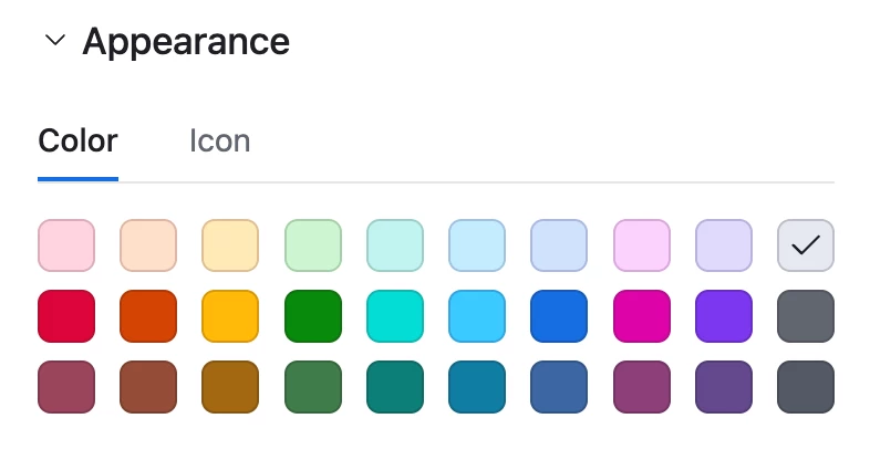
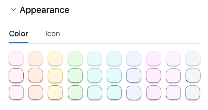
Regarding the new UI changes, I really dont care very much about new buttons disposition, but changes in appearence colouring have been a downgrade in my PoV.
The new Light appearance is extremely Light, and the Beta Dark mode, in my POV, is currently not good enough (contrasts, especially with coloured dropdowns are not good yet).
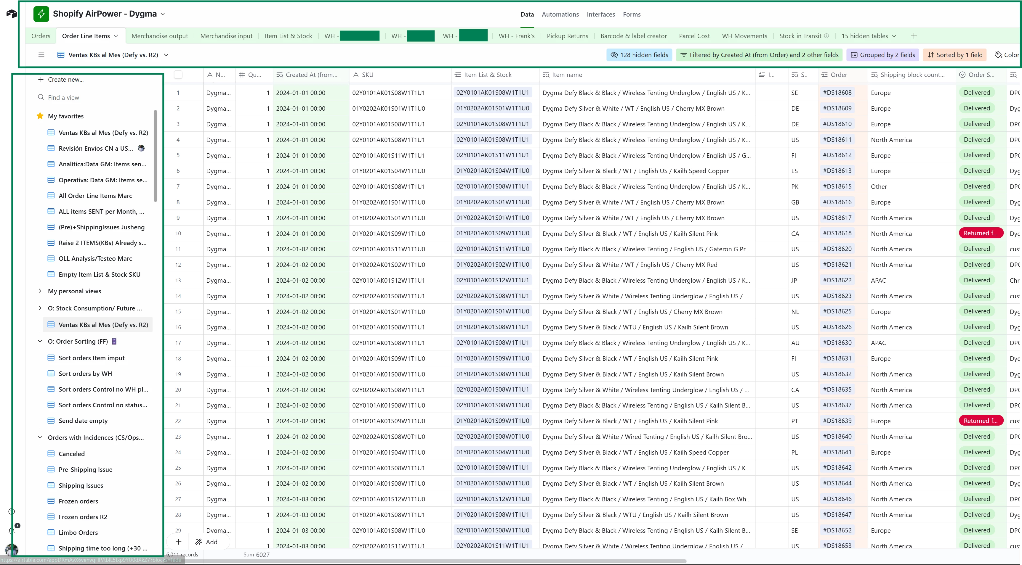
Boxes marked in green used to be filled in predetermined color (in my case, green), but now it has been changed all to white.
Couldn’t find a way to change that with the current UI changes.
If someone knows how to, please let me know.
Thanks!
Page 2 / 2
I agree completely with all of you! Submitted some feedback too—I felt like I couldn’t get my head around how much greyer everything was without seeing it so I pulled the new background color hex codes and superimposed them over the old pallette and I feel like it speaks for itself. The contrast is nonexistent and the options are all literally just slightly hued shades of grey. They took away all of the color, and the blues are especially changed. EW!
It’s wild to me that Airtable would make a huge move towards making their product look more like Google Sheets / Excel. Every single person in our office hates the new color (or lack thereof) scheme.
People like colors. Contrast. Dark mode.
Thanks for sharing @Valerie_Chamber!
I did not get a part about AI, for AI is not important UI/CSS as it works with API, for humans it is important and why our needs mean less then AI needs, what kind of AI revolution is it? :)))))
The new design makes difficult to work with several databases. Many bases have the same tables, some of bases can be production, some develop or test and it was so convenient to understand where are you now just by colour.
As a workaround, some web browser extension can be used which allows to redesign CSS styles, though think about the privacy concerns first.
I received the same verbatim response listed previously in this thread. Listed my RE to their canned response. Feel free to use as a basis for keeping this topic relevant with AT:
Hi Magi, thanks for taking the time to respond — I really do appreciate the insight into the rationale behind these changes.
That said, I have to be blunt: this update is deeply disappointing. Airtable’s greatest strength has always been its clarity, simplicity, and visual organization — not just its raw functionality. Stripping out the base colors from the data layer seriously undermines one of the most useful tools for fast, intuitive navigation, especially for power users managing multiple open bases.
Yes, AI features are exciting and I understand the drive to modernize the UI — but that should never come at the expense of usability. Visual cues like color aren’t cosmetic fluff; they’re functional tools that reduce cognitive load, prevent errors, and improve speed. Replacing rich, differentiated colors with subtle pastels and faint accents feels like a major UX regression.
This may seem like a small design choice on your end, but it’s having a disproportionately large impact on workflows. I’m willing to bet many teams are going to start feeling that pain soon — if they haven’t already.
I strongly urge the team to reconsider making base color customization a user-controlled setting. That would satisfy both camps: those who want the clean AI-first layout and those who need visual clarity to work effectively.
Please raise this as critical feedback. This isn’t about being slow to adapt — it’s about removing something that worked really, really well.
Thanks again for listening.
So, I contacted Support regarding the Interfaces opening directly in Editor mode when navigating from the Data Layer, Automations or Forms if Users have Creator access or higher. We have Creators that are not versed in editing Interfaces as they would only ever need to make some minor tweaks on the Data Layer, hence the issue!
Airtable’s response (which feels like an AI response TBH) is detailed below:
Hi Daniel,
Monica here from Airtable👋 Thanks for writing in - Happy to help you with this!
As of recent Airtable updates, the Interface tab now opens Interfaces in Editor mode by default for users with Creator-level access or higher, which is indeed a shift from the prior behavior where Interfaces would open in User (view-only) mode unless explicitly edited.
Here’s a breakdown of what’s going on and what options you have:
Why It Opens in Editor Mode Now
New UI behavior: Airtable seems to have updated the Interface experience so that anyone with edit permissions (Creators, Interface Designers) lands directly in Editor mode when opening an Interface.
This change likely aligns with their goal to make editing more seamless for those expected to maintain interfaces — but it doesn’t always reflect real-world use cases where Creators should not necessarily be modifying Interfaces.
Why This Matters for Your Team
Creator-level users often need access to make minor schema changes in the Data Layer (Base) but shouldn’t be editing Interfaces — especially if they’re not trained to do so.
No toggle exists currently (as of July 2025) to force open in “User mode” for Creators.
This may introduce accidental edits, interface confusion, or even layout breakage.
Workarounds & Recommendations
1. Limit Access to the Interface
If a Creator doesn't need to access Interfaces at all, you could:
Restrict them to the base only, or
Create a duplicate Interface that’s intended solely for editing (used only by Interface Designers/Admins).
2. Educate on How to Exit Editor Mode
Let Creators know that once they land in Editor Mode, they can click “Preview” (top right) to view the Interface as a user.
It's also helpful to train them not to hit “Publish” unless they are certain of their changes.
3. Use the Interface Sharing Link
If the goal is to have Creators only use the interface:
Share the Interface’s public/shared URL (in User Mode).
This bypasses the workspace’s UI and loads the Interface as a view-only experience — assuming the permission model fits your setup.
4. File Feedback with Airtable Support
Many teams are flagging this change. Submitting feedback through the “Help” menu or via the Airtable Community Forum can help escalate the issue and push for a toggle or role-specific behavior.
Best, Monica
Just a F@ScottWorld @Mike_AutomaticN @Valerie_Chamber as well.
Am I crazy to feel insulted by that response, which is obviously AI generated?
You reached out to Airtable Support and your response discusses Airtable in the 3rd person. Like shoot guys, at least have the AI chatbot act like it’s an Airtable employee. You don’t even have the AI chat parameters dialed in, and this is supposed to be an AI first company now?
LOL, yeh exactly @DisraeliGears01
I did respond to that email not long ago and got the following response from ‘Monica’:
Hi Daniel,
Thanks for reaching out and taking the time to share your honest feedback about the recent UI changes in Airtable. We know that changes, particularly the reduced color and relocated functional actions, can take some time to get used to. Please know that we truly value your input, and are actively listening to what our users are experiencing.
These changes are part of our recent AI-focused update, designed to create a more streamlined and intuitive experience that better supports AI-driven building and data analysis. This refresh is guided by a few core design principles:
As our newest and most powerful offering, we aimed to make the Omni functionality and AI panel the most prominent feature, positioning it on the left side of the UI to emphasize its role as the primary interaction model.
The overall base structure has been designed for a cleaner aesthetic, aiming for a less cluttered environment, especially when paired with the latest grid view redesign. This minimalist approach led to reducing the prominence of the base color in the data layer, though it remains in key areas like the base icon, share menu, and a colored bar indicating your current surface. You'll also see a pastel version highlighting tables within the data layer.
We've worked to make sidebars and sub-navigations more consistent across Data, Automations, Interfaces, and Forms tabs for a more unified feel and to make navigation easier across all surfaces of the platform.
While we believe these changes will ultimately enhance the user experience by making Airtable more powerful and efficient with AI, we understand that adapting to new layouts can take time. Your feedback is crucial in helping us understand how these changes are impacting your workflow, and it helps us continue to refine and improve Airtable for everyone. I have passed your feedback to our Product team, including the context of your frustrations you shared.
If you have additional specific examples of where the changes are causing significant friction, please don't hesitate to share them. We're here to help you navigate this transition and ensure you can continue to get the most out of Airtable.
Thank you again for taking the time to share your feedback—it truly helps us continue to improve the Airtable experience for everyone.
Best, Monica
🤔
That sounds quite a lot (read word for word exactly) like “Bridgitt”s response to an earlier response posted to this thread.
Like, I suppose I prefer a canned response to an AI response, because somebody at one point had to come up with that canned response, rather than just feed it into ChatGPT.
Double posting intentionally here because I want to be real (dunno if that’s on brand here).
Hey @MaddieJ does Airtable actually give a fig about customer feedback on the universally derided UI changes? You can’t change AI brained execs, but funneling user feedback into AI garbage signals that the company doesn’t actually care about user experience. Some of the other power users here make their living on this, but I technically don’t so I don’t care about calling this garbage out.
“It ain’t broke; don’t fix it for me.” That is the most frustrating aspect of this platform for me - it does feel like they won’t work with us on making their product work for us and don’t care. They make changes to layout appearance and functionality - at times breaking my interfaces with those changes. I never get any warning. I just log in one day and poof! Something’s broken or doesn’t look right anymore. I spent hours of time outside of my main position, learning the platform (as a person who only has had experience with spreadsheets), building up bases and syncing them together, creating interfaces for our team to make it easy to use, and it’s so frustrating when that work changes or disappears. It also creates more work for me in the long run, making us less efficient as a whole. Our team needs the interface layouts, and only admins get into the base data, to add a layer of protection. So yes, I have given my team the direct links, it’s what we’ve been using all along, but sometimes we’ll click a link from somewhere else and it will take us into the base, and the base is no longer hidden as neatly as it used to be for those who are trying to limit base access. Anyway, I feel like we no longer have control over what we built and use every day, and it’s concerning. I no longer trust the platform. I mean, we do have backups but I still have a general unease about using it now, and my colleagues are getting frustrated or confused when their interfaces change or appear different, too, so we feel it throughout our team.
The blank approach makes the data blend into the background too much. It provides an unprofessional visual presentation, almost as though the website is broken and still loading.
Sad to say that this UI update makes GSheets look better, which is a hard pill to swallow. Yes, interface can be a good alternative, but the data tables is where most of our team operates and doesn’t have to continue to be edited like the interfaces when something needs to be added or moved.
Time Machine, bring back the color schemes and design prior to this update!
Hi all, I'm Amanda, and I lead Global Support here at Airtable. I really appreciate you taking the time to speak so openly about your experience. I know how frustrating it can be when changes, especially to something as central as the UI, feel disorienting or disconnected from your needs.
To address one of the concerns directly: no, the responses you've received weren't written by AI. They were written by real humans on our team, intentionally crafted as templates to help our support folks respond consistently to some of the more common feedback themes we're hearing right now, including the shift in Interface editing behavior and the color palette changes.
That said, I understand why the replies might have felt automated or impersonal. And if the response you received didn't feel like it fully acknowledged your specific concern, that's on us. It's a good reminder that even with a template, every message still needs the human touch. We're going to keep pushing on that balance. Where we are using AI within Support is to help us sort through the post-launch feedback we're receiving and identify patterns we need to escalate to our product and engineering partners.
I also want to acknowledge how frustrating it is to feel like the product is changing around you without enough visibility or control.. That sentiment has come through clearly, and it's something we're actively surfacing internally as we think about how to better communicate, coordinate, and design with customers in mind. From a color palette perspective specifically, the relevant teams are exploring ways to improve visibility and usability while staying aligned with the overall design direction.
Thank you again for the feedback, and for giving the Support team the chance to respond in a more thoughtful and personalized way moving forward.
I agree with the feedback here.
This is a productivity application, and form needs to follow function.
I think that if Airtable did some UX testing, they would find the new design slows users down.
The previous design allowed me to look at the data table and instantly know where to look and click. This is especially important when you are working with multiple applications and windows.
I’m sorry @amanda.harris , but that first response by ‘Monica' was AI generated or someone on your team should be fired for writing their template with AI. If it was written by real humans on a team at Airtable why does it discuss Airtable in the 3rd person?
I appreciate Support engaging on her occasionally, but lying to us that certain support responses aren’t AI generated doesn’t engender trust or goodwill with the community, and I would hope that the lead global support person at Airtable would understand that.
Hi @DisraeliGears01 , thanks for sharing. We're certainly not trying to be unclear or evasive about our use of AI — we use it in a number of places across Support, including triage and routing, our chatbot powered by Forethought, and internal agent assist tooling. Our templates come from real people — they're reviewed and managed by our team, not auto-generated or dropped into replies by AI. That said, what matters most here is that the response left folks feeling unheard and unseen. We'll be better.
I only recently joined the community here, but I'm eager to contribute meaningfully. Please feel free to tag me in where I can be most helpful!
I mean, I’m going to keep coming back to this because you are being unclear or evasive because the first response Cool_Kiwi received from support was written by an AI chatbot. Like, just admit that because it so obviously the case.
A person at Airtable, writing a template, would not say “This change likely aligns with their goal to make editing more seamless for those expected to maintain interfaces”. They would say “This change aligns with our goal of making editing more seamless...” To provide just one textual example (aside from formatting and many others).
You can be better by being honest with the community and not telling us the sky is green or the grass is blue.
@DisraeliGears01 You're right - my apologies. I didn’t fully read the first message and was focused on the second one that had been posted in the thread. Looking now, it does appear that AI was used in crafting that initial response, and I should have caught that before weighing in. I’ll be following up with the team member directly to get clarity and make sure we’re aligned internally on how and when AI tools are used in Support responses.
Rather than keep going back and forth here, I’ll also reach out via email so we can close the loop more directly. Thanks again for flagging - I appreciate it.
@amanda.harris wrote:
From a color palette perspective specifically, the relevant teams are exploring ways to improve visibility and usability while staying aligned with the overall design direction.
Thank you, @amanda.harris and team for hearing this feedback and letting us know it is being addressed internally. I know it is difficult to distinguish between the (sometimes hyperbolic) complaints that happen whenever any notable change is made and the constructive feedback that helps make the product better.
There’s been a consistent thread that deemphasizing color in the UI has made it harder for users to easily distinguish between bases. I think this is distinct from the discomfort of building new muscle memory because of layout changes because it makes it harder to find essential information for everyday use. I share this concern, especially since my team color codes bases by area of work.
For example, finding the right base in a thumbnail (alt tab, via the task bar, in a browser, etc) is effectively impossible without slowing down to read the names.
Beyond that simple usability concern, a white/un-colored header is also confusing because of how it appears to change the information hierarchy. I appreciate moving account-level surfaces to the sidebar -- that makes lots of sense to me. (And I imagine shifting the filter tools to the right helps reduce the number of UI elements in an otherwise crowded space.) But making the header, sidebar, views list, and grid all white works against the goal of distinguishing between app-scope and account-scope UI. It puts the header and the sidebar on the same “level,” and it’s less clear than it would be if there was a visual/color distinction between the two. The tiny keylines between these importantly-different sections are also very low contrast, so I have to look much more closely/carefully to understand how the various parts of the UI are intended to relate to eachother. Heck, I bet that some people on badly calibrated screens (or over 50!) care barely see those lines.
As we discuss the color palette changes, let’s also not lose sight of the fact that the sidebar on the left of the data view that can no longer be collapsed is a complete waste of space and exists only to shove the LLM button in our faces. There are a dozen other places you could put the LLM button without dedicating an entire sidebar to it.
The idea that the LLM is the “primary interaction model” is pretty laughable if you’ve ever tried to use it. I gave it a try, attempting to do the basic tasks of my workflow, and it could not handle even the simplest questions I had for it. All it can do is count up things that have tags on them.
The removal of the colored header for BASE completely shocked me. It was such a unique element on a large monitor when having multiple open sessions, and the base was a crucial navigation aid. What’s strange is that in the mobile app, the original coloring is still there, and also in tables shared via HTTP links, the original coloring remains.
For now, I’m replacing the missing colors in the base by using basic emojis in the BASE names, which helps quite a bit—see my screenshots for inspiration, maybe it’ll help someone else too.