We’re excited to share that we’ll be taking our first step in rolling out the brand new home screen experience into General Availability. Thanks to your feedback, we were able to make significant improvements to the experience that will make it easier to navigate and discover the apps that matter most to you.
Benefits of the new home screen:
- A visual refresh that focuses on increased scannability and legibility on the home screen
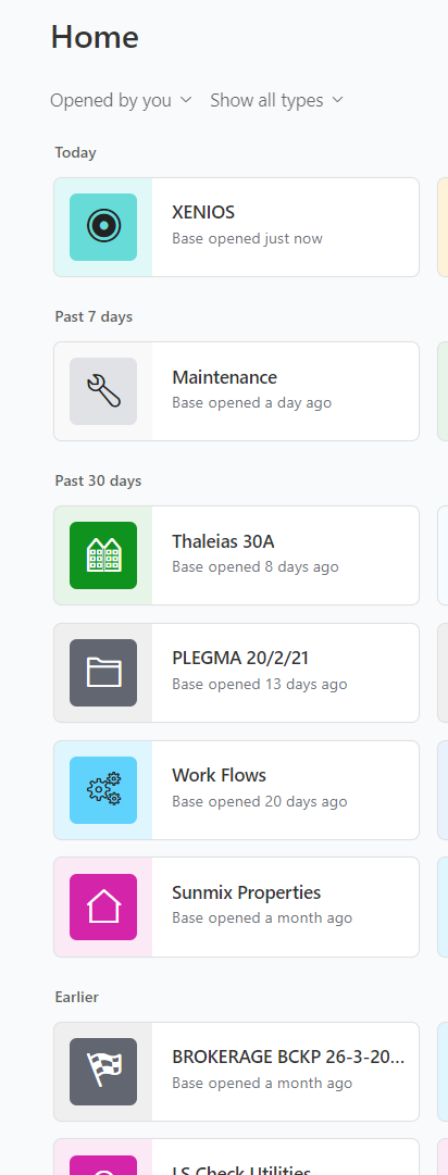
- A focus on apps that you engage with most frequently, by promoting recently accessed apps to the top of your home screen
- The ability to star workspaces, bases, and interfaces to make them easily accessible
- A more prominent search that aggregates all content, including workspaces, bases, and interfaces
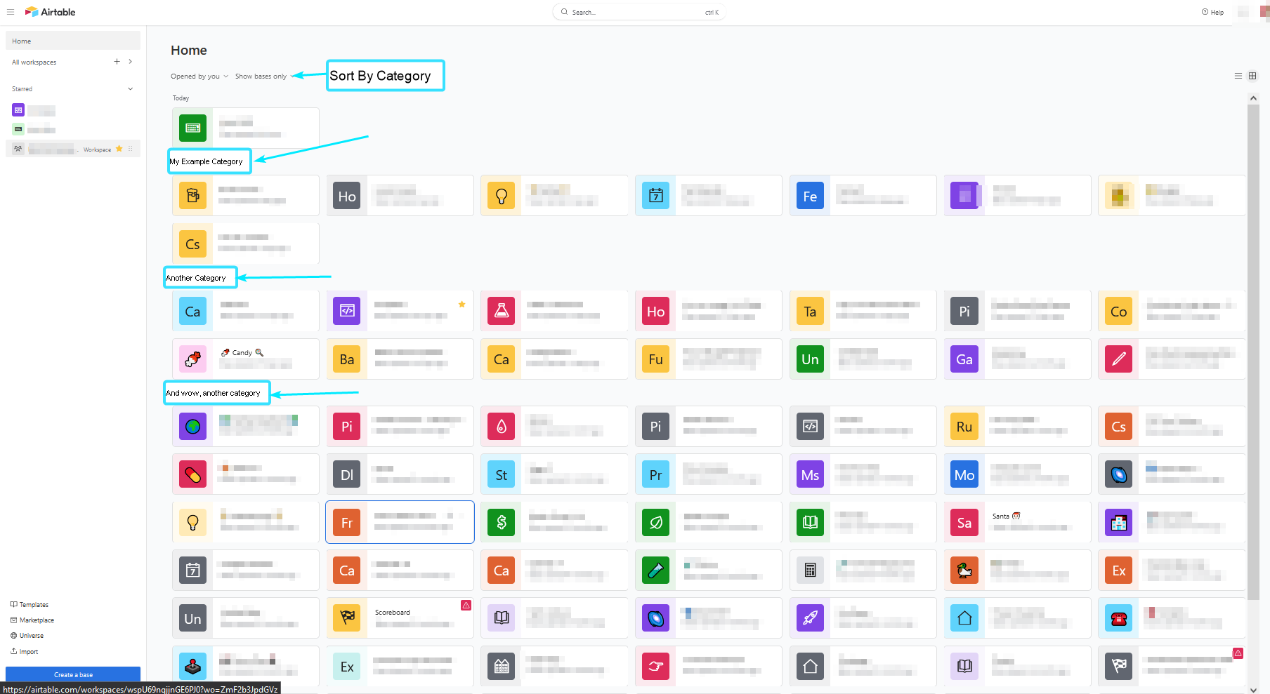
- Additional filters and sorts on the home screen, including shared with you, interface-only, and base-only filters
- A dedicated page for every workspace that enables users to pin the most critical apps for quick and easy access
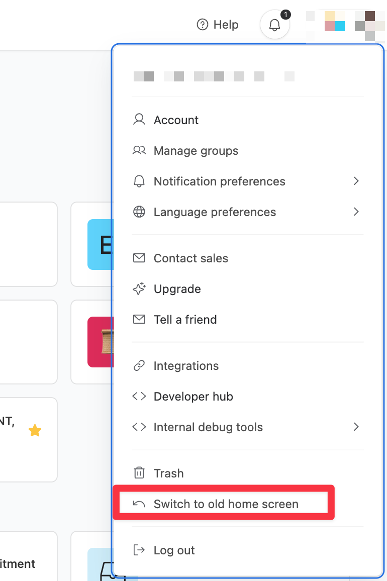
Starting March 21st, we will automatically enable the new home screen experience for all users. We will continue to allow users to revert to the old experience until late April.
While we hope these improvements will make your experience with our home screen more useful and enjoyable, we know that change is never easy. Our team is here to support you as we make this transition. As you get started, please feel free to reach out to your account team with any questions or concerns.