Hi,
I’m quite new to Airtable, and used to use Excel.
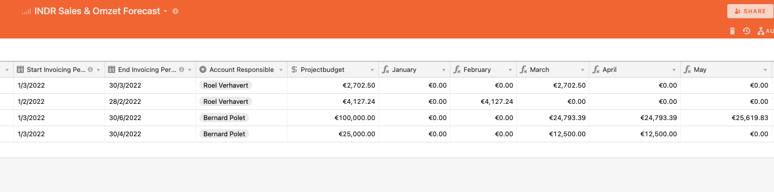
For my company, I would like to create a Sales/revenue dashboard, to visualize when our revenue will be realised. I created a table where I distribute the total project value over the coming months, based on a start date and an end date. I have a column with the total project amount (e.g. 100.000€), and then 12 columns, one for each month. I figured out a way to distribute the 100.000€ over the different columns, using formulas: so far so good.
Now, I would like to have a report with a bar-chart or a line-chart, showing the total revenue expected through the months January-December (in excel, rather easy).
I really don’t know how to obtain this, and now I’m thinking this might have something to do with the setup op my table/base.
Would be fantastic if anyone could help.
Steven