Help

Re: Please, please tell me the home screen won't be updated like the free account

4013 1
cancel
Showing results for 
Search instead for 
Did you mean: 
Jessica_Swingle
5 - Automation Enthusiast

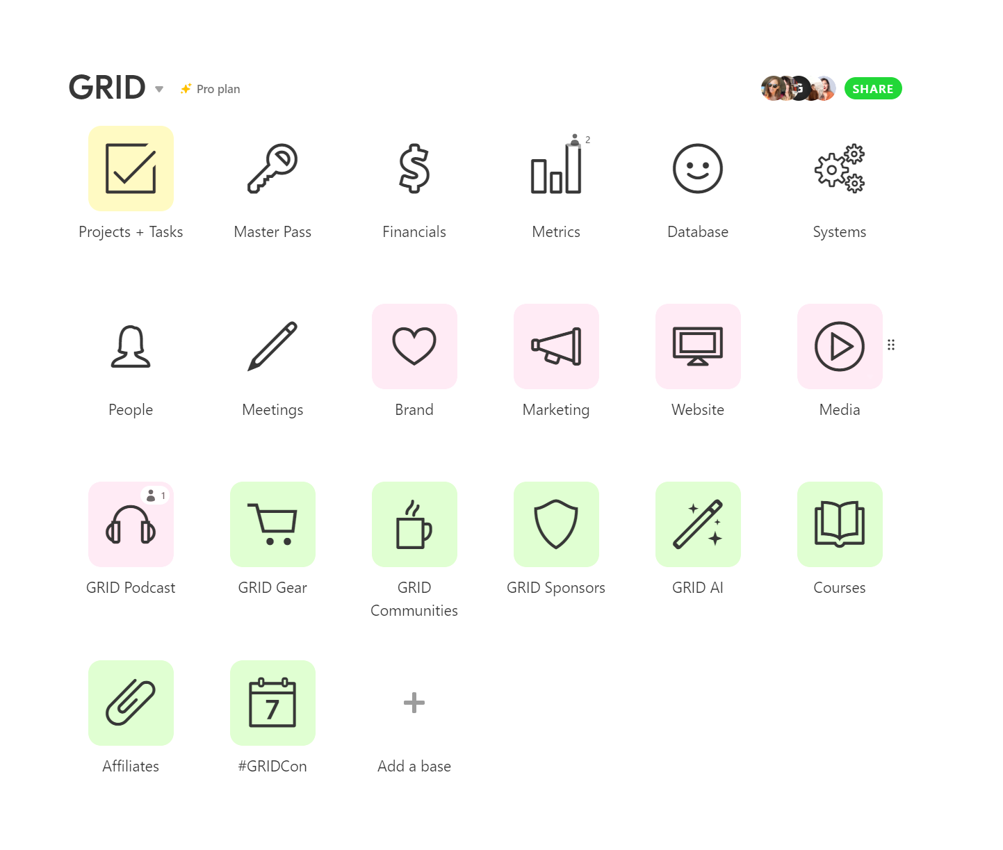
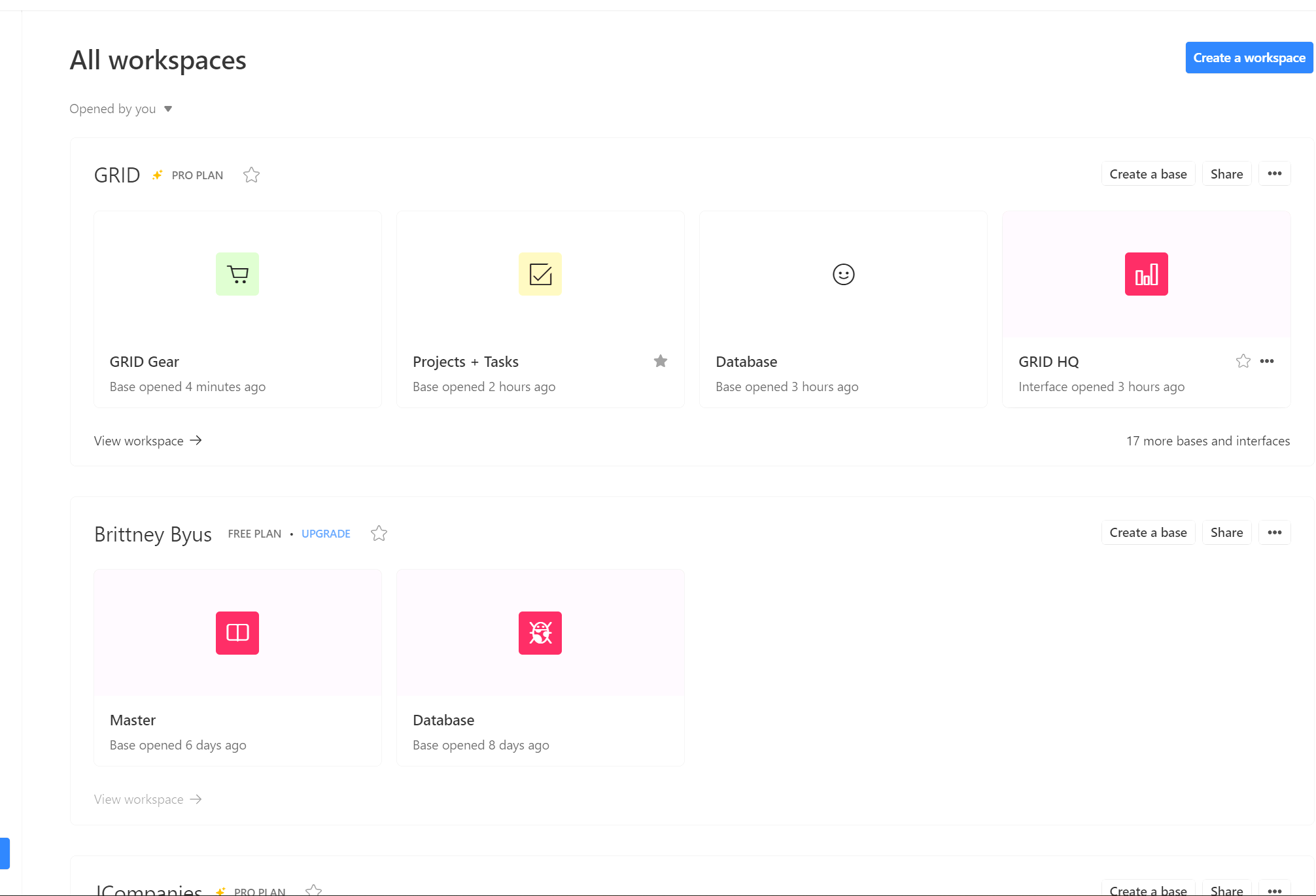
My sister is on a free account and she noticed her home screen changed. Please, please tell me this isn’t going to happon the Pro account. It’s so much less user-friendly. The icons are micro sized (which wastes a massive amount of space) and the icons don’t move in the order you want them (has to be alphebetically, etc).

I absolutely LOVE Airtable and it makes work so much better but this is not an improvement.

Can someone let me know if this is happening across all accounts?

Thank you!!
2022-10-25_16-03-30

26 Replies 26
Alasdair_Crawfo
4 - Data Explorer
4 - Data Explorer

Also not a fan of this new home screen. Horrible use of space and no way to save preferences to get it back to something manageable - e.g. Maybe if it saved things like ‘Show Bases only’ etc. I could deal with it, but right now it’s just terrible :frowning:

Mine hasn’t changed yet but I’m dreading the dayyyyy. Why is there so much wasted space? I just wish I could understand the logic behind it, but I’m dumbfounded.

Nooooooo! I’m speaking up too. Just sent an email about my frustrations. Hoping this madness stops!

BOA_VIDA
4 - Data Explorer
4 - Data Explorer

Wow logging in since the change was just a rude awakening. I truly hope it goes back to how it was!

Jenn_Stamps
5 - Automation Enthusiast

Hello Team Airtable,

First I’d like to say, I love Airtable and find it very useful for so many things to organize data for the many documentary film projects I’ve worked on over the years, as well as many other types of bases that I need to my various jobs and personal life.

With that said, WHY would you change the Home dashboard to this new design? It’s horrendous and more like google drive, which I hate!

The large thumbnail grid icons take up so much space and tell you nothing. No longer can I put my workspaces and their related bases in MY preferred order and move them around as needed when the projects enter different phases/completion. This new design leads to extra clicks and more scrolling, which is NOT an improvement in efficiency. Bring back my home dashboard/switchboard!

Sorry to crap on your new design, but it’s really frustrating and not good. Hope you are able to make changes that integrate the previous design or just change it back! I don’t need another “cloud” type space with a pile of stuff that’s endless like Google drive/Dropbox, etc.

All best,

Jenn

I sooo agree! This is why I moved AWAY from Google Drive - the clicking and complexity. It looks clean but from an efficiency standpoint, it’s not as quick as Airtable. I found the AT dashboard and thought “genius!” But now…

I just hope they let us keep the old design if we want it. Not being able to order the bases in preferred order is KILLER.

Jessica_Swingle
5 - Automation Enthusiast

@Brittney_Byus1 - why don’t you share with this group Mario’s response to your support@airtable.com message? I think the follks in this group would be intersted to see their response.

I come from the old Microsoft Access days and then FileMaker Pro, so I love a good dashboard/switchboard to manage bases. The old layout definitely gave me something closer to that and loved that is was malleable to my needs. Google drive isn’t a database, it’s a cloud space, so not sure why they would make a drastic change that’s more like a cloud storage space. And many times I find “clean design” not distinct enough to help the eye navigate. Too clean/sterile becomes invisible in my opinion.

Jessica_Swingle
5 - Automation Enthusiast

Has everyone’s dashboard changed? Mine hasn’t yet (I work with @Brittney_Byus1 and hers did weeks ago). I’m having major anxiety over this lol.

Airtable typically rolls out controversial & negative changes like this in stages to gauge people’s reactions. They only reverse their poor decisions if enough people write them angry emails in a very short amount of time. If they don’t receive enough of a negative pushback from their paying customers, then they move forward with the change for everyone, and they never look back.