I completely agree, this does not feel like an improvement at all. I have the free version and this new update has slowed down my workflow immensely. The interface is not user friendly. Please, AT—we love you—let us switch it back! SOS. :pleading_face:
As an enterprise user, I can confirm that my home screen looks like that now 
As an enterprise user, I can confirm that my home screen looks like that now
Oooo no. This simply can’t be! 
As an enterprise user, I can confirm that my home screen looks like that now
This is SO much cleaner and easier to navigate. I just don’t understand.
Personally, I feel that the new home screen is terrible. You can try to get @Jordan_Scott1 involved or try to get support@airtable.com involved, but they often make decisions like this that affect us negatively.
Oh no!
I still have the old view for now and I’m dreading this change!
I currently have access to nearly 4 dozen bases across 5 workspaces and I used upwards of 20 of them on a regular basis.
The current (old?) homepage is highly functional and efficient. This change will only make my life worse. Please say it ain’t so!
It’s coming to all workspaces very soon… within days. Be sure to speak up about this, but as we all know too well from previous experiences, Airtable rarely (if ever) listens to its paying customers. And it doesn’t seem like they have ever used their own product, either.
Oh no!
I still have the old view for now and I’m dreading this change!
I currently have access to nearly 4 dozen bases across 5 workspaces and I used upwards of 20 of them on a regular basis.
The current (old?) homepage is highly functional and efficient. This change will only make my life worse. Please say it ain’t so!
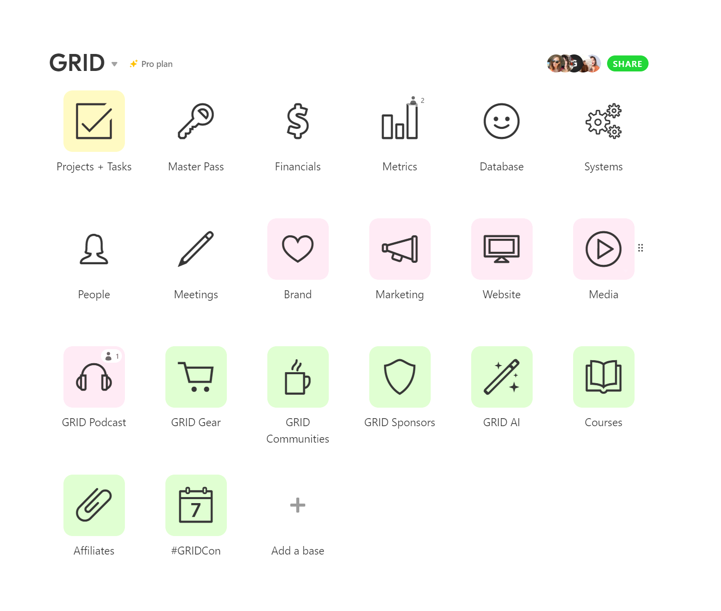
Me too! I can move SO quickly across different workspaces and bases - and isn’t that the point? I’m cool with the left side, index-style drop down, but there is no way anyone thinks the smaller icons and wasted space is a good idea. I don’t understand…!
It’s coming to all workspaces very soon… within days. Be sure to speak up about this, but as we all know too well from previous experiences, Airtable rarely (if ever) listens to its paying customers. And it doesn’t seem like they have ever used their own product, either.
This is my first experience with a major change disrupting my workflow. I refer everyone I know into Airtable - peers, clients, everyone. I’m an entreprenuer focused on ops and systems, and for that, Airtable is gold. I recently moved all my data from Google Docs, Evernote, and Nuclino into AT over 3 companies. So I guess what I’m saying is…I’m begging for this to be optimized and not a step back in functionality! 
Also not a fan of this new home screen. Horrible use of space and no way to save preferences to get it back to something manageable - e.g. Maybe if it saved things like ‘Show Bases only’ etc. I could deal with it, but right now it’s just terrible 
Also not a fan of this new home screen. Horrible use of space and no way to save preferences to get it back to something manageable - e.g. Maybe if it saved things like ‘Show Bases only’ etc. I could deal with it, but right now it’s just terrible
Mine hasn’t changed yet but I’m dreading the dayyyyy. Why is there so much wasted space? I just wish I could understand the logic behind it, but I’m dumbfounded.
It’s coming to all workspaces very soon… within days. Be sure to speak up about this, but as we all know too well from previous experiences, Airtable rarely (if ever) listens to its paying customers. And it doesn’t seem like they have ever used their own product, either.
Nooooooo! I’m speaking up too. Just sent an email about my frustrations. Hoping this madness stops!
Wow logging in since the change was just a rude awakening. I truly hope it goes back to how it was!
Hello Team Airtable,
First I’d like to say, I love Airtable and find it very useful for so many things to organize data for the many documentary film projects I’ve worked on over the years, as well as many other types of bases that I need to my various jobs and personal life.
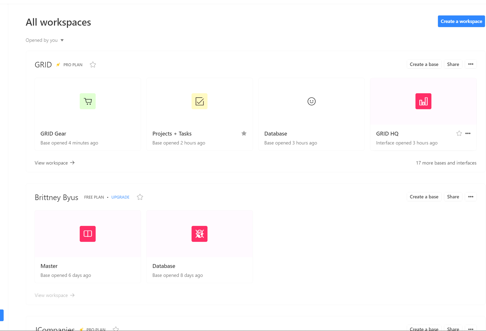
With that said, WHY would you change the Home dashboard to this new design? It’s horrendous and more like google drive, which I hate!
The large thumbnail grid icons take up so much space and tell you nothing. No longer can I put my workspaces and their related bases in MY preferred order and move them around as needed when the projects enter different phases/completion. This new design leads to extra clicks and more scrolling, which is NOT an improvement in efficiency. Bring back my home dashboard/switchboard!
Sorry to crap on your new design, but it’s really frustrating and not good. Hope you are able to make changes that integrate the previous design or just change it back! I don’t need another “cloud” type space with a pile of stuff that’s endless like Google drive/Dropbox, etc.
All best,
Jenn
Hello Team Airtable,
First I’d like to say, I love Airtable and find it very useful for so many things to organize data for the many documentary film projects I’ve worked on over the years, as well as many other types of bases that I need to my various jobs and personal life.
With that said, WHY would you change the Home dashboard to this new design? It’s horrendous and more like google drive, which I hate!
The large thumbnail grid icons take up so much space and tell you nothing. No longer can I put my workspaces and their related bases in MY preferred order and move them around as needed when the projects enter different phases/completion. This new design leads to extra clicks and more scrolling, which is NOT an improvement in efficiency. Bring back my home dashboard/switchboard!
Sorry to crap on your new design, but it’s really frustrating and not good. Hope you are able to make changes that integrate the previous design or just change it back! I don’t need another “cloud” type space with a pile of stuff that’s endless like Google drive/Dropbox, etc.
All best,
Jenn
I sooo agree! This is why I moved AWAY from Google Drive - the clicking and complexity. It looks clean but from an efficiency standpoint, it’s not as quick as Airtable. I found the AT dashboard and thought “genius!” But now…
I just hope they let us keep the old design if we want it. Not being able to order the bases in preferred order is KILLER.
@Brittney_Byus1 - why don’t you share with this group Mario’s response to your support@airtable.com message? I think the follks in this group would be intersted to see their response.
I sooo agree! This is why I moved AWAY from Google Drive - the clicking and complexity. It looks clean but from an efficiency standpoint, it’s not as quick as Airtable. I found the AT dashboard and thought “genius!” But now…
I just hope they let us keep the old design if we want it. Not being able to order the bases in preferred order is KILLER.
I come from the old Microsoft Access days and then FileMaker Pro, so I love a good dashboard/switchboard to manage bases. The old layout definitely gave me something closer to that and loved that is was malleable to my needs. Google drive isn’t a database, it’s a cloud space, so not sure why they would make a drastic change that’s more like a cloud storage space. And many times I find “clean design” not distinct enough to help the eye navigate. Too clean/sterile becomes invisible in my opinion.
Has everyone’s dashboard changed? Mine hasn’t yet (I work with @Brittney_Byus1 and hers did weeks ago). I’m having major anxiety over this lol.
Has everyone’s dashboard changed? Mine hasn’t yet (I work with @Brittney_Byus1 and hers did weeks ago). I’m having major anxiety over this lol.
Airtable typically rolls out controversial & negative changes like this in stages to gauge people’s reactions. They only reverse their poor decisions if enough people write them angry emails in a very short amount of time. If they don’t receive enough of a negative pushback from their paying customers, then they move forward with the change for everyone, and they never look back.
My co-worker opted for the change not knowing what the new Home Page would look like-- she really regrets having done so. After having her show me what her Home Page looks like now I am delaying the change for as long as I can. I still have the old Home Page, and I have the option to update.
My co-worker has been using Airtable for 4+ years and mentioned to me that it took her far too long to figure out how to create a new Workspace on the new home page… that sounds terrible.
Please make sure that she sends an email to support@airtable.com about her experiences.
I sent an email to the support desk and this was the reply:
“I am sorry for the unexpected change! It may not seem like it at first, but the new home screen does boast more organizational prowess than the earlier version of the dashboard UI, giving you the ability to search for specific bases both via workspace and throughout your entire base catalog. You can also star workspaces, interfaces, and bases for easier access, and pin up to 3 bases in each individual workspace. It’s built to support speedier access to key bases and reduce clutter in the process.
We do of course understand if you don’t love the new changes at first glance, but we would encourage you to give the new layout a sincere college try considering that there are several new features to work with. This article will give you an overview of what exactly is going on in the new home page to help it feel more familiar as you go. If you feel inclined, and we would positively welcome it, you can formally submit your feedback to us as we’d love to take note of what we could improve!
Thanks again for understanding, and we’d like to apologize if this caught you off guard at all. Let me know if you have any more questions!”
So annoying and not helpful. Everything requires extra clicks, it’s ridiculous and way less efficient.
Unbelievable!!!
Unbelievable!!!
The “college try” statement infuriated me! In my email to them, I laid out my reasoning for disliking the new interface, so if any human actually read my email, they’d know that I had indeed already tried working with it. OY!
I don’t seem to have the new home screen. Am on a Pro plan