Hi there,
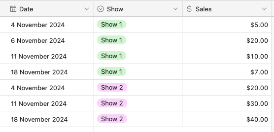
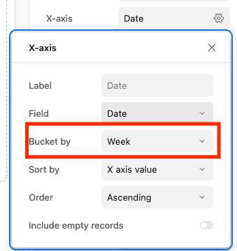
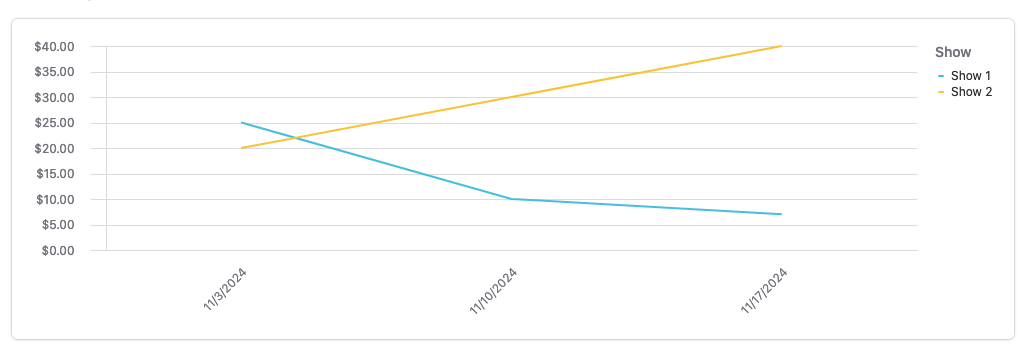
I've created a base where I track all of the marketing activity for a number of shows, and now wish to track the weekly sales and present them in a line graph, similar to how you would in Excel.
At the moment, I have a column in a table called 'Revenue To-Date' where I update the figure. However, this is replacing the data each time rather than tracking it in order to show trends. I'm open to using an app or building out another table but would love a simple way to update this via the interface I have built out.
The data itself comes through via an email each day as an Excel spreadsheet, so if there was a way for this to be automated, too, I'd love to learn the best way to configure.
Thanks in advance!