
Hello. Not sure if I have chosen the right forum (formulas) but here’s hoping someone can help me.
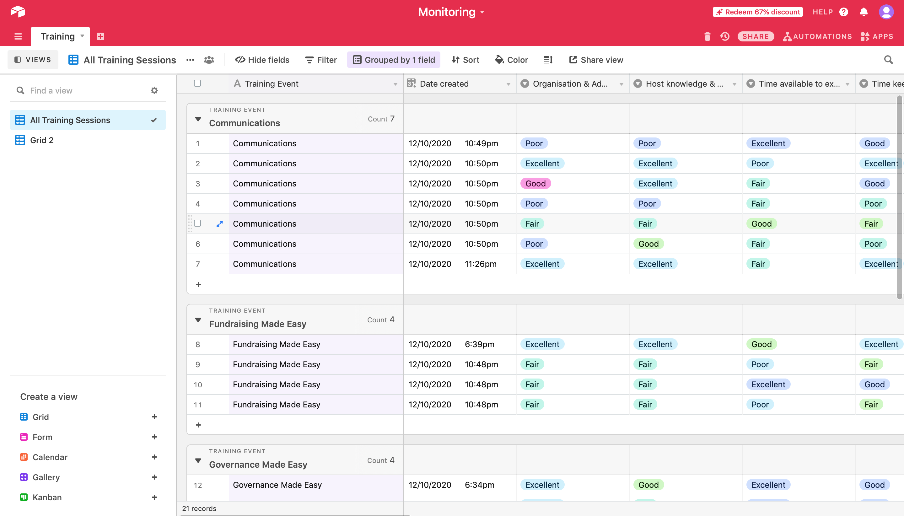
I work for a charity that holds a number of different training sessions with the local community. We use a standardised survey for gathering feedback for all the different sessions with Survey Monkey, and then use Integromat to import the results into the table you see below. The results are then grouped by the training session that respondents indicted that they attended in the survey in order to make them comparable to some degree. Each quarter, we will filter responses from the last 3 months and then use the feedback to report on our progress.
This information is for funders and obviously I can’t share with them a full set of survey responses. Therefore, I want to somehow turn this data into informative data at-a-glance without using the Charts block because that doesn’t display info in an appropriate way and it also can’t be downloaded.
The core issue I am having is one of converting the information I have here into percentages/ integers which could then, say, be turned into a pie chart or bar graph. I would like to have some means of aggregating the data so that it shows something along the lines of (a) the total amount of responses for each training session, i.e. ‘Fundraising Made Easy’, and (b) the percentage of the total respondents for each session that chose a particular response that best represents their opinion. For clarity, each field/ column corresponds to a question on the survey.
Looking at the ‘Fundraising’ session, for example, under the field headed ‘Host knowledge’ there are 4 responses: 1 person/ 25% says ‘Excellent’, while 3/ 75% say ‘Fair’. However, in the future there will be many more responses that won’t make a mental calculation feasible so therefore I will need this done quickly- potentially with a formula of sorts? I literally have no idea- I feel like I have been bashing my head against a brick wall for some time now! I would be profoundly grateful with any help anyone can provide. Thanks for reading- please use simple terms in your response to assist my understanding of what you mean.
PS: These are tests results, we’re not as wildly inconsistent as the test data would suggest!
 . All good questions. I’d use the pivot table app to show variations in responses and share the dashboard.