I just experienced this too. Are they removing the ability to have custom sidesheets, or are they all going to be this boilerplate list? It's a huge step-back for flexibility.
Not everyone has access to them yet. Can you clarify any of the following so those who don’t see this behavior yet have a more complete idea of whats going on?
- You mention side sheets, but that is one of two types of detail pages. Does this only affect your side sheets, or does it also affect your full screen detail pages as well?
- Were existing detail pages modified, or is this only appearing on new detail pages you recently created?
- Can non-field elements like charts, record pickers, etc. still be placed on the detail page? If so, do those go in sections or “loose” on the page?
- Do fields have to be in a section to be on the page? Like, if you want to avoid the section behavior is that possible?
- Other screenshots show a toggle for “column” and “row”-based sections. I suspect you are reffering to the column layout. What do the row sections look like?
- Is this behavior only in place of you drag from the right side bar, or does it also affect layouts if you use the “Add element” floating menu at the bottom right?
- You mention side sheets, but that is one of two types of detail pages. Does this only affect your side sheets, or does it also affect your full screen detail pages as well?
This also affects full screen.
- Were existing detail pages modified, or is this only appearing on new detail pages you recently created?
It appears to only affect new detail pages. Not existing.
- Can non-field elements like charts, record pickers, etc. still be placed on the detail page? If so, do those go in sections or “loose” on the page?
Nope. Maybe they plan on implementing? I don’t know, but they’re not available right now.
- Do fields have to be in a section to be on the page? Like, if you want to avoid the section behavior is that possible?
I’m not sure what you mean.
- Other screenshots show a toggle for “column” and “row”-based sections. I suspect you are reffering to the column layout. What do the row sections look like?
I didn’t see this, but maybe it’s being rolled out?
- Is this behavior only in place of you drag from the right side bar, or does it also affect layouts if you use the “Add element” floating menu at the bottom right?
There is no more ‘Add Element’ section.
Not everyone has access to them yet. Can you clarify any of the following so those who don’t see this behavior yet have a more complete idea of whats going on?
- You mention side sheets, but that is one of two types of detail pages. Does this only affect your side sheets, or does it also affect your full screen detail pages as well?
- Were existing detail pages modified, or is this only appearing on new detail pages you recently created?
- Can non-field elements like charts, record pickers, etc. still be placed on the detail page? If so, do those go in sections or “loose” on the page?
- Do fields have to be in a section to be on the page? Like, if you want to avoid the section behavior is that possible?
- Other screenshots show a toggle for “column” and “row”-based sections. I suspect you are reffering to the column layout. What do the row sections look like?
- Is this behavior only in place of you drag from the right side bar, or does it also affect layouts if you use the “Add element” floating menu at the bottom right?
- You mention side sheets, but that is one of two types of detail pages. Does this only affect your side sheets, or does it also affect your full screen detail pages as well?
The behavior is the same whether it's a sidesheet or full screen.
- Were existing detail pages modified, or is this only appearing on new detail pages you recently created?
So far it is limited to new pages, but I'm hesitant to experiment on the existing pages until I get some response from airtable. I've wasted a lot time today trying to figure out what was going on with the pages I was creating and what might be different about them, hoping to find a solution.
- Can non-field elements like charts, record pickers, etc. still be placed on the detail page? If so, do those go in sections or “loose” on the page?
I don't use any of those, it's supposed to be a simple data page.
- Do fields have to be in a section to be on the page? Like, if you want to avoid the section behavior is that possible?
There are no sections on the page. Are we talking about the same sheets?
- Other screenshots show a toggle for “column” and “row”-based sections. I suspect you are reffering to the column layout. What do the row sections look like?
What screenshots? I'm referring to the simple sidesheet, that's all.
- Is this behavior only in place of you drag from the right side bar, or does it also affect layouts if you use the “Add element” floating menu at the bottom right?
I didn't drag anything, and there is no "Add element" floating menu.
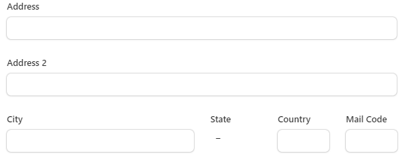
Wow. This is a really horrible change. The blue "+ Add element" button no longer appears when designing a new side-sheet. (Previously created side sheets seem to be okay, but I am afraid to touch them.) I can only add fields for the current record using the configuration panel on the right. It's like a throwback to the old record expanded view.
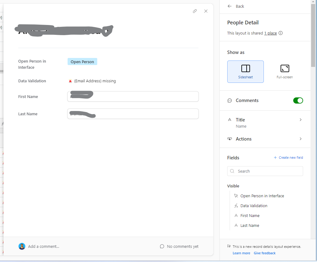
This button is missing when I am working on a new side-sheet or full-screen record details!

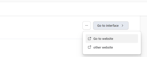
I cannot put a button wherever I want--buttons can only go at the top of a section, and if there is more than one button, it goes in a menu. What the heck? I should be able to put buttons next to the data that they relate to. I have some side sheets with multiple buttons that need to be pushed in a workflow as a person fills in data. Users fill in data, push a button, fill in more data, push another button, fill in more data, and then push another button. Properly for the workflow, the button should appear in the same section as the data, but below the data. But this design groups all for a section together at the top of the section, and even hides buttons.
These changes aren't even tied the new page layouts. I started this interface page as a blank page and started adding in elements, including elements from multiple tables.
When designing my side-sheets, I often used a two-column design. The left column was for editable values. The right column included help text and formula fields that provided feedback on the editable values. For example, if two of three fields needed values, my formula field would give warnings if only one was filled out. I also put lesser used editable fields in the right column (for example, overrides) so that those fields were out of the way when normally scanning down a column of fields to enter. My users found these designs intuitive and easy to use. They liked the help text and the formula feedback next to where they did data entry, but out of the way of the normal flow. I can no longer create these designs.
I am feeling very angry about this.
@ScottWorld Care to share your thoughts on this change?
Reposting here for visibility, the below was originally posted here.
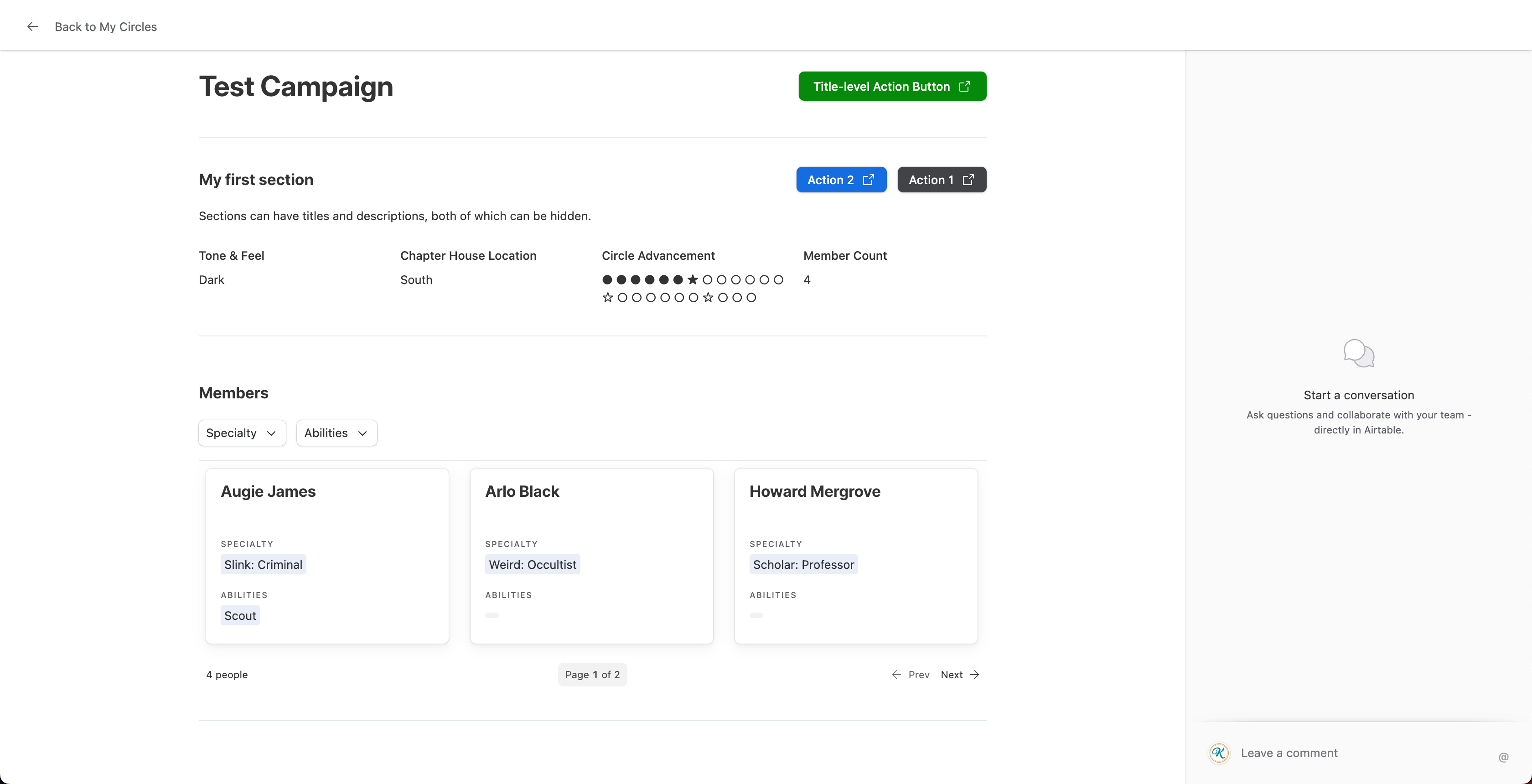
I now have access to the new layouts and have a few thoughts. Here is a screenshot of a full page detail layout for reference:
Positives:
- You can still make fields side-by-side. For whatever fields are visible, you add them to a section and make that section use row instead of column.
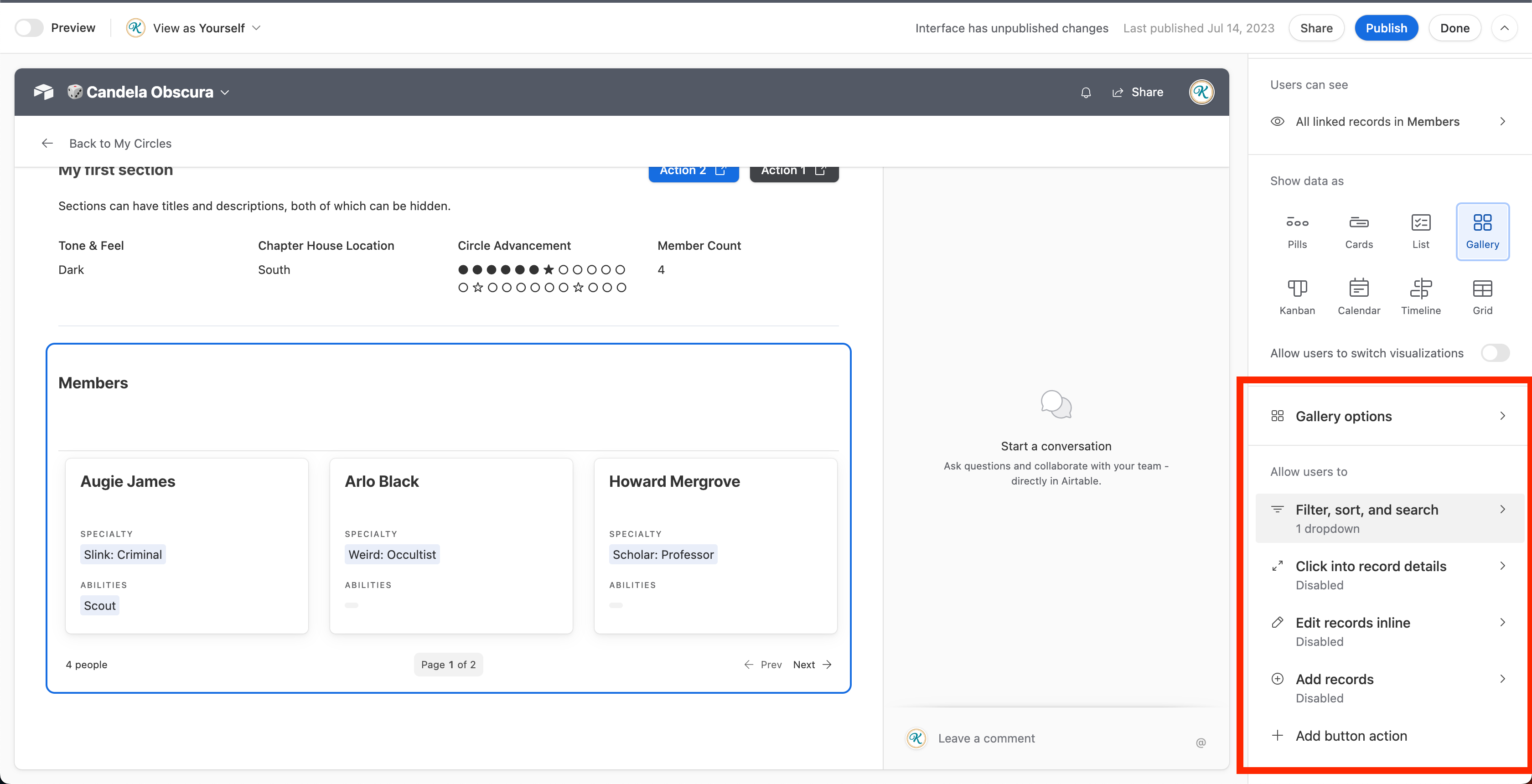
- Sections can have titles and descriptions, both of which can be turned off section by section. Descriptions can use rich text, and titles have 2 size options.
- When you add a linked record field, you have the option of changing its display from cards or pills, to grids, galleries, etc. See the image example for "Members".
- If you do the above, you can use Tabs/Dopdowns filter like you can on the newer "full" interface pages. **Very helpful,** likely the best part about the changes in my book, and something many have been requesting. See screenshot below.
- None of my existing detail pages have been changed. The options are only there for brand new detail pages.
Major Negatives (my personal opinion):
- While yes, you can still have horizontally placed fields, you have to create a section for each row, select the "row" option instead of the default (which is column).
- You also can't decide which field should be what width. The field width is evenly distributed, which will not work in all cases.
- The maximum number of side-by-side fields is 4, the 5th and so on fields will wrap to a new row. That's not inherently bad, but again I have no control on the width of fields.
- It doesn't seem like sections in full-screen detail pages can span the full width of the page anymore. There used to be options for "narrow" and "wide" rows, now we can only have narrow sections but not wide sections. I have a lot of screen real estate and I want to use it, but can't.
- Colored backgrounds are gone. They were helpful in visually breaking up pages.
- You can't make the title of the page/record sticky (remain in view on scroll, as the back button is) anymore.
- Record Pickers aren't placeable anymore. Neither are arbitrary text elements (which appear by default as Section titles/descriptions) or dividers or filters, but that is trivial (to me) than not being able to place a record picker. Since filters get baked into the liked record elements, that one isn't such a negative to me.
Nitpicking (still my personal opinion):
- Action buttons applied to sections feel backwards to me. The first button I added is named "Action 1". As you can see, the more buttons you add, the get added to the left. In left-to-right languages, it feels like that should be the other way around. Minor, but strange.
- While I appreciate the placement of comments in the fullscreen and side sheet layout (comments are optional, and can be turned off), it would be better to allow multiple different options for this. Maybe I want comments to be at the bottom and not the side. If their on the side as shown in the picture, I would like them to be collapsable.
- Each section gets a divider put underneath it automatically. You can't turn this off, or adjust the spacing between sections. Would be great if you could.
- Somebody out there probably wants to use a grid/gallery/etc. on a detail page that doesn't relate to linked records. That person isn't me, but that feature is now gone.
Potential:
- Sections might open the door to anchor tags to allow you to direct link to a part of the page (i.e. a section at the bottom of a really long page). That would be very useful.
- A more rigid building experience does mean it will be easier for Airtable to turn these into mobile-ready views, at least in theory.
In short:
Not as bad as I was expecting from looking at screenshots of un-designed pages, but worse than I'd like for the reasons above. I'm sure they can fix what I've pointed out, the question is will they (assuming many people agree that what I think are issues actually are issues)
Thank you @kuovonne you explained many of the issues I was afraid to even attempt, and some that I was far too upset to describe in detail.
Even at the basic level, previously you could use the interface to create a form that was intuitive and followed a workflow, and with the sidesheet come very close to replicating the look and feel of the form. Easy for onboarding users. Not any longer I guess.
I also have buttons placed in sheets to update statuses based on conditions and if we can't position them correctly it's back to using automations and catching errors after the fact rather than controlling the flow.
Where is the product management? Where is the consideration for clients? Airtable as an organization just doesn't get it. It's not just the people here, it all the potential clients, even enterprise level, that get enthused by prototypes and demos only to be permanently turned off by things like the left sidebar and this mess showing up without any warning.
@Kamille_Parks11
Thank you for your input. I appreciate the positives you mention, but for a change like this there should have been advance warning.
@Kamille_Parks11 Thanks for your additional insights.
To me, if feels like the new "row or column" is like reverting to a flexbox way of laying things out. I don't like it. It is too limiting. I cannot have two shorter fields in a left column and one long text field in a right column (that fills the height of the two shorter fields).
I get that they are trying to address the fact that placing elements in interfaces was tricky. But making things easier by taking away functionality isn't the answer. I'm okay taking a bit more effort to get an interface that works for my users versus having to tell my users that I cannot continue to give them the interface design patterns that they like.
I'm okay with the concept of sections. I used the divider element and headings to visually group things in my side-sheets into sections. Maybe eventually we will be able to collapse sections. But I don't like how they force buttons to be at the top of the section and in a menu. I don't like how I cannot add freeform text. I don't like how I cannot repeat a field in multiple sections.
I get the need to simplify interface designs to work on mobile. But don't cripple the experience on desktop because of mobile.
In flexbox (or grid) styling, you can control the width and/or height of items within the container with grow/shrink properties. Or you put a flexbox inside another flexbox. It stands to reason anything you put in a section should have an "Appearance" option for width: full (span the whole row), half, third, or quarter, as well as height. That way you can place things side by side predictably, and with varied widths/heights. Since we're all used to having a grid-based interface (all elements were 1 of several pre-defined widths), I think that could be a good compromise between the old and new.
I say "anything inside a section" and not "field" because I agree: I want to place a text element or button inside a section, not just on top.
And linked record fields should have a display type of chart and number so that functionality isn't taken away. Right now most functions aren't gone, they're in a different place and perhaps not how I would like. Charts and Numbers are straight up missing.
Additional positive:
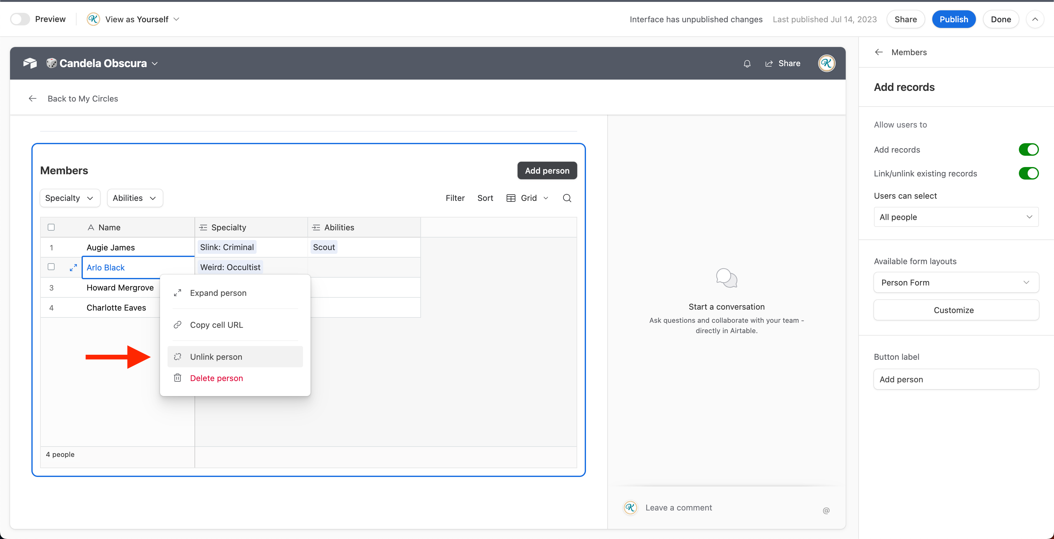
The new update does allow you to directly add new linked records. That means creating new records, unlinking a currently linked record, or deleting a linked record. Like elsewhere in newer "full page" interface pages, you can independently toggle whether someone can link/unlink records, or create new records. The old layouts did not allow for this and required workarounds.
Also new detail pages are very responsive. Adjust the width of your browser to test. Not bad, though not all elements are suited for a small screen, and may mean mobile-interfaces are very near.
Related negatives:
I don't think you can adjust the height of any linked record sections except for Gallery (which lets you choose how many rows of card there are). This is bad. What if I want a lot of space for a grid/list? Can't do that yet it seems.
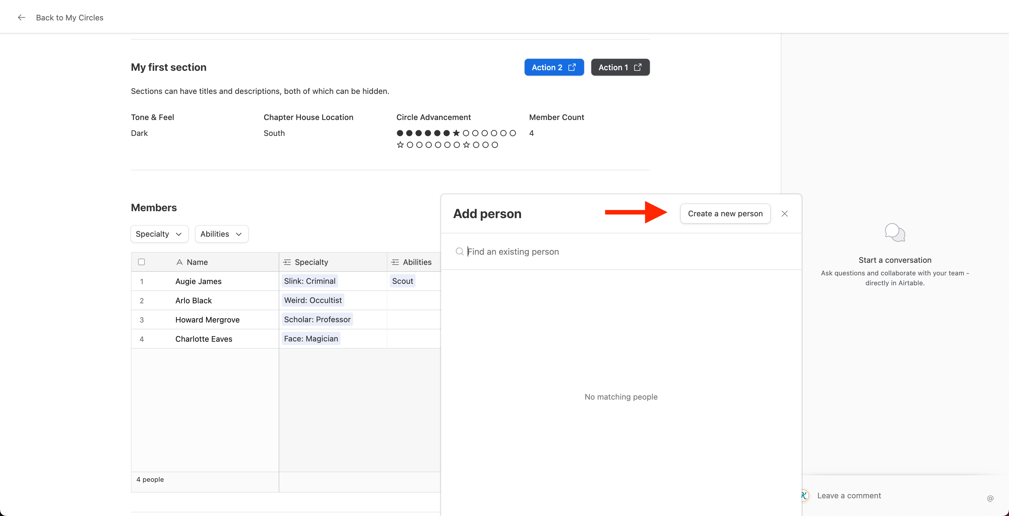
While you can create new linked records, you can't just quickly create a new row/card. It pulls up a form view of your choosing. But that can potentially slow down a workflow. A plus button in the bottom left as available in the data view would be nice.
Also the "unlink" right click option might be bugged lol. Great that it will be in place eventually when fixed, but it is not currently unlinking records when I click it.
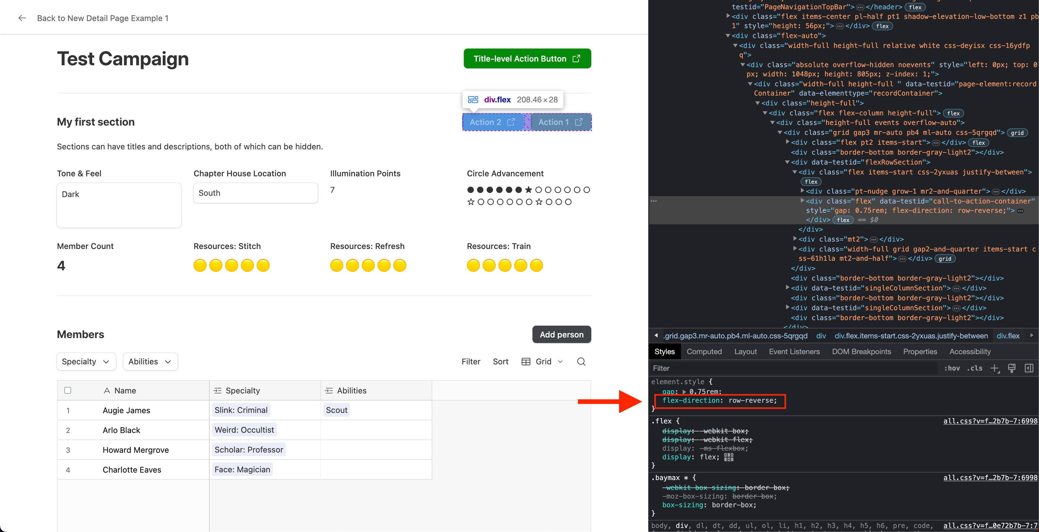
Day 2 of Testing
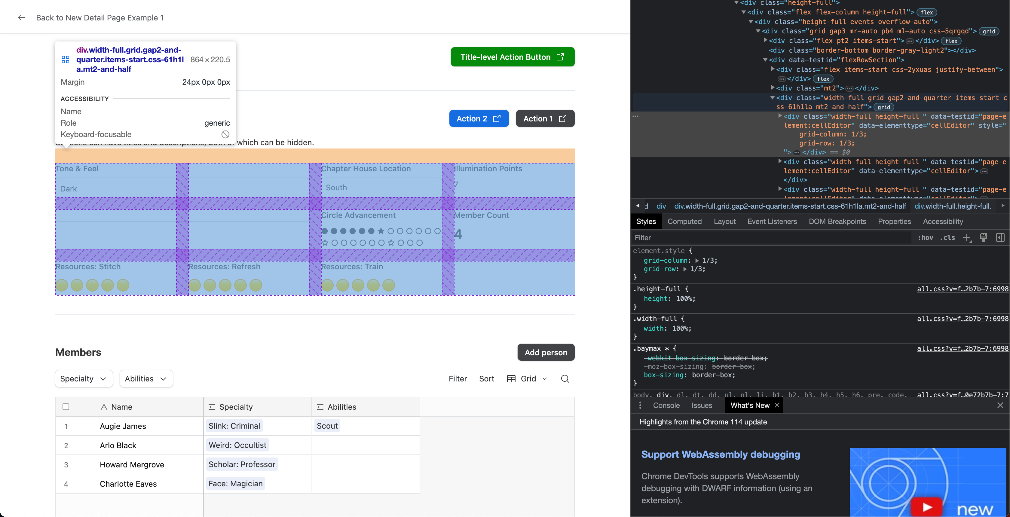
The new Detail Page sections use CSS grid, not CSS flexbox. This is a good thing. Grids give child elements (in our case, fields) the ability to explicitly identify the column and/or row they start and end. For that reason, I maintain that it should be easy for Airtable to add settings in (preferably) both of the following ways:
- Individual fields within sections should get column and row settings to control their span
- Sections should get settings for the maximum number of columns in a row
I wrote some truly basic css to force a long text field to span 2 columns and 2 rows (see below). This is the desired end result for the two settings options proposed above. It can be done in two lines of CSS as pointed out by the arrow. I didn't even have to override any styling, just adding those two lines. With my given example, reducing the screen size doesn't break it either, so their responsive code appears clean enough to handle this adjustment fairly gracefully.
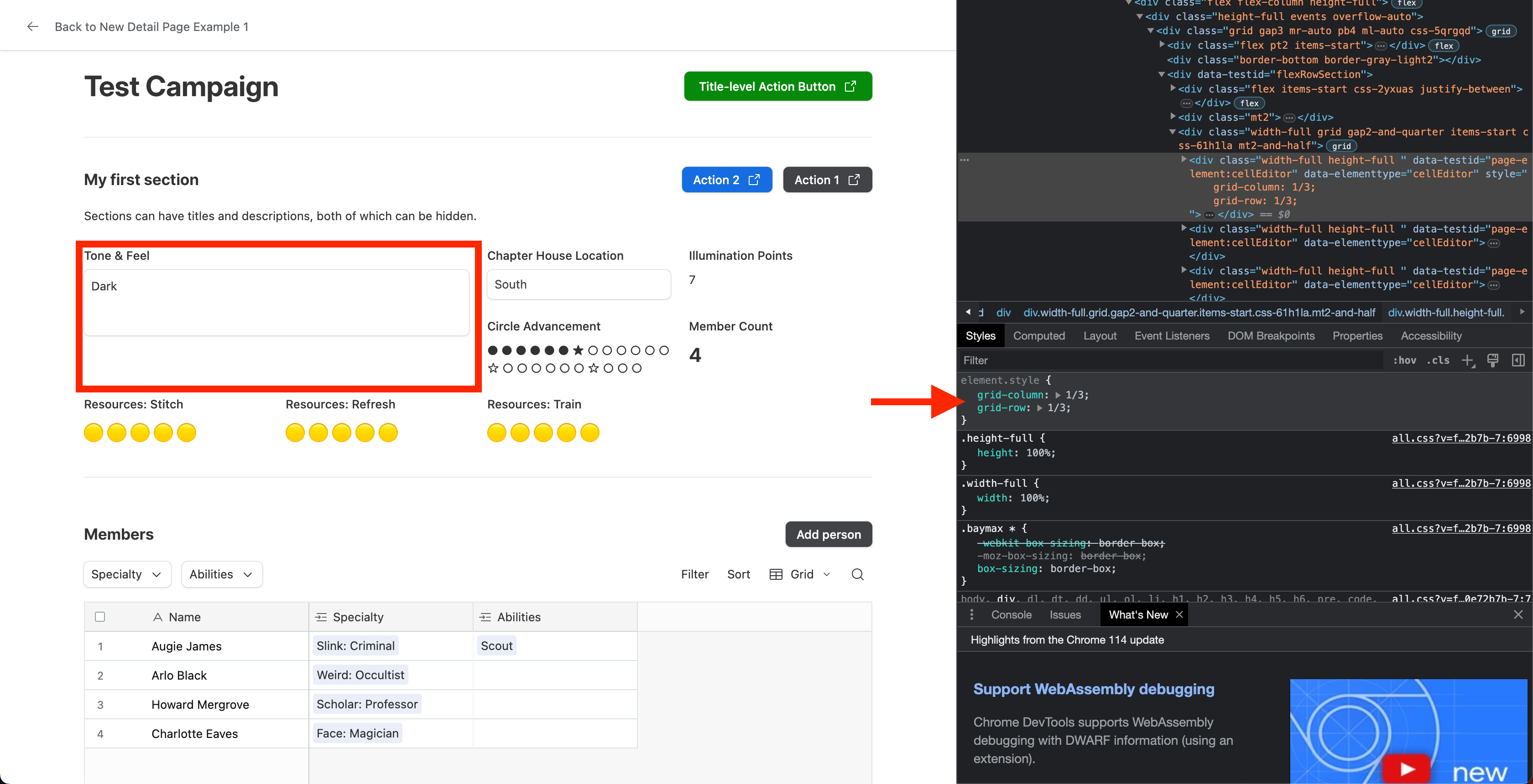
Also earlier up I said "the section button placement seems backwards". That's because it is, explicitly. Their containers have the property "row-reverse" turned on. I would very much like for that to be removed lol
Day 2 of Testing
The new Detail Page sections use CSS grid, not CSS flexbox. This is a good thing. Grids give child elements (in our case, fields) the ability to explicitly identify the column and/or row they start and end. For that reason, I maintain that it should be easy for Airtable to add settings in (preferably) both of the following ways:
- Individual fields within sections should get column and row settings to control their span
- Sections should get settings for the maximum number of columns in a row
I wrote some truly basic css to force a long text field to span 2 columns and 2 rows (see below). This is the desired end result for the two settings options proposed above. It can be done in two lines of CSS as pointed out by the arrow. I didn't even have to override any styling, just adding those two lines. With my given example, reducing the screen size doesn't break it either, so their responsive code appears clean enough to handle this adjustment fairly gracefully.
Also earlier up I said "the section button placement seems backwards". That's because it is, explicitly. Their containers have the property "row-reverse" turned on. I would very much like for that to be removed lol
You break these features down like I’ve never seen. Kudos to you.
I’m still not entirely sold on these sidesheets, but I’m hopeful they go through some iterations until there’s a nice middle-ground. As it stands, I don’t dare touch any of my existing custom sheets, for fear they may break.
While they’re working on sidesheets, I wish they would add some additional options for opening them.
I’d love it if buttons could open a sidesheet record, either fed by a record picker or if the buttons could individually select the record.
I’d also love it if the calendar view ‘+’ button had the option to open up a sidesheet immediately as well, instead of that modal that pops-up.
I’d love it if buttons could open a sidesheet record, either fed by a record picker or if the buttons could individually select the record.
All detail pages can be opened view a button. Create a formula field in a table for which it makes sense that prefills the url of a particular detail page using the appropriate record IDs. To figure out the url, add a list/gallery/whatever to a page that links to the desired detail page. Navigate to that detail page and grab its url. Ascertain which record ID is that of the detail page, and which is that of whatever page you were just on (likely preceded by "home").
I do that all the time.
I’d also love it if the calendar view ‘+’ button had the option to open up a sidesheet immediately as well, instead of that modal that pops-up.
You can do that too. Set the calendar to non-editable, and enable "open record details". This will immediately open the detail page without the calendar modal.
All detail pages can be opened view a button. Create a formula field in a table for which it makes sense that prefills the url of a particular detail page using the appropriate record IDs. To figure out the url, add a list/gallery/whatever to a page that links to the desired detail page. Navigate to that detail page and grab its url. Ascertain which record ID is that of the detail page, and which is that of whatever page you were just on (likely preceded by "home").I do that all the time.
WOW. Now that's something I've never seen, and I love it.
Bit annoying that I can't open that sidesheet to edit it in the interface page that I'm adding it to, but that's serviceable. Still a workaround that I wish airtable would add natively, but I'll take whatever I can get.
So, I'm assuming the button action to get this working is 'go to url in record', is that right?
Have you gotten it to work on the pre-made interface pages (ie. calendar, list, etc.)? I get it to open the record, but it has to reload the page. Not the biggest issue, but I wonder if maybe I'm doing something wrong. Those buttons are limited to only three options though (go to interface page, open record creation form, and external URL). I'm assuming this is happening because of the action 'open external URL'.
I’d also love it if the calendar view ‘+’ button had the option to open up a sidesheet immediately as well, instead of that modal that pops-up.
You can do that too. Set the calendar to non-editable, and enable "open record details". This will immediately open the detail page without the calendar modal.
I tried that in both the element version of calendar and the pre-made calendar page. Neither showed the '+' button when hovering over a day. It only worked if a record was already present in that day. It works great for that use case, but I want to be able to add records to that day by just pressing the '+' button.
Either way, really fantastic tidbits you've shared. I really appreciate it.
We have been building interfaces for months and months and months. Tediously trying to make design decisions that work for functionality with an already very limited design-toolset. Personally I don't care right now where Airtable is going with this. It freaks me out that the paradigm changes on a whim. We have established how certain elements work throughout all interfaces so that functionality makes sense where ever you are. And boom, you wake up one morning and all your tools have been pulled. Just like that. And to make things worse (which is hardly possible), there is no announcement from Airtable at all. Nowhere that I could find. And I thought Webflow was bad about client-realations...
We have been building interfaces for months and months and months. Tediously trying to make design decisions that work for functionality with an already very limited design-toolset. Personally I don't care right now where Airtable is going with this. It freaks me out that the paradigm changes on a whim. We have established how certain elements work throughout all interfaces so that functionality makes sense where ever you are. And boom, you wake up one morning and all your tools have been pulled. Just like that. And to make things worse (which is hardly possible), there is no announcement from Airtable at all. Nowhere that I could find. And I thought Webflow was bad about client-realations...
Thank you @Kamille_Parks11 for the explanations that are far more complete than anything Airtable has supplied.
My problem is that Airtable has taken away flexibility in the process, and we shouldn't be presented with a situation where we need to use scripts or external code to bring back a portion of what was originally present.
It looks to me like Airtable is putting the code back into no-code.
I also posted this on the other thread....
I started the other thread with the hope that if I directed the post to several airtable employees there might be an official response, but so far nothing.
I think the best quick solution would be to provide an option when a record detail page is created where we could stick with the older style, at least for existing interfaces. I have users just getting acclimated to the existing sheets, and having two different styles and workflows is not going to make things easier for them, or make them more receptive to using an tool that they haven't gotten to see the benefit for at this point.
Thank you @Kamille_Parks11 for the explanations that are far more complete than anything Airtable has supplied.
My problem is that Airtable has taken away flexibility in the process, and we shouldn't be presented with a situation where we need to use scripts or external code to bring back a portion of what was originally present.
It looks to me like Airtable is putting the code back into no-code.
To clarify: My screenshots and tests with the inspector are in no way meant to insuate users can or should use code to adjust the new detail pages how they wish.
The point was to show it would be easy, in theory, for Airtable to add additional settings/toggles that accomplish what users want. I am advocating that Airtable make adjustments based on their chosen design architecture rather than blindly guessing or suggesting something impractical.
That being said, Airtable is not a no-code platform. It's a low-code platform, evidenced by all the places wherein users are encouraged to write their own code. One thing people have been begging for is the ability to use scripts within Interfaces.
@Kamille_Parks11
Apologies if I misworded my response.
Of course Airtable isn't totally no-code, but it provides a platform that allows users to access without code. They provided an addition with their interfaces where I could build a workflow based tool that could be used by people understanding the business of what they do could easily replace their various spreadsheet applications with a better controlled and easier to use solution. I did this without writing a single line of code or any scripts (although it does include automations).
Now they took that away. New sidesheets will have a different look and feel. Some of the current functionality can't be replicated. My users are upset, I'm upset.
(Hi, I’m Phil and I work on the Product team at Airtable.)
Thank you all for the detailed, thoughtful feedback in this thread. I apologise that the rollout of this feature caused frustration and disruption to your work. That wasn’t our intention, and there’s a lot we can do to improve the way we roll out new features. While we tried to create documentation for this release, I fully acknowledge that there’s a lot more we could have done, both in terms of communication and also in how the feature itself was rolled out. We hear the feedback loud and clear and will learn from it with future releases.
@BillH, @kuovonne and others who mentioned this: I want to make it clear that your previously-created Record Detail layouts will not change. You can continue to edit them and your collaborators will be able to view and use them exactly as before, with no risk of unexpected changes. The changes released last week only apply to newly-created Record Detail layouts.
We were eager to launch the new Record Detail layouts for a few reasons:
- New functionality: working with linked records is more powerful in the new layouts:
- Collaborators can now create new linked records from List/Grid/Gallery/Timeline/Calendar elements (both with forms and, coming soon, inline in Lists and Grids)
- Collaborators can filter, sort and search linked records
- Linked record elements now adjust to fill the space they need
- Builders can now easily switch between Card/Pill and larger visualizations like List/Grid
- Builders can configure specific permissions for linking/unlinking and creating/deleting linked records
- Builders can create pre-configured filters for their collaborators to use
- Comments now appear in a consistent, predictable location
- Foundation for new Interfaces capabilities: the structure introduced with sections in the new Record Detail layouts is key to enabling Interfaces to work across different devices, screen sizes and content formats (like PDF) without adding lots of new complexity for builders. We hear from many customers that they want to use Interfaces in different situations than they can today, and we’re investing to make Interfaces and Interface content available in more places in the near future. We also want to support more complex workflows in Interfaces in the longer-term, and this new structure provides a foundation for builders to make sure their collaborators see only what’s relevant to them to take action and move a process forward.
- Making it easier to build good Interfaces: lots of people in this Community have built intuitive, useful Interfaces, but many more of our customers struggle to do so. We believe layouts like these can play an important part of making it much easier to end up with an Interface that looks good and works well without needing lots of fiddling or prior experience making software.
But making building good Interfaces easier doesn’t have to mean that builders lose the ability to customise them to fit their needs. We are extremely grateful for the extensive feedback you’ve provided (I deeply appreciate the level of detail from @Kamille_Parks11 and others.) Along with valuable conversations we continue to have with customers (including some in this thread), it is directly informing short-term changes we’ll make to allow more customisation and restore missing functionality to these layouts that you can expect to see very soon.
I’ll close by reiterating that no changes will be made to any existing Record Detail layouts and they can continue to be edited and used as before. I’m keen to hear further feedback about the new Record Detail layouts - particularly as we make improvements in the coming weeks and months - and apologise again for the frustration the rollout of this feature has caused.
Hi Phil! Thank you for chiming in on this conversation and providing your perspective.
> I want to make it clear that your previously-created Record Detail layouts will not change.
This did not need clarification. I did not expect my previously-created designs to change, and the fact that I didn't get reports from surprised users made it clear that my existing record detail layouts hadn't changed.
However, it isn't currently possible to create new record detail layouts with the same design patterns. And this is a problem. It's not like I am done making interfaces. I still have an ongoing need to make interfaces and when I find a design pattern that both my users and myself like, I want to be able to reuse that pattern in new interfaces. I wanted to start a new project that involved making more interfaces, but now I cannot use the design patterns that I want to. I don't know if I should try to make all new designs with the current constraints, hope that you will restore the ability to make the old designs in a timely manner, or look into moving to a third party portal.
I understand that you want to add new features and make things easier. But, it is very unfair to take away the ability to build things the same way we had been building them, especially with no warning.
> But making building good Interfaces easier doesn’t have to mean that builders lose the ability to customise them to fit their needs.
But that is just what you did. While we gained the ability to customize in some new ways, we lost the ability to customize in other ways that we were invested in.
> We believe layouts like these can play an important part of making it much easier to end up with an Interface that looks good and works well without needing lots of fiddling or prior experience making software.
That's great! Having an easier way to make interfaces that look good and work well is a plus for everyone. Lowering the floor is a good thing. However, can we also keep that ceiling high? And part of having a high ceiling is having as few restrictions on how builders build things as possible (even if it means allowing them to build ugly, non-functional designs).
> Along with valuable conversations we continue to have with customers (including some in this thread)
When do you have these conversations (before of after you make changes)? How do you determine which customers you have conversations with? Do you feel that the system you have for interacting with customers about potential changes is working or could it use improvement?
> short-term changes we’ll make to ... restore missing functionality ... very soon.
Thank you for restoring missing functionality. Please keep us updated on the progress and when we can expect the functionality to be restored.
I'm also excited about your plans to bring interfaces to new devices and screen sizes (mobile!?!?)
(Hi, I’m Phil and I work on the Product team at Airtable.)
Thank you all for the detailed, thoughtful feedback in this thread. I apologise that the rollout of this feature caused frustration and disruption to your work. That wasn’t our intention, and there’s a lot we can do to improve the way we roll out new features. While we tried to create documentation for this release, I fully acknowledge that there’s a lot more we could have done, both in terms of communication and also in how the feature itself was rolled out. We hear the feedback loud and clear and will learn from it with future releases.
@BillH, @kuovonne and others who mentioned this: I want to make it clear that your previously-created Record Detail layouts will not change. You can continue to edit them and your collaborators will be able to view and use them exactly as before, with no risk of unexpected changes. The changes released last week only apply to newly-created Record Detail layouts.
We were eager to launch the new Record Detail layouts for a few reasons:
- New functionality: working with linked records is more powerful in the new layouts:
- Collaborators can now create new linked records from List/Grid/Gallery/Timeline/Calendar elements (both with forms and, coming soon, inline in Lists and Grids)
- Collaborators can filter, sort and search linked records
- Linked record elements now adjust to fill the space they need
- Builders can now easily switch between Card/Pill and larger visualizations like List/Grid
- Builders can configure specific permissions for linking/unlinking and creating/deleting linked records
- Builders can create pre-configured filters for their collaborators to use
- Comments now appear in a consistent, predictable location
- Foundation for new Interfaces capabilities: the structure introduced with sections in the new Record Detail layouts is key to enabling Interfaces to work across different devices, screen sizes and content formats (like PDF) without adding lots of new complexity for builders. We hear from many customers that they want to use Interfaces in different situations than they can today, and we’re investing to make Interfaces and Interface content available in more places in the near future. We also want to support more complex workflows in Interfaces in the longer-term, and this new structure provides a foundation for builders to make sure their collaborators see only what’s relevant to them to take action and move a process forward.
- Making it easier to build good Interfaces: lots of people in this Community have built intuitive, useful Interfaces, but many more of our customers struggle to do so. We believe layouts like these can play an important part of making it much easier to end up with an Interface that looks good and works well without needing lots of fiddling or prior experience making software.
But making building good Interfaces easier doesn’t have to mean that builders lose the ability to customise them to fit their needs. We are extremely grateful for the extensive feedback you’ve provided (I deeply appreciate the level of detail from @Kamille_Parks11 and others.) Along with valuable conversations we continue to have with customers (including some in this thread), it is directly informing short-term changes we’ll make to allow more customisation and restore missing functionality to these layouts that you can expect to see very soon.
I’ll close by reiterating that no changes will be made to any existing Record Detail layouts and they can continue to be edited and used as before. I’m keen to hear further feedback about the new Record Detail layouts - particularly as we make improvements in the coming weeks and months - and apologise again for the frustration the rollout of this feature has caused.
Thank you Phil for the detailed and thoughtful response.
I'm in agreement with everything @kuovonne mentions in her response, so for the most part I won't repeat what's she's already stated other than to emphasize that once you have developed interfaces (or any other application that will be used by others) it's important to keep designs consistent for the benefit of your user base. In my case this has already meant stripping away features on existing pages that have not been rolled out, because I would never be able to include them on new pages.
So before I go much further on this and several other projects, is there any way to get an idea of what else might be going away? In particular, you mention the ability to create new records from additional elements, which in itself is a step forward, but does this mean that the current interface form pages will be going away shortly? Many of the design features for positioning and resizing fields behave similarly to the no longer supported features on the sidesheets, and if they are eliminated in one place I have to be concerned that they may be eliminated in others as well.
Thanks again for the response and I think we all look forward to hearing further on the upcoming strategy.