Also here looking for more information on the "new left navigation panel." I have only seen it referenced in one blog post and can't find any information on it. For our team, only creators seem to have it. Not sure if this is the case for everyone, but a temporary fix might be to switch all users to Editors, if that doesn't mess with their workflows. In my case I am lucky because I am the only creator at our company.
Well, our clients are going bullsh*t this morning.
ANY HELP TRIAGING THIS would be incredibly appreciated. I'm going to check on Editor/Creator settings for our clients as an immediate patch, but can we please keep this thread going as a solution set?
My first impression was it looked good.
Then I logged in through my 13" laptop.
It felt like I was on my phone!
Between the space the new sidebar took, and the bar from the Record Review, I wasn't left with much space to see the record I actually had open. I'm hoping we can at least hide & control it in a way similar to the base's sidebar for views.
In general I think having the left panel as an option, as in some use cases it is great, but I'll add 2 reasons why we don't like it/items that need solutions.
1. In some cases our interfaces are meticulously designed with the width of the display in mind and losing horizontal space is a big problem.
2. Although Airtable does not support interfaces on mobile, they can actually work pretty good on the browser if using Safari on an apple product. The left navigation panel eliminates this option completely, similar to a "record review" page, because the menu is not collapsible (I should note that if it was collapsible, it shouldn't be auto-collapsed on desktop view because I can't stand when navigation panels require a click to open them. In a perfect world, it would only collapse when the horizontal width of the window was below or adjusted to be below a certain pixel width).
TEMP FIX: Switch affected users in workspace from Creator to Editor.
Longer term fix, I really hope like hell that Airtable understands something very, very important:
"Let's disrupt workflow for everyone and not give them documented choices" is rarely good customer service. It bespeaks an indifferent arrogance that eventually destroys relationships.
AIRTABLE: Please ensure that there is a way for this new interface view to NOT be forced on creators. If this new interface is forced on Editors, it's going to completely destroy our client's ability to use Airtable in the field on their phones in physical work environments. Half their visual real estate will change from vital work information to some bloody menu they don't care about.
While we are on the topic, Airtable can you please start making interface decisions with mobile in mind. We would not be Airtable users without us having found work-arounds to use interfaces on mobile and tablet. This the the world we live in and we've been waiting for official mobile interface support since the day it came out.
I have a concern to share on the same topic.
It appears that the new sidebar is a feature regression because it no longer allows us to select different colors for different interfaces.
This is worrying enough for creating new interfaces, because there is significant value in having different colors on different interfaces in order to differentiate the experience visually.
But it is more worrisome for existing interfaces, as there does not appear to be any way to edit the existing color if it needs to be changed. If the company undergoes a branding change and we wish to change our interfaces, we are locked in forever unless we manually recreate the interface? (Duplicating the interface keeps the existing color.)
New designs should not include regression from old features at all without significant care, and they definitely should not regress without warning or acknowledgement. The plan to remove the feature to have individual color options per interface should have been published with reasoning included and the community should be provided the time needed to share their thoughts. I'd be interested for example to hear what percentage of bases have an interface that is a different color from the base itself.
Also here looking for more information on the "new left navigation panel." I have only seen it referenced in one blog post and can't find any information on it. For our team, only creators seem to have it. Not sure if this is the case for everyone, but a temporary fix might be to switch all users to Editors, if that doesn't mess with their workflows. In my case I am lucky because I am the only creator at our company.
As far as I know, it will also roll out to Editors starting 17th May.
I have a concern to share on the same topic.
It appears that the new sidebar is a feature regression because it no longer allows us to select different colors for different interfaces.
This is worrying enough for creating new interfaces, because there is significant value in having different colors on different interfaces in order to differentiate the experience visually.
But it is more worrisome for existing interfaces, as there does not appear to be any way to edit the existing color if it needs to be changed. If the company undergoes a branding change and we wish to change our interfaces, we are locked in forever unless we manually recreate the interface? (Duplicating the interface keeps the existing color.)
New designs should not include regression from old features at all without significant care, and they definitely should not regress without warning or acknowledgement. The plan to remove the feature to have individual color options per interface should have been published with reasoning included and the community should be provided the time needed to share their thoughts. I'd be interested for example to hear what percentage of bases have an interface that is a different color from the base itself.
@David_Smedberg wrote:
I have a concern to share on the same topic.
It appears that the new sidebar is a feature regression because it no longer allows us to select different colors for different interfaces.
This is worrying enough for creating new interfaces, because there is significant value in having different colors on different interfaces in order to differentiate the experience visually.
But it is more worrisome for existing interfaces, as there does not appear to be any way to edit the existing color if it needs to be changed. If the company undergoes a branding change and we wish to change our interfaces, we are locked in forever unless we manually recreate the interface? (Duplicating the interface keeps the existing color.)
New designs should not include regression from old features at all without significant care, and they definitely should not regress without warning or acknowledgement. The plan to remove the feature to have individual color options per interface should have been published with reasoning included and the community should be provided the time needed to share their thoughts. I'd be interested for example to hear what percentage of bases have an interface that is a different color from the base itself.
You're mistaking us for Entreprise clients.
Adding my voice that the sidebar feels like a major regression, or like it's directly aimed at enterprise teams with many interfaces? I'm not really sure but I don't see a mostly empty sidebar taking up a ton of horizontal space being beneficial for most non-enterprise customers which potentially sets a pretty worrying precedent for future updates...
While the non-hideable menu on the old interface was an annoyance, the new menu bar on the side takes up significantly more real estate and completely breaks all of our interface views. The whole point of views is to build dashboards which can be displayed on standalone screens. There should be an option to HIDE ALL MENUS. That can be achieved in roughly 4 lines of code (2 lines in css, 2 lines in javascript). Fingers crossed this gets fixed soon.
Absolutely ruins the interfaces I have developed for our team. I am already looking for alternative solutions. Additionally, the lack of a mobile interface in 2023 is a joke. I have loved Airtable, but whoever is making these decisions needs to be fired.
Absolutely ruins the interfaces I have developed for our team. I am already looking for alternative solutions. Additionally, the lack of a mobile interface in 2023 is a joke. I have loved Airtable, but whoever is making these decisions needs to be fired.
We have Glide running for this exact reason. I need to control who sees what, as well as clean things up for the average user.
@NAVana986 @nwttyler @Erin_Keeffe @TDY @David_Smedberg @Eric_McFetridge
Please note:
I agree with all of your sentiments, but Airtable employees do not typically read the posts that people make in this community, so this entire thread will most likely never be seen by Airtable employees.
The only posts that they MIGHT READ are the ones where they started the thread (and even then, it's questionable if they will read your responses).
So, everybody who posted in this thread, please be sure to repost your comments in their official announcement thread about the new interface design. That is the only place where your comments MIGHT get seen.
p.s. You may also want to send an email to support@airtable.com, but they typically don't reply to emails for several weeks (if at all).
Good call thanks @ScottWorld ! I would also highly recommend people submit a feature request through the "Message support" option from the help menu in the top right when in a normal base (not an interface). This is probably the best way to make noise that will get to people who can make decisions about this stuff. the more noise on the same topics the better.
In the chat, type a few words, hit enter, and click "No" for the help article suggestions until you get the option to click "Help with Airtable product", and then "Feature request" (or "Bug") at which point you can submit a request.
@NAVana986 @nwttyler @Erin_Keeffe @TDY @David_Smedberg @Eric_McFetridge
Please note:
I agree with all of your sentiments, but Airtable employees do not typically read the posts that people make in this community, so this entire thread will most likely never be seen by Airtable employees.
The only posts that they MIGHT READ are the ones where they started the thread (and even then, it's questionable if they will read your responses).
So, everybody who posted in this thread, please be sure to repost your comments in their official announcement thread about the new interface design. That is the only place where your comments MIGHT get seen.
p.s. You may also want to send an email to support@airtable.com, but they typically don't reply to emails for several weeks (if at all).
Thanks for pointing us to that post. I have commented over there and had already reached out to enterprise support and our success manager as well. I appreciate the talent and the capability the Airtable team has and understand that we all hate change, but this particular change is going to cause some serious issues. I honestly like aspects of the navigation panel, but it will not work for us in its current state.
I have a concern to share on the same topic.
It appears that the new sidebar is a feature regression because it no longer allows us to select different colors for different interfaces.
This is worrying enough for creating new interfaces, because there is significant value in having different colors on different interfaces in order to differentiate the experience visually.
But it is more worrisome for existing interfaces, as there does not appear to be any way to edit the existing color if it needs to be changed. If the company undergoes a branding change and we wish to change our interfaces, we are locked in forever unless we manually recreate the interface? (Duplicating the interface keeps the existing color.)
New designs should not include regression from old features at all without significant care, and they definitely should not regress without warning or acknowledgement. The plan to remove the feature to have individual color options per interface should have been published with reasoning included and the community should be provided the time needed to share their thoughts. I'd be interested for example to hear what percentage of bases have an interface that is a different color from the base itself.
This does not bear well for this change. I'd start looking at rollback, plus high user engagement here, and the solution of "make optional" really does work I think for everyone. How can optional be argued with?
As far as I know, it will also roll out to Editors starting 17th May.
That may kill our largest contract.
Adding my voice that the sidebar feels like a major regression, or like it's directly aimed at enterprise teams with many interfaces? I'm not really sure but I don't see a mostly empty sidebar taking up a ton of horizontal space being beneficial for most non-enterprise customers which potentially sets a pretty worrying precedent for future updates...
That's not good.
We have Glide running for this exact reason. I need to control who sees what, as well as clean things up for the average user.
Please explain Glide in this context?
I have a concern to share on the same topic.
It appears that the new sidebar is a feature regression because it no longer allows us to select different colors for different interfaces.
This is worrying enough for creating new interfaces, because there is significant value in having different colors on different interfaces in order to differentiate the experience visually.
But it is more worrisome for existing interfaces, as there does not appear to be any way to edit the existing color if it needs to be changed. If the company undergoes a branding change and we wish to change our interfaces, we are locked in forever unless we manually recreate the interface? (Duplicating the interface keeps the existing color.)
New designs should not include regression from old features at all without significant care, and they definitely should not regress without warning or acknowledgement. The plan to remove the feature to have individual color options per interface should have been published with reasoning included and the community should be provided the time needed to share their thoughts. I'd be interested for example to hear what percentage of bases have an interface that is a different color from the base itself.
Hi David,
I agree with all your points, but just so you know I was able to change the color of my interface by going back to "Home" and then customizing the base. You are right that it appears ALL interfaces tied to the base now are the same color, but at least you can change the color. 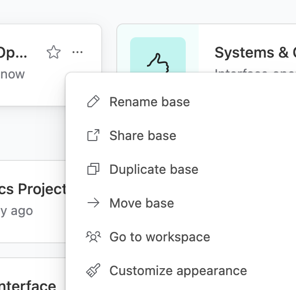
@NAVana986 @nwttyler @Erin_Keeffe @TDY @David_Smedberg @Eric_McFetridge
Please note:
I agree with all of your sentiments, but Airtable employees do not typically read the posts that people make in this community, so this entire thread will most likely never be seen by Airtable employees.
The only posts that they MIGHT READ are the ones where they started the thread (and even then, it's questionable if they will read your responses).
So, everybody who posted in this thread, please be sure to repost your comments in their official announcement thread about the new interface design. That is the only place where your comments MIGHT get seen.
p.s. You may also want to send an email to support@airtable.com, but they typically don't reply to emails for several weeks (if at all).
Thanks Scott! If it helps anyone, I did email support this morning about this rollout and heard back within an hour. We are an enterprise customer so that could be why, I'm not sure.
Adding to this, my clients are also upset at this and want to find a way back to the old version...
MY anger, is why do you have to make it so complicated to do simple things like change an interface color?!?!?!? WHERE IS THE OPTION?!?!?!?!?!
