
I am trying to bar chart comparison of 2 fields in a table
| Project Name | Pod Name | Planned Duration | Actual duration |
| project 1 | pod 1 | 3 | 4 |
| project 2 | pod 2 | 10 | 11 |
| project 3 | pod 3 | 12 | 14 |
| project 4 | pod 1 | 11 | 12 |
| project 5 | pod 2 | 12 | 10 |
| project 6 | pod 3 | 11 | 9 |
| project 7 | pod 1 | 11 | 9 |
| project 8 | pod 2 | 11 | 9 |
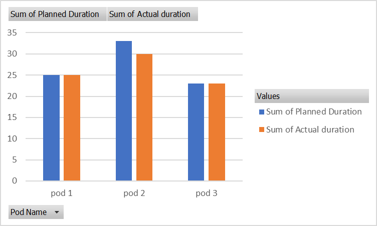
Row LabelsSum of Planned Duration Sum of Actual duration Grand Total8178
| pod 1 | 25 | 25 |
| pod 2 | 33 | 30 |
| pod 3 | 23 | 23 |
Is there a way to chart this in a dashboard given the first set of data? Or is there a secondary table that I need to have then chart it from there