Help

The Community will be undergoing maintenance on Friday January 10 at 2:00pm - Saturday January 11 at 2:00pm EST, and will be "read-only." For assistance during this time, please visit our Help Center.

Grouping unique values into buckets for interface pie chart

Topic Labels: Interface Designer
Solved
Jump to Solution
590 2
cancel
Showing results for 
Search instead for 
Did you mean: 
Mouser-IB-Admin
6 - Interface Innovator

I'm really hoping this can be accomplished without needing to create yet another formula field, so I'll give details below and see where I get. 🙂

I have fields for start and end dates and then a formula that calculates the duration between them, including when the end date is blank and then it just keeps counting from the start. I want to have a chart show this data on an interface, but I don't want every single value showing uniquely on the chart if possible.
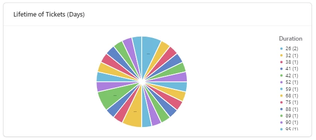
MouserIBAdmin_0-1721661953490.png

Instead, I'd like to have it group them into buckets for things like 0-30 Days, 31-90 days, 90+ days, but I can't see any way to do that intelligently within the interface. My fear is that I'm going to need a formula field that gathers this at the table level and then point the pie chart to that field instead of the duration field.

Anyone have a suggestion for the best way to accomplish this kind of reporting? Thanks!

1 Solution

Accepted Solutions

I think you're right. You'll most likely have to make a formula to manually group your data before you can display it in the chart. I don't think the grouping functionality within the grid views would be able to accomplish this with you manually creating a formula to group them by. I'm glad Airtable gives us the tools to build these seemingly arbitrary conditions.

The formula shouldn't be too hard to make if you utilize the new Single Select outputs and use a SWITCH()

🙂


Justin Ng
Programme Coordinator at Sistema Aotearoa
https://www.sistemaaotearoa.org.nz/

See Solution in Thread

2 Replies 2

I think you're right. You'll most likely have to make a formula to manually group your data before you can display it in the chart. I don't think the grouping functionality within the grid views would be able to accomplish this with you manually creating a formula to group them by. I'm glad Airtable gives us the tools to build these seemingly arbitrary conditions.

The formula shouldn't be too hard to make if you utilize the new Single Select outputs and use a SWITCH()

🙂


Justin Ng
Programme Coordinator at Sistema Aotearoa
https://www.sistemaaotearoa.org.nz/

Thanks, I ultimately broke down and made the formula field yesterday afternoon and it works great. Is it yet another field? Yes. Does it get the job done? sigh Yes. With Airtable having a limit on the number of fields you can have, I really wish they'd stop having the workaround for nearly every issue be to just create another formula field. For the record, my final formula is below.

IF(
  {Ticket Duration},
  IF(
    {Ticket Duration} <= 30, 
    "0-30 Days", 
    IF(
      {Ticket Duration} <= 90, 
      "31-90 Days", 
      IF(
        {Ticket Duration} <= 180, 
        "91-180 Days", 
        "180+ Days"
      )
    )
  ),
  BLANK()
)

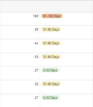
 I then formatted the results as single selects, so below you can see that on the left is the original field with the actual number value for each record, and on the right is the output from the formula which groups them into buckets.

MouserIBAdmin_0-1721735894826.png

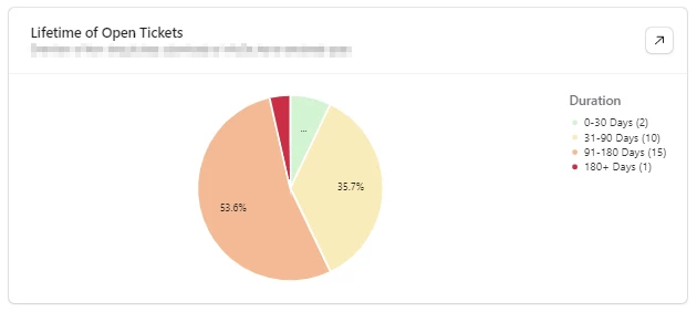
Which gives the end result of a much cleaner pie chart. 🙂

MouserIBAdmin_1-1721735974534.png

Hopefully sharing these details will help someone else. The Airtable community is awesome and I'm happy to be a part of it.