Help

Re: How to build multi-series line charts

Solved
Jump to Solution
1596 0
cancel
Showing results for 
Search instead for 
Did you mean: 
mel3201
4 - Data Explorer
4 - Data Explorer

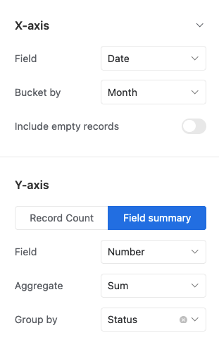
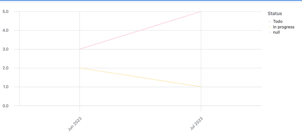
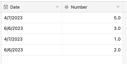
Trying to build a Multi-series line charts. I found articles from 2022 announcing it as a feature in interfaces but can't find any information about how to do it. I don't see an option to add an additional data set. Does anyone know how to implement this? 

https://blog.airtable.com/interface-designer-product-updates-1/

Thanks!

1 Solution

Accepted Solutions
TheTimeSavingCo
18 - Pluto
18 - Pluto


Try using the "Group by" dropdown:
Screenshot 2023-07-18 at 12.18.11 PM.png

Gives me this:

Screenshot 2023-07-18 at 12.18.17 PM.png
Based on this:

Screenshot 2023-07-18 at 12.18.52 PM.png

See Solution in Thread

4 Replies 4
TheTimeSavingCo
18 - Pluto
18 - Pluto


Try using the "Group by" dropdown:
Screenshot 2023-07-18 at 12.18.11 PM.png

Gives me this:

Screenshot 2023-07-18 at 12.18.17 PM.png
Based on this:

Screenshot 2023-07-18 at 12.18.52 PM.png

Is it possible to create a stacked line chart in the interface based on several fields/columns from the same table in a base?

I created a stacked line chart using Vega-Lite in the dashboard in the base, but I would like to do the same in the interface. Additionally, Vega-Lite is not interactive, so I cannot see the exact values when I hover over the lines/data points.

> Is it possible to create a stacked line chart in the interface based on several fields/columns from the same table in a base?

Heh to deal with this I usually create another table that compiles all of the data from those fields into a single field with a single select to differentiate each field.  I then group by that single select, thus creating the stacked line chart

Not the most elegant, but it works!

Hi Adam,

Thank you so much! I tried it out and it works. You're a lifesaver!