You’re looking for charts that allow “multiple series” on the X-axis. I actually had 2 clients who needed this exact same thing within the last month.
Be sure to send this in as a feature request to support@airtable.com.
In the meantime, you’d have to turn to external charting/graphing apps to do this.
Some apps that support this are: Google Sheets, Microsoft Excel, Databox, Tableau, Vega Lite, Nocodechart, QuickChart, Looker Studio, Knack, Flourish, and Image-Charts.
I always use Make’s automations 100% of the time to integrate Airtable with charting apps.
And then, after automatically generating the chart, you could:
(1) automatically embed that chart into an attachment field in Airtable, or
(2) automatically add the direct links to the charts in URL fields in Airtable.
p.s. If you have a budget for your project and you’d like to hire an expert Airtable consultant to help you with any of this, please feel free to contact me through my website: Airtable consulting — ScottWorld
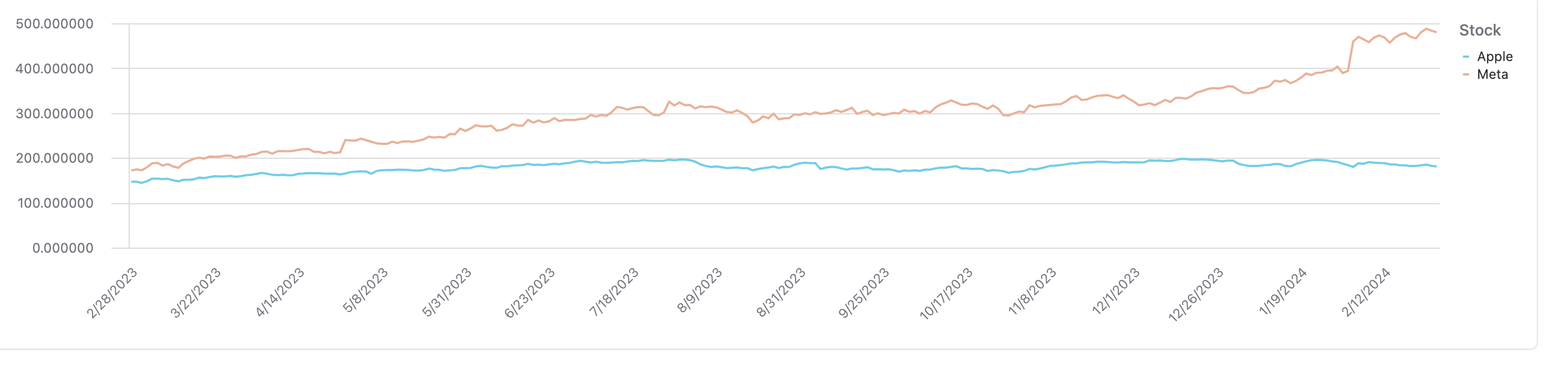
Airtable can graph multiple X values on a graph.
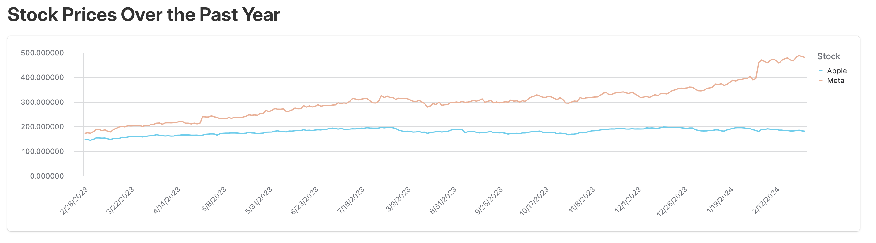
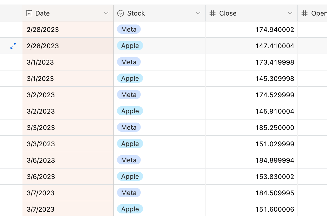
This works by using a date field as the primary field. Each X value you want to graph needs its own row in the table with an associated value. In this example, I've downloaded the stock prices for Meta and AAPL over time and put them both in the same table. The fields I use are date, stock and closing price
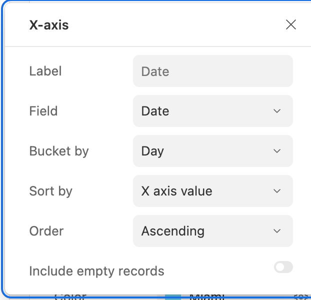
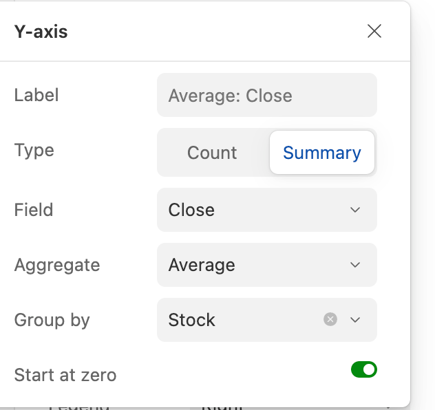
Using the Dashboard Interface select line graph,
X-Axis : Date
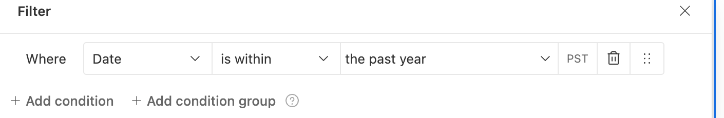
If your data isn't organized by date, item, and value, create an automation that runs on a regular scheduled time to take a snapshot of your data.
This results in the following graph over the past year:
@Dan_Montoya That is very cool! Could you put in the request with Airtable for us to get this exact same functionality with bar charts as well?
Airtable can graph multiple X values on a graph.
This works by using a date field as the primary field. Each X value you want to graph needs its own row in the table with an associated value. In this example, I've downloaded the stock prices for Meta and AAPL over time and put them both in the same table. The fields I use are date, stock and closing price
Using the Dashboard Interface select line graph,
X-Axis : Date
If your data isn't organized by date, item, and value, create an automation that runs on a regular scheduled time to take a snapshot of your data.
This results in the following graph over the past year:
I suppose I would have to adjust my table to fit this structure. May not exactly fit my needs as a practical matter of my specific use case
