We have a fleet of vehicles, with a entry_date and exit_date, we also categorise their type (passenger/commercial). I was hoping Airtable could graph (suspecting only line graph will work here) each month of the year (Jan 2023/Feb 2023/Mar 2023/etc) and the total count for passenger vehicles and commercial vehicles where the month of the year fell between the entry_date and exit_date. Has anyone done this before? Thanks for any help in advance!!

Page 1 / 1
@wilkie here is a interface I've used to show stock prices over time. There is both a line graph which is mobile and desktop friendly and a desktop only version. You could easily change the stocks to vehicle types and total passengers per type. I've added a filter at the type for the start and stop dates.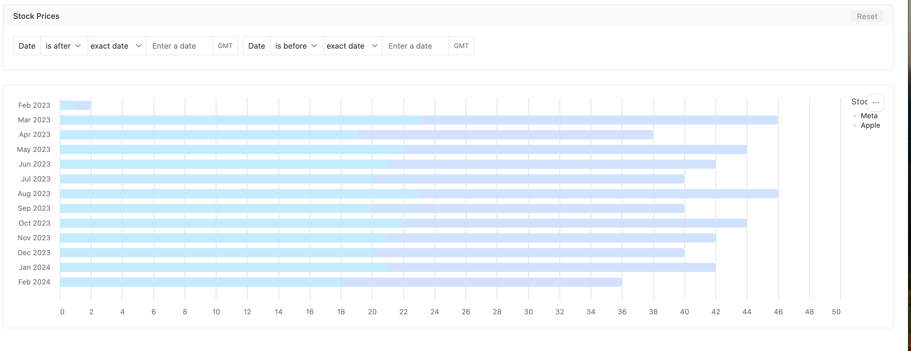
Hey @Dan_Montoya, thanks for sharing this! It looks to be just plotting multiple data points though, however I was looking to plot using a single record for each vehicle with entry_date and exit_date, and then with a graph bucketing by month, if each month along the x-axis fell between entry_date and exit_date then it would add to the count of vehicles for that month.
Eg Vehicle1, entry_date: 25/12/2023, exit_date: 07/02/2024.
On a graph where months were along the x-axis (count on the y-axis), so Oct 2023, Nov 2023, Dec 2023, Jan 2024, Feb 2023, Mar 2023, the count would be as follows:
Oct 2023: 0
Nov 2023: 0
Dec 2023: 1
Jan 2024: 1
Feb 2023: 1
Mar 2023: 0
something like 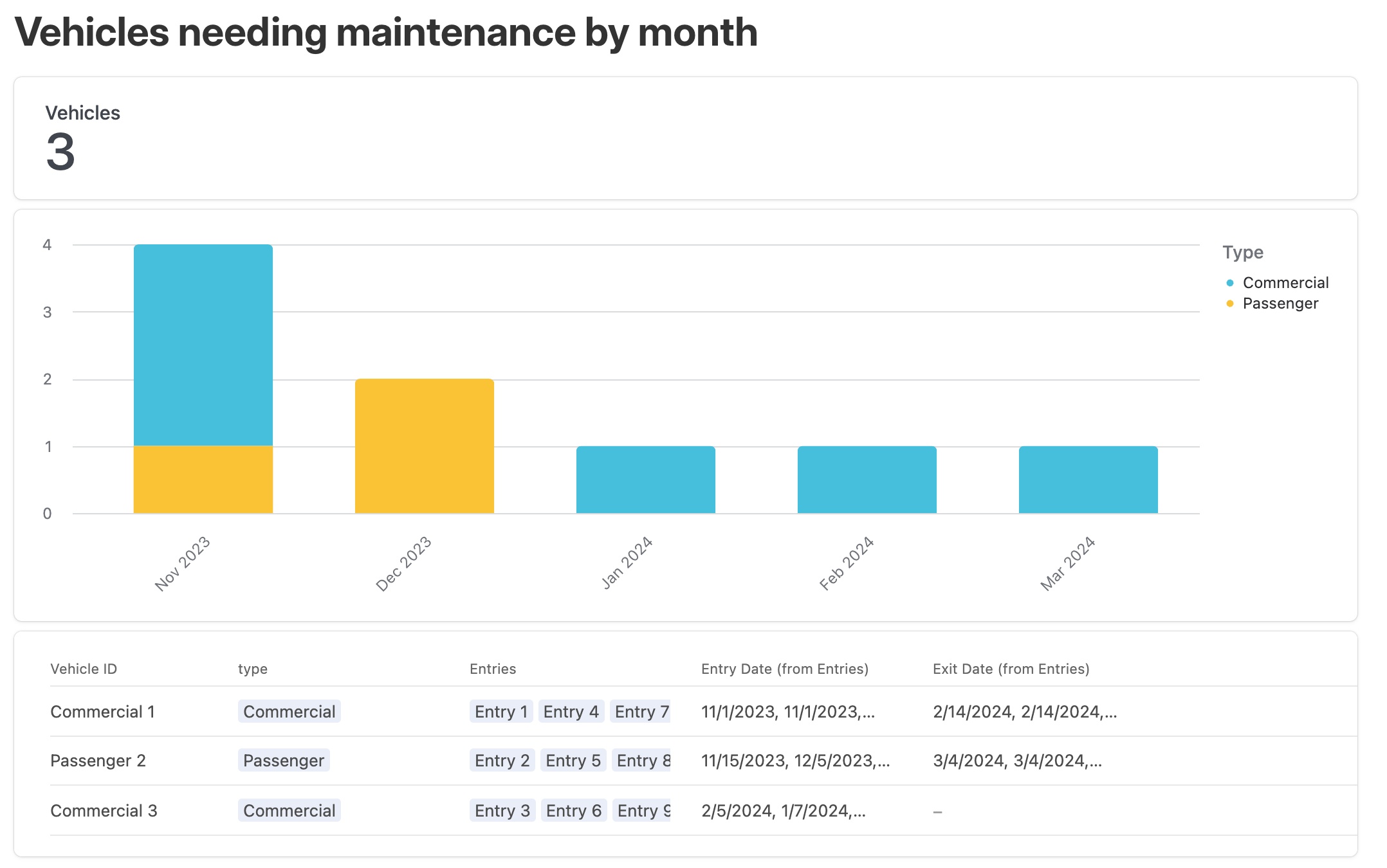 ?
?
I think so, though not sure what is behind Entry 1, Entry 2, Entry 3, Entry 4, etc?
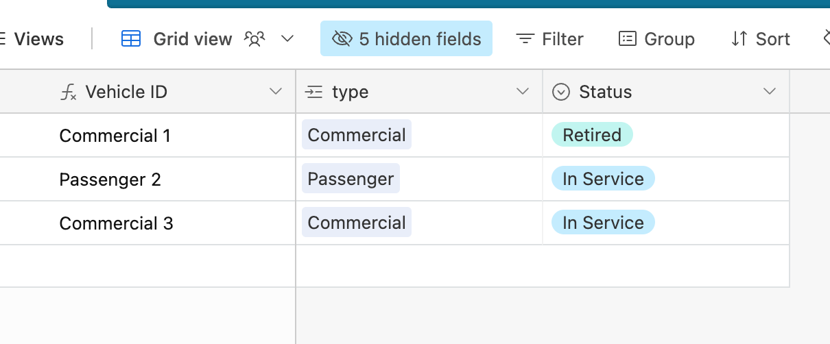
Entries are service events.
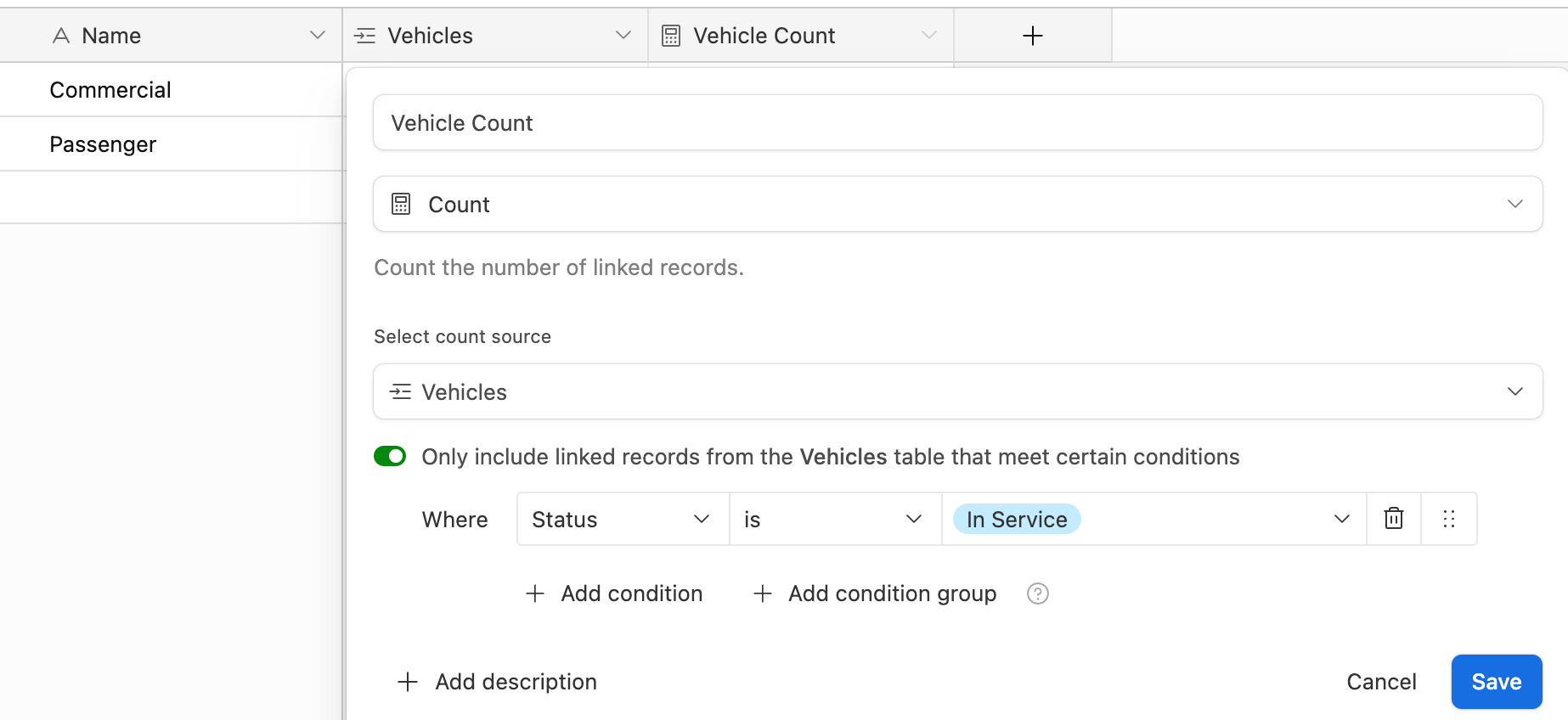
Ahh ok thanks, it seems I still need to have something between the entry_date and exit_date for the vehicle to appear, is that right? Assuming a vehicle had 0 service events, what would be the best way to have its existence in the fleet be represented on a chart? Some of my vehicles don't have service events for a long period, so we essentially wouldn't be able to see they "exist" until that happened if it relied on that
The entry dates can be the day they entered service and the day they left service. Your choice.
How would this ensure they get displayed in the months/periods between the entry and exit date @Dan_Montoya ? Sorry I am confused! 😵
I think you want something more like 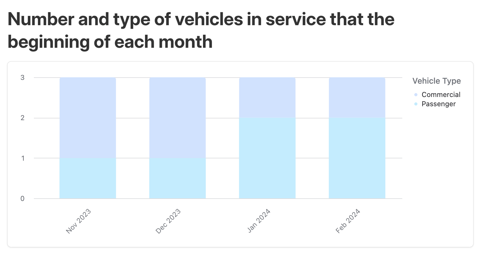 .
.
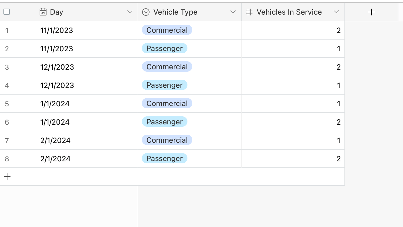
This graph is created from a table I call "historical log." At the beginning of each month, an automation records the number of each type of vehicles in service creating a separate record for each type.
Reply
Enter your E-mail address. We'll send you an e-mail with instructions to reset your password.