Hi there,
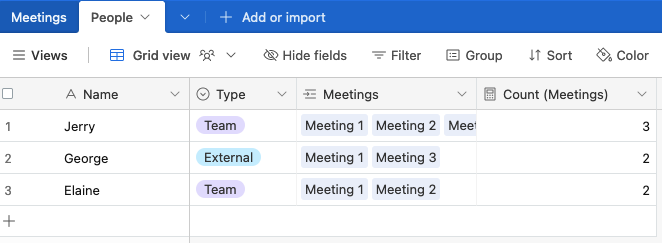
I have two tables : "Meetings" and "People".
Each meeting is of a certain Type (Single Select)
Each meeting can contain multiple People. Some People are team members, some are not.
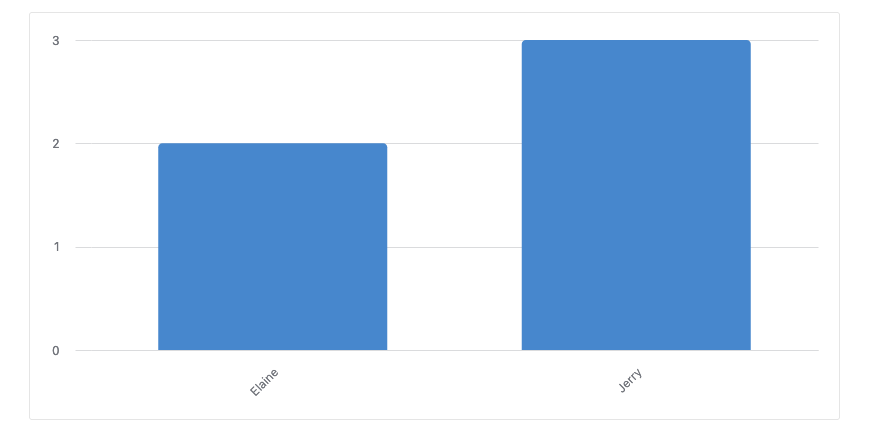
I want to create an interface chart to display the total number of meetings per People, aggregated by Type, but only for certain People (team members).
Unfortunately, when add as a condition that the displayed Meetings have to contain People that are team members, the graph also shows other People that are part of these meetings, but that are not team members. It makes sense so far.
But what I would like to do is to filter the People displayed on the x-axis only. Is there a simple way to do so ?
Thank you for your help !
Jean

Page 1 / 1
Hmm, I'm not sure I follow; does this look right? If not, could you provide some screenshots of your data and existing chart and let me know what needs to be different?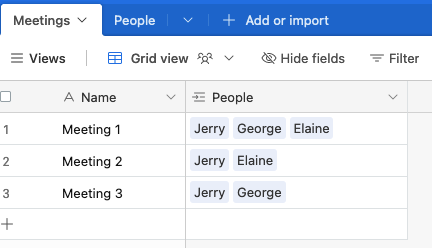
Hi @TheTimeSavingCo ,
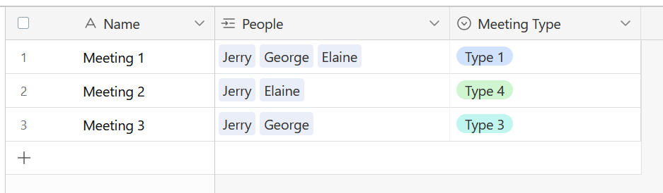
That would be the idea, yes, but in my case I need to differentiate Meetings by Type.
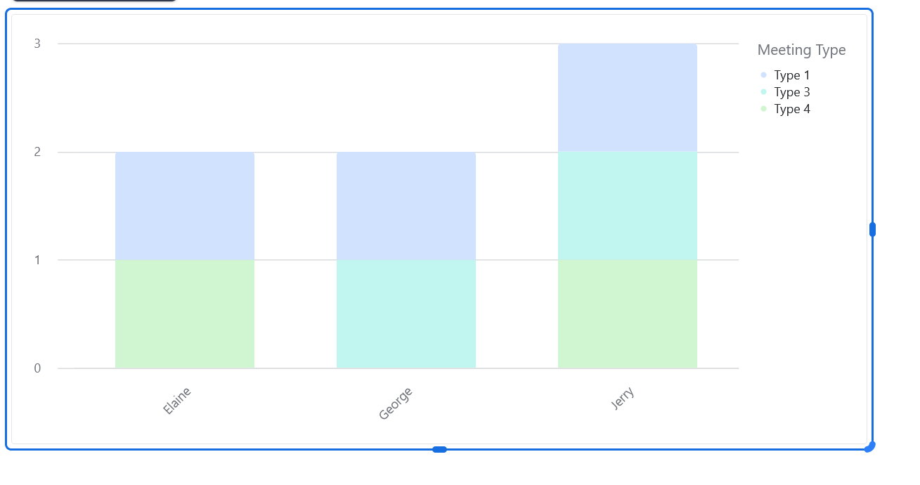
The only way to display this information is to chose "Meetings" as the source of the graph since that is where the Meeting Type information is stored. By doing so, I cannot seem to filter out the People that are not part of my Team on the graph :
Hi @TheTimeSavingCo ,
That would be the idea, yes, but in my case I need to differentiate Meetings by Type.
The only way to display this information is to chose "Meetings" as the source of the graph since that is where the Meeting Type information is stored. By doing so, I cannot seem to filter out the People that are not part of my Team on the graph :
Ah, I see! Thanks for the details! In that case try:
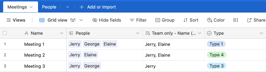
1. Creating a lookup field in "Meetings" that'll display the names of the team members:
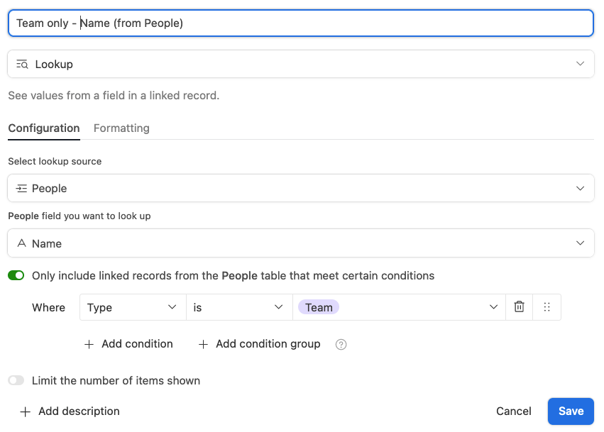
2. Give it a conditional to only display the records where the type is "Team":
And in your Interface, use that new lookup as the X axis:
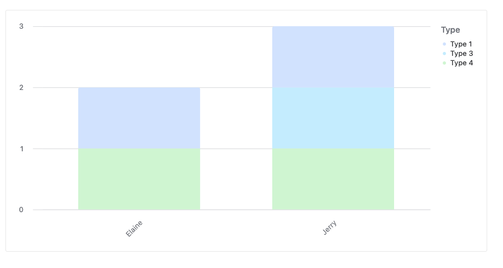
Does that work? I've also updated the base to reflect this change so you can view it there!
Thank you again @TheTimeSavingCo, that would work in an elegant way !
(Unfortunately I had to simplify my use case to make it short, but it happens to be way more complex : there are in fact companies and people that are involved in each meeting, companies are segmented by Type as well, and team members are assigned by type of companies but some meetings are mixing team members that are assigned to different types of companies on different types of meetings bla bla bla ...)
I have found ways to make it happen with rollups and lookups in various tables, but it is cluttering each table with so many fields that I was looking for a way to filter people out directly in the dashboard / graph parameters.
It seems that you can only filter information with fields that are on the source table. My source table being the "Meetings" table, I am reaching a dead-end..
Ahh, yeah fair enough. Like you, I find myself creating new fields and tables just so that data gets formatted in a way that I can plug into charts due to how it expects the data sigh. Sorry I couldn't help!
Reply
Enter your E-mail address. We'll send you an e-mail with instructions to reset your password.