- Mark as New
- Bookmark
- Subscribe
- Subscribe to RSS Feed
- Permalink
- Report Inappropriate Content
Jun 08, 2023 02:02 PM
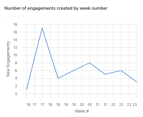
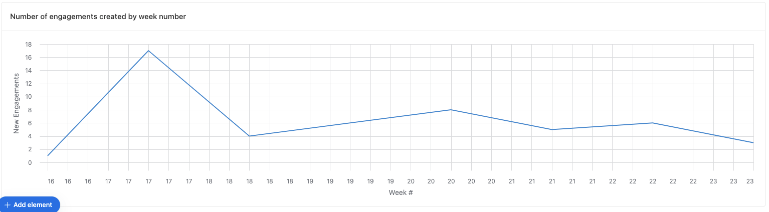
I used a calculation to track the week (in a cal year) that a data point was input into my base so I can track my sales team meeting their weekly quota. When I charted this in the dashboard, multiple weeks (16, 17, 17, 18, 18, etc.) showed up in the chart (pic 1). If I spread out this report in the db, even more weeks show up (pic 2)
- Mark as New
- Bookmark
- Subscribe
- Subscribe to RSS Feed
- Permalink
- Report Inappropriate Content
Jun 08, 2023 10:55 PM
Any chance you could provide a screenshot of your data as well?
- Mark as New
- Bookmark
- Subscribe
- Subscribe to RSS Feed
- Permalink
- Report Inappropriate Content
Jun 09, 2023 01:33 PM
Hi,
just a guess - you get floating point numbers, which are all different, but shown as integers, with some 'matches'. To check - try to change formatting to decimal, with a few digits after point. To fix - wrap result in INT( ) or other rounding function.
Note that sometimes in rollup result you can get a integer-like number, but with +-0,00...001 in 15-16th digit. You can't see this difference even with maximum precision, but it's clearly seen when you try to filter exact number. Try to filter with week=17, week=18 etc and count. Also try week>18, week>19
For example, same issue with percent
