airtable VIEW’s UI is slowly improving, and in the right direction!
Bravo and thanks AIRTABLE DEV team !
I’ve already often weighed against the VIEWs in the SCRIPT-BLOCK section but when it evolves in the right direction, it doesn’t leave me indifferent.
Most importantly, AIRTABLE DEV team, keep going, read the Product Suggestions about the most requested VIEWS UI and features and don’t stop on the way !
olπ
@Jason @Kasra

Page 1 / 1
I cannot speak to the scripting interface improvements of this feature but the UI is a plus/minus. It’s nice to not have to scroll through views, however when I select a view from the previous drop-down (just to the right of the new feature), I have to then click the drop-down again or the new feature to hide the views panel again. It’s really an annoying intrusion on the workspace. There should be a way to set the default to auto-hide or not as is common.
I cannot speak to the scripting interface improvements of this feature but the UI is a plus/minus. It’s nice to not have to scroll through views, however when I select a view from the previous drop-down (just to the right of the new feature), I have to then click the drop-down again or the new feature to hide the views panel again. It’s really an annoying intrusion on the workspace. There should be a way to set the default to auto-hide or not as is common.
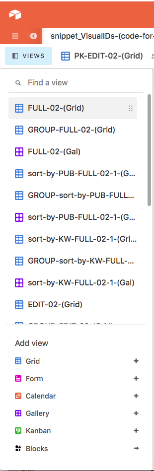
I’m digging the new “views as a sidebar” layout. People have been requesting a layout akin to the Airtable Universe one for some time, and I believe this does that nicely.
But I do agree with you, I think there should be an option to auto-hide the panel.
I cannot speak to the scripting interface improvements of this feature but the UI is a plus/minus. It’s nice to not have to scroll through views, however when I select a view from the previous drop-down (just to the right of the new feature), I have to then click the drop-down again or the new feature to hide the views panel again. It’s really an annoying intrusion on the workspace. There should be a way to set the default to auto-hide or not as is common.
Unhappily nothing, nothing, nothing…
…VIEW parameters array or object are out of script-Block’s scope : that’s why I was talking about VIEWs at Script’s DEV Community.
So some UI improvements like this can help exclusively manual VIEWs management !
Yes ! It would be better !
oLπ
This is a horrible change. How do I get it reversed?
Command-shift-K is my go to shortcut to switch views across the base. Now when I type the shortcut, the view I want, and hit return, this stupid menu stays open and reduces my screen real estate. Not only that, but just opening the view shifts my whole line of sight on my massive grids of records. Why did you make this change? How do I get the old way back ASAP?
I have another thread going on this topic here.
After trying to use the new view sidebar all night long, I now find it intrusive, unwieldy, disconcerting, and a terrible use of screen real estate. I discuss my thoughts in full detail in that other thread.
I believe that it is a highly unusable design decision that slows us down due to too many clicks, continuously gets in the way, and makes it way more difficult to use our systems because the entire base is constantly shifting left & right to accommodate the sidebar.
Not user-friendly nor enjoyable at all.
This new view option is awful. And the fact that this was rolled out to random users is ever worse. One of our AirTable power users is very upset that this new view was forced onto her. When she sent me a screenshot I had no idea what she was talking about. I just wasted 30 minutes trying to figure out what happened to her view menu and revert to back to the old one. Before I came in here to try and find an answer. This roll out of the new view was handled in a very poorly.
I rarely post in the community, but I want to say THANK YOU…
This addition has changed my world with Airtable!
And me, what did I see so “extraordinary” in this modification of the IU which is not at all unanimous?
Just a first modification of UI which would be the first step towards the addition of VIEWs Grouping and/or Sorting.
Am I just a dreamer ? Well we’ll see…
The best FIX for everyone who spoke out against this UI seems to me:
I am not a fan of this new view - I especially don’t like that this is not an option. I have the classic drop down menu in my account, but my business partner has the slide out view window. He’s not that used to Airtable, so that sidebar is always open and it cuts down on his screen real estate. You could say, why doesn’t he close it? Well some people don’t think in that direction.
Also - if you have long view names, this new slide out sidebar seems to be showing less of the names as the drop down window. Am I right on this or is it just a perception?
I agree with @Markus_Wernig. The #1 thing that I dislike the most about Airtable is this new view menu. It’s so wrong on like 5 different levels.
No matter what the final decision is on which way to go with the sidebar, I would like to see consistency, those that share my base as editors cannot see the new sidebar at all. This creates great confusion when trying to talk someone through how to use the UI as they cannot ‘see’ what I am seeing.
I’m digging the new “views as a sidebar” layout. People have been requesting a layout akin to the Airtable Universe one for some time, and I believe this does that nicely.
But I do agree with you, I think there should be an option to auto-hide the panel.
Agreed; as someone who often switches between views, the old view menu is hugely annoying, since I first need to click to get the list of views; on the other hand, with the new layout, I can just click immediately on the view that I want.
Clearly, people use Airtable in different ways and have different preferences, so a single solution is not going to satisfy everyone, particularly for something so important; thus, users should simply be given more choices as to the behaviour of the panel (ability to switch between the old and new menu/option to auto-hide panel/etc.)
Reply
Enter your E-mail address. We'll send you an e-mail with instructions to reset your password.