Help

Save the date! Join us on October 16 for our Product Ops launch event. Register here.

Build a dynamically-colored Risk Matrix

Solved
Jump to Solution
4022 6
cancel
Showing results for 
Search instead for 
Did you mean: 
Patrick_Esmonde
5 - Automation Enthusiast

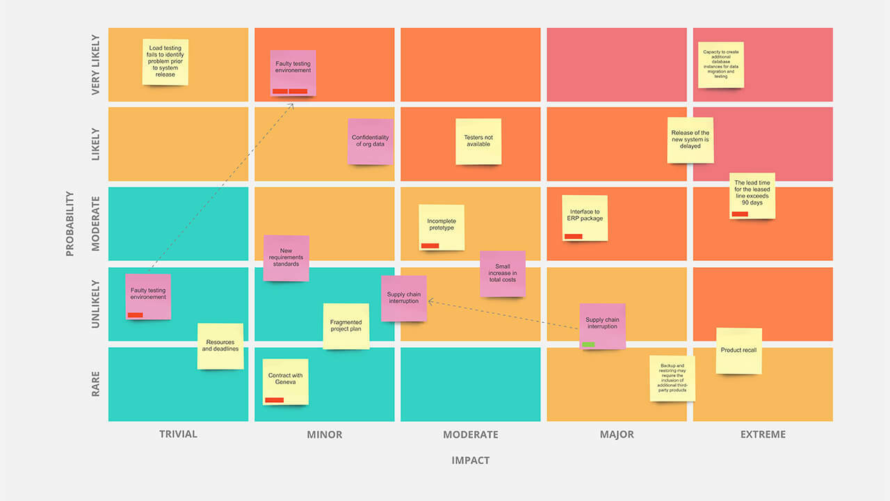
We are looking to build a risk matrix like the attached graphic using AirTable. The table would be a list of risks with drop-downs to assign the occurrence and probability. That part is easy enough, but then I also want to bin it into the High/Med/Low category based on a lookup table. Still doable. Where my challenge is is formatting the grid to have the appropriate colors. I tried conditional formatting, but it does not carry into the grid, as there’s no option in the color. Any ideas on how to solve this?

1 Solution

Accepted Solutions
W_Vann_Hall
13 - Mars
13 - Mars

You have two options, as far as I know:

  1. Fake color-coding using emoji
  2. Use the Page Designer Block in conjunction with the layered color hack (see the 5th entry in this reply).

Either/both can be surprisingly effective — once you get past the fact it doesn’t look the way you envisioned it…

See Solution in Thread

6 Replies 6
W_Vann_Hall
13 - Mars
13 - Mars

You have two options, as far as I know:

  1. Fake color-coding using emoji
  2. Use the Page Designer Block in conjunction with the layered color hack (see the 5th entry in this reply).

Either/both can be surprisingly effective — once you get past the fact it doesn’t look the way you envisioned it…

Patrick_Esmonde
5 - Automation Enthusiast

risk-matrix

If you manage to implement that in Page Designer, I will bear your children. :winking_face:

(Actually, seeing that gives me some ideas I will now inevitably spend way too much time pursuing. Thanks, I guess…)

I could see it as an X-Y coordinate chart, but the background is still complicated.

I think you should be able to insert a static image for the background, with text layers overlaid. For the Post-it notes, you would use a second text layer underlying the first, with alpha-graphic characters (e.g., ‘’) used to create colored blocks.

The hard part would be figuring out how to position each entry appropriately. Presumably, you’d have to devise a formula that translated X-Y positioning into a specific number of leading hard-space characters (e.g., em, en, figure, and the like) by a specific number of preceding line feeds (’\n') — taking into consideration any previous entries in the same column — with the entire column consolidated into a single long text field as an ARRAYJOIN() rollup.

To complicate matters further, I recommend each ‘impact’ category be rolled up and positioned as its own column, as I’ve yet to find a browser capable of displaying fixed-width web fonts with any degree of consistency. While in theory you could generate the entire text layer as a single field, I suspect the rightmost entries could never be brought into acceptable alignment. (To see what I mean, take a look at the ‘Distribution of Rankings’ Page Designer block in my Black Mirror base from Airtable Universe. Load the Block fullscreen and then, using the ‘Page Designer’ dropdown in the Block’s upper left corner, reload the Block. Not only are the bars in the alpha-graphic bar charts poorly aligned, but the amount of misalignment changes with each reload. As best I can tell, this is a browser/webfont deficiency, and not an Airtable issue.)

The flags on urgent issues are simply a third text layer containing strings of '█' or '▄', rolled up and positioned as the others, with the character color set to red. As for how to implement the ‘in transition’ arrows, I haven’t a clue. :winking_face:

Thanks for your help on this! I’ll give these a try