Help

Re: Chart Blocks - how to get lines together

1551 0
cancel
Showing results for 
Search instead for 
Did you mean: 
Natalie_Vijlbri
6 - Interface Innovator

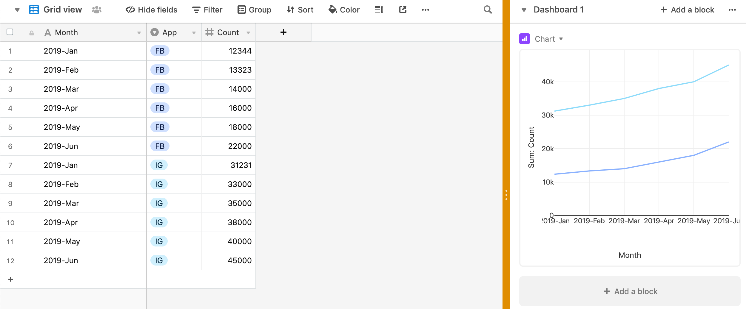
Chart Blocks somehow baffle me. I have a table with a month per year (so 2018 - 04 april) for instance as records and per record I have stuff like FB total likes, newsletter total size, IG total size. I would like to have 1 block that has all 3 together as lines, but I can’t seem to figure out how.
Am I doing it wrong or is it not possible with the table I made?

8 Replies 8
Mike_McLaughlin
8 - Airtable Astronomer

One way to do what I think you need: with a record structure like this and then group by app in the y-axis field. Hope this helps.

Screen Shot 2019-04-01 at 9.03.41 PM.png

Natalie_Vijlbri
6 - Interface Innovator

Ohhhh so I nicely put everything in 1 record, in different columns but that is actually keeping me from getting them all in 1 chart. Darn it!

I sympathize. It must be a left brain/right brain thing, but I’ve finally accepted I will never intuitively understand the Chart Block…

Susan_Lanier
6 - Interface Innovator

Airtable really needs a better graphs generator. It’s totally counter intuitive.

I have a table that lists different projects as records, and then time used on particular tasks (a different task per column) to complete said project. It would be completely counter intuitive to put each task as a record and different projects in the the columns, particularly since i like to see total time used by grouping projects by the same client.

Indresh_Kumar
6 - Interface Innovator

The lack of this prevents me from doing a lot of simple things like plotting target vs actual on one line chart. This is the most basic feature a charting tool can do. Strange that it is absent.

Rahn_Kitson
4 - Data Explorer
4 - Data Explorer

Why on EARTH?! would it not just plot the Column on a line Graph/Chart like all other programs? It makes no sense to group data horizontally. My two cents after spending 30mins trying to work out how to do the same thing, pre google search.

Thomas_Mackay
5 - Automation Enthusiast

I agree with the frustration here.

Having to set up data in this way means that you can’t use it with data gathered by forms unless you want users to have to complete multiple forms for one set of data. In the example above, if the data were submitted via a form, the form completer would have to complete a form for FB, and then another form for IG, rather than just submitting both pieces of data through one form.

I wish that Airtable would improve the charting tool as this is a major drawback.

Yikes, this has created a major usability problem for me: I’m building a database for a client who needs to track multiple metrics over time. If they need to make an individual record for each instance during the treatment session, they’re quickly going to max out the allowed # of records. Has anybody figured out a workaround for this?