I can’t figure this out:
It’s about a voting system to vote for songs a specific artist should play on a specific event/date.
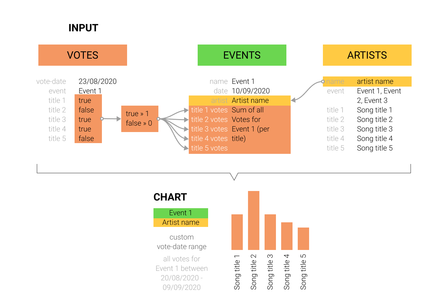
I need to gather and visualize a chart with these votes for each event/date.
I can get record entries in a table “Votes”.
A “Vote” has 10 columns for 10 questions that can be 0 or 1.
It also contains a name, date and can be linked to an “Event”
The other table is called “Events”.
An “Event” is bound to a Date and typically only has one artist.
I need to sum up all votes per event.
In a 3rd table i have the “Artists”.
Each artist has 10 values for the questions, which contain specific song_names for that artist.
So voting for Event A with artist B will have different voting values (read = song titles) than voting for Event B with artist C.
So i just get 1 or 0 values in a “Vote”-record.
Most important is that i can get this:
- an overview of votes for a specific event, which results i can limit within a date range
- it should be in a chart with on x-axis the 10 names of the songs that are linked to the event/artist
- on the y-axis the amount of votes (within a date-range ideally)
I know all the data is in the tables, but i have no idea how to combine this to get one good (bar)chart.
Visual Data Graph/Map: