Jun 29, 2020 11:56 AM
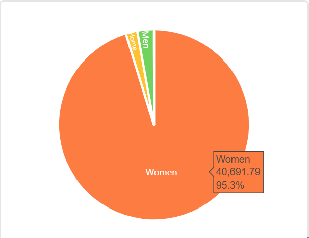
Hi, I’ve been trying to visualize data in blocks using charts and was wondering if there’s a way to add data labels to these charts. For example, if I make a pie chart, is there a way to mention percentages on the chart. At the moment I only see the percentage when I hover the mouse on the chart. (see image)
Jun 29, 2020 12:09 PM
Hi @HQ_Team and welcome to the community!
I don’t know the answer to your question because I’ve tried to avoid using the integrated chart block ever since my clients pulled me into Airtable. It seems their level of satisfaction with Chart Block has never been good.
But I do have an answer to a different question - what’s better than Chart Block?
Clients have begun to express some degree of delight because of the customizations possible with this new [beta] block. It requires a little more technical nuance, but it might be helpful if data visualizations are important to you.
Jun 29, 2020 04:34 PM
It’s true, the Chart block is woefully inadequate in most use-cases.
Jul 06, 2020 11:38 AM
Thanks so much @Bill.French! We’ll try out the alternative blocks you mentioned!