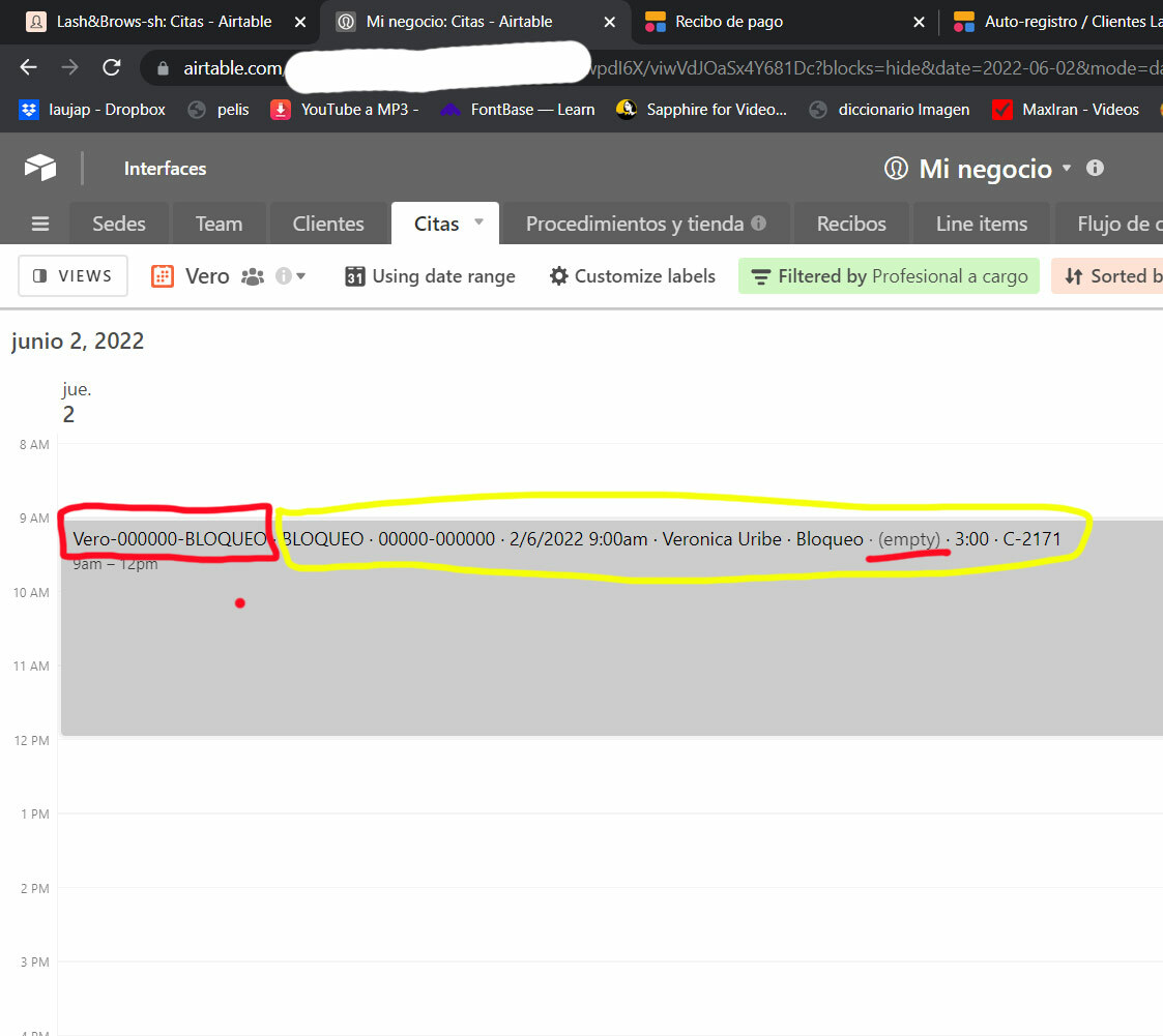
Most of the extra displayed info is already part of the record name formula.
Expanding a record will always display un-hidden fields by default. You can control which fields are hidden in a calendar view by hovering over any field name in the expanded view for a record, clicking on the downward triangle that appears, and choosing “Hide field” in the popup menu. That field will now default to being hidden for all records in that view.
If that doesn’t address your issue, then please share more details about what you want to accomplish. Screen shots might be helpful as well (just drop them into the comment editor).
Most of the extra displayed info is already part of the record name formula.
Hi,
It’s a new feature that is not yet even announced. You can now personnalize what’s shown with the new “customize label” button on the calendar view.
It’s nice to have this feature but it comes with a drawback : before the update, the record name could go on several lines if needed, but now it stops at the end of the first line even if there’s some space left. I contacted the support earlier about this because this new behavior breaks some of my workflows on several apps I made. I hope they’ll turn the serveral lines name back soon.
It’s good to have a “moving” application but sometimes it’s hard with maintenance…
I hope you have your answer with this !
Expanding a record will always display un-hidden fields by default. You can control which fields are hidden in a calendar view by hovering over any field name in the expanded view for a record, clicking on the downward triangle that appears, and choosing “Hide field” in the popup menu. That field will now default to being hidden for all records in that view.
If that doesn’t address your issue, then please share more details about what you want to accomplish. Screen shots might be helpful as well (just drop them into the comment editor).
In the screenshot, the way it used to be is marked with the red line. Now I need to hide everything in the yellow line. Most of it is already in the field name (red line). See how it also reads ‘empty’ for fields with no info, not very smooth…
I can’t hide those fields in yellow color, because they are needed to edit the record in the expanded view.

I was just informed that there’s now a “  Customize labels” button on the calendar view toolbar (to the left of the filter button). Use that to customize how things look.


 Customize labels” button on the calendar view toolbar (to the left of the filter button). Use that to customize how things look.