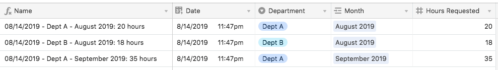
I manage a team of laboratory technicians and we recently started using Airtable in an effort to track the total amount of support time we’re providing to departments, projects and even broken down to task type.
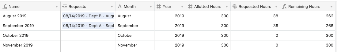
One view we’d like to provide to our group is the total amount of man-hours available for new requests by month. The initial thought is that in the form we require our “customers” to fill out we would ask for the expected start date (month) for the task along with the total number of hours they expect us to take to complete said task. Is there a way to have a bar graph that has the month on the X-axis and total available hours on the Y-axis where, when someone submits a request it subtracts that expected time from the available time on the chart? We would publicize this information outside the lab so people can plan ahead.
Thanks in advance!