Hmm, could you provide a screenshot of the way your data's set up?
I managed to create this:
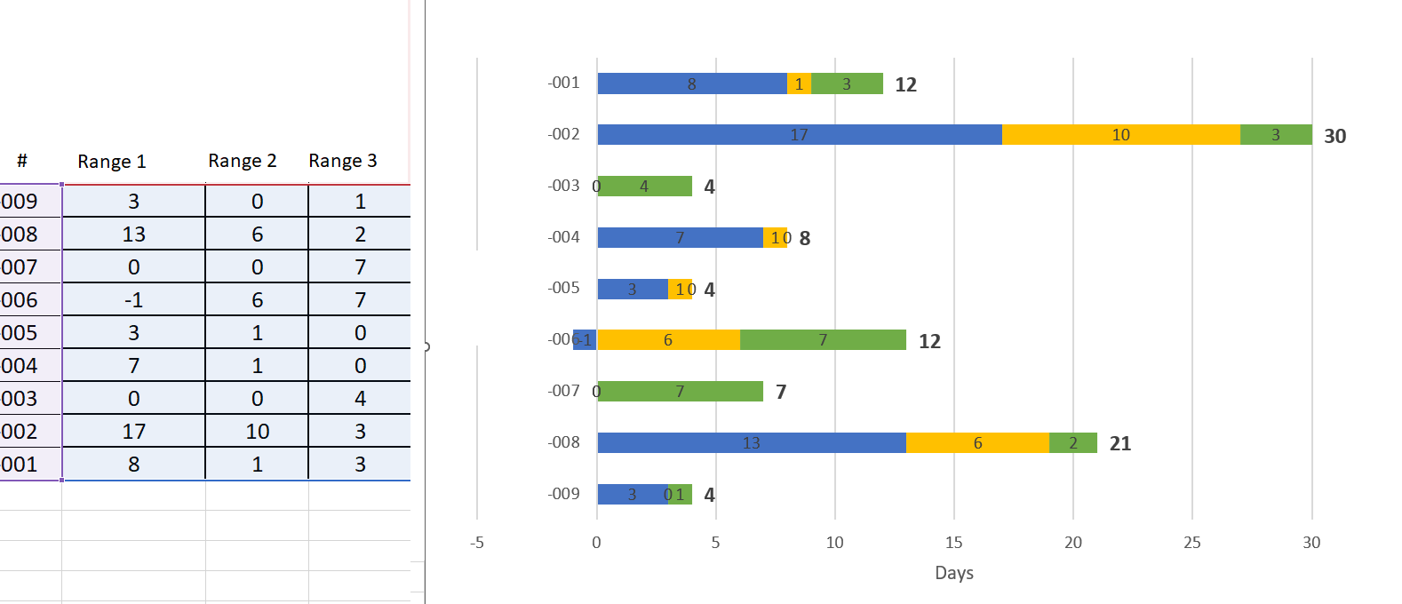
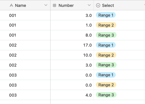
And my data's set up like so:
Link to base
Might need to manipulate your data a bit so that the chart can display it the way you want!
Hmm, could you provide a screenshot of the way your data's set up?
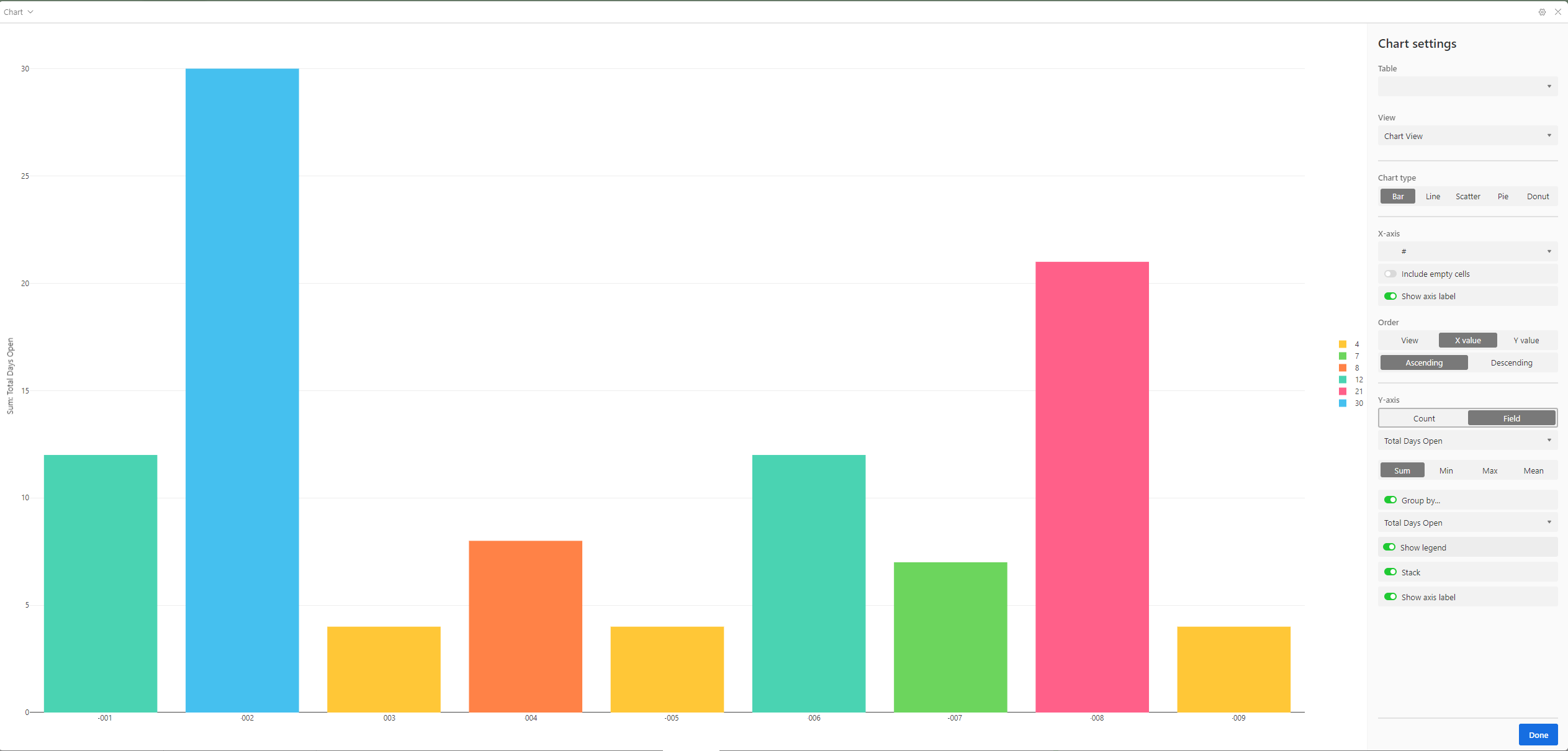
I managed to create this:
And my data's set up like so:
Link to base
Might need to manipulate your data a bit so that the chart can display it the way you want!
Thanks for responding Adam, you are correct that I needed to manipulate my data to display the chart in the way I wanted.
One last thing, how did you get the stacked bar chart to be horizontal in Airtable? I can only get it to be vertical.
Thanks again!
Thanks for responding Adam, you are correct that I needed to manipulate my data to display the chart in the way I wanted.
One last thing, how did you get the stacked bar chart to be horizontal in Airtable? I can only get it to be vertical.
Thanks again!
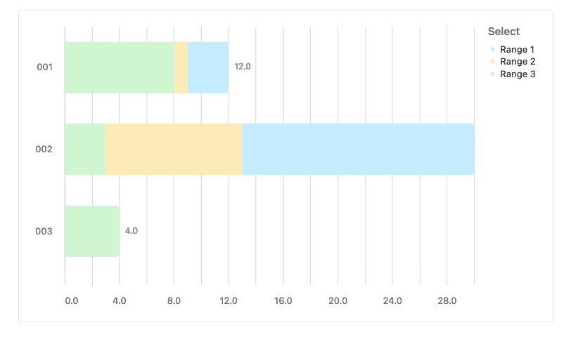
Ah, it's in the "Appearance" tab found here:
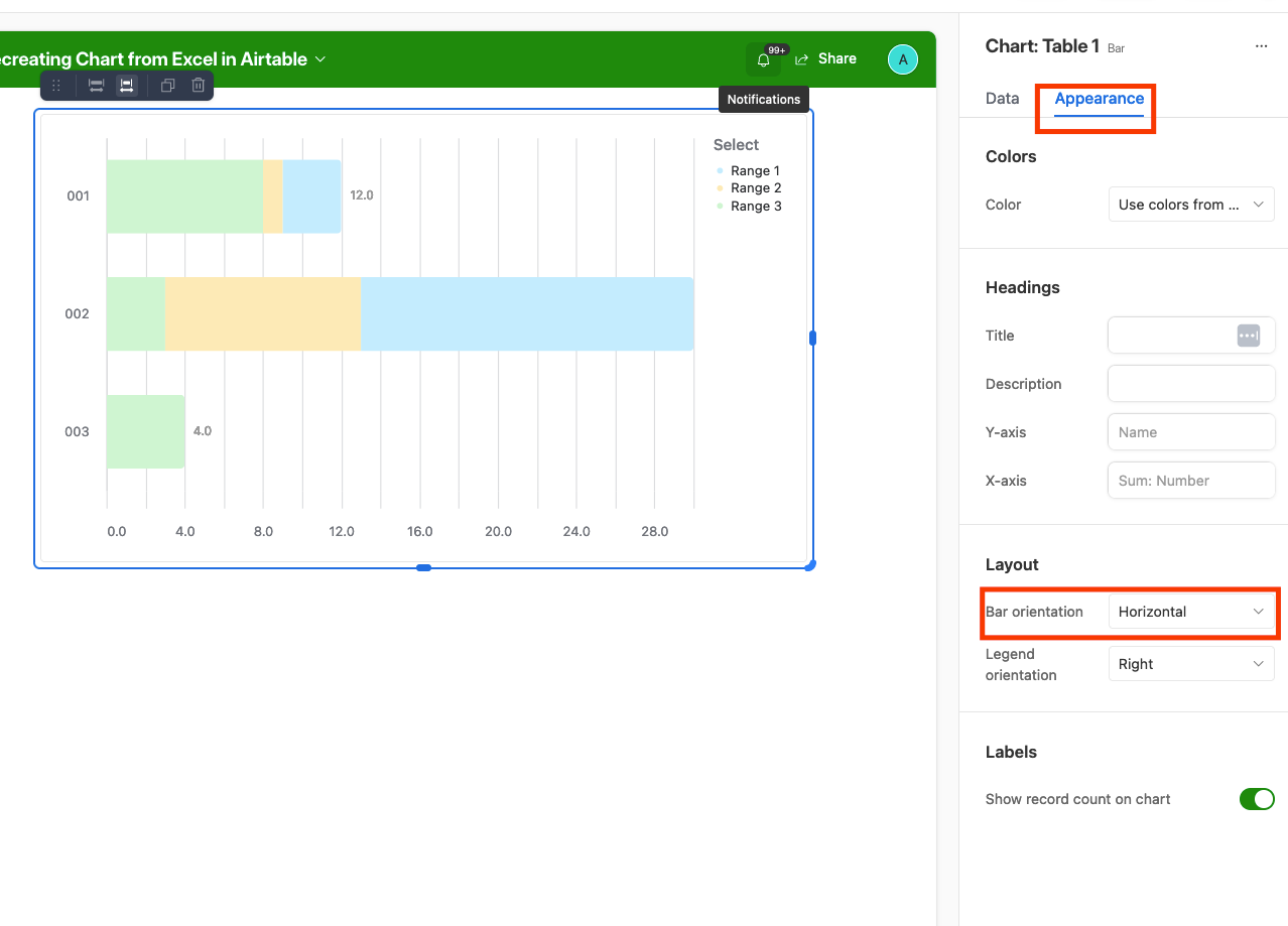
Ah, it's in the "Appearance" tab found here:
Interesting, I think we might be using different Extensions.
Interesting, I think we might be using different Extensions.
Ah, yeah, I'm making a chart in an interface, sorry about that!