Help

Visualising data within the Chart extension

Topic Labels: Extensions
753 3
cancel
Showing results for 
Search instead for 
Did you mean: 
Matt_Engage
5 - Automation Enthusiast

Hello everyone,

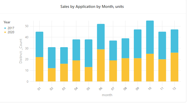
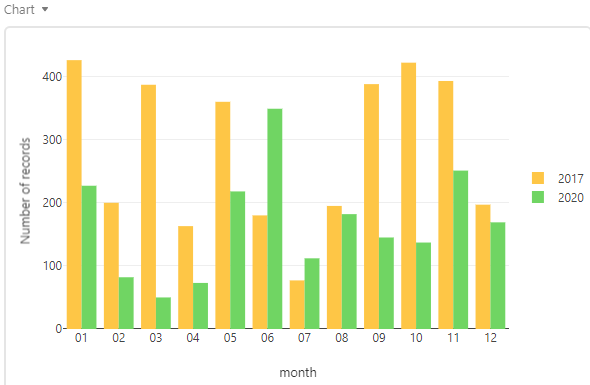
I’m trying to visualise data that I have within my base in a bar chart. It’s to simply compare my sales forecast vs sales target on a monthly basis.

So I’d like a simple bar chart that has for example; a bar for November Revenue next to a bar depicting the November Target. I’d then like to have this for every month of the year within the same graph.

I have columns for both [Month] Revenue and [Month] Target but I can’t figure out how to show the two side by side using the Chart extension.

Any help would be much appreciated!

Many thanks

3 Replies 3
Andrey_Kovalev
8 - Airtable Astronomer

@Matt_Engage I think what you want is not currently possible. You can use two separate bar charts side by side or make color distinction as in example below.
barchart

Matt_Engage
5 - Automation Enthusiast

Thanks @Andrey_Kovalev I thought that might be the case. Do you know if there are any extensions that might be able to do a similar thing?

If not, I’ll give what you’ve suggested above a go.

Thanks again!

@Matt_Engage You can use the extension Chart to get a bar chart like this:
bar chart