Jan 26, 2022 11:04 PM
Update (2022-02-11):
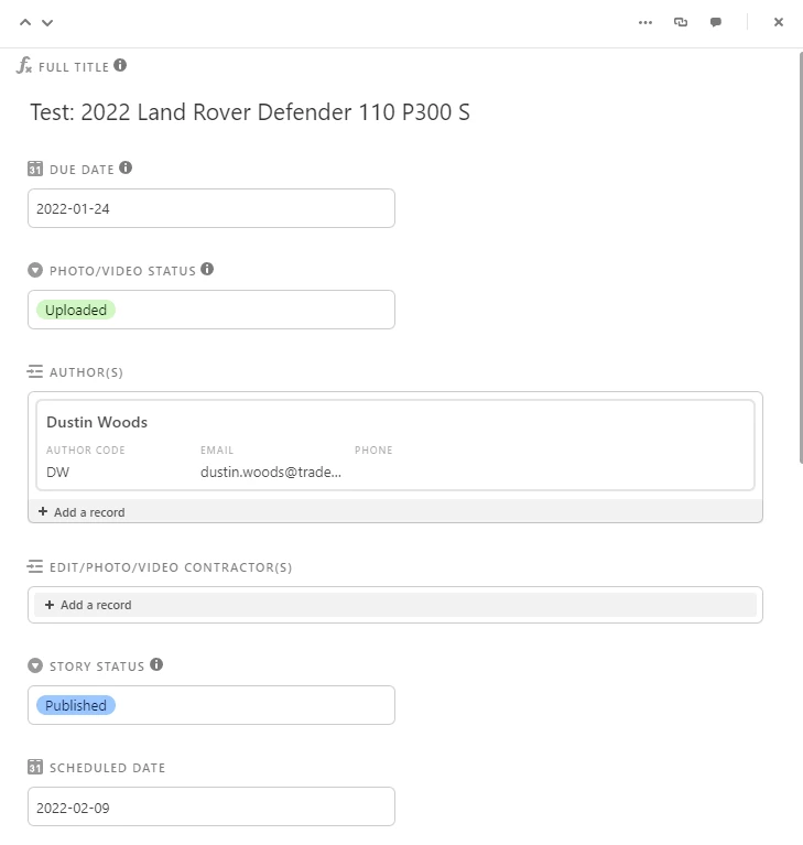
The stylesheet is now designed to be used “out of the box” to restore the look of the original expanded record view. (Unfortunately, I’m working off my memory of what it looked like so it may not be an exact replica.)
Here’s what it looks like by default:
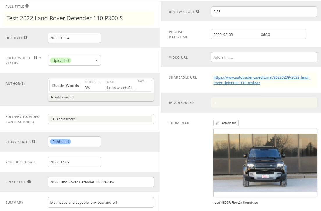
Or, if you prefer the new expanded record view design, you can select the “Current” preset and make some tweaks (below: column layout, zebra stripes, type-based field coloring, compact linked record view, expanded whitespace, variable field width):
The code for the expanded record view has been completely overhauled. Due to the number of tweaks, instead of grouping rules by function, they’re now defined based on the view’s HTML structure. There may be some new bugs, but thanks to the new structure, changes will only affect the full expanded record view (and not the mini expanded record view in Timeline views, for example).
Setting up Stylus:
Install the addon/extension
(Firefox) Stylus – Get this Extension for 🦊 Firefox (en-CA)
(Chrome) Stylus - Chrome Web Store
Download the file linked below (Airtable UI QoL 2022-02-11.user.css)
Click on the addon/extension icon and select “Manage”
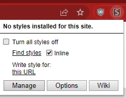
Drag and drop the .css file into the window with the Stylus management page
If Step 4 doesn’t work, you can manually add the stylesheet as follows:
a. On the Manage page, click “Write new style” (make sure “as Usercss” is checked)
b. Copy the contents of the file you downloaded
c. Paste it into the window
d. Click “Save”
Original post:
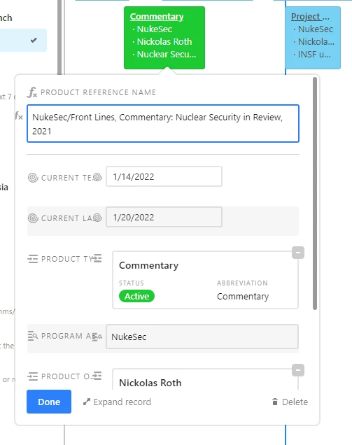
I previously started a topic on Better Whitespace Use with Custom CSS, and this is a follow-up based on the recent change to the expanded record view.
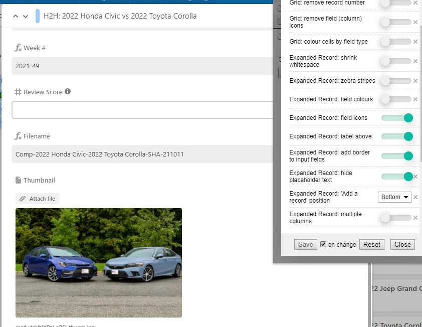
And you can make your expanded record view resemble the abomination seen here:
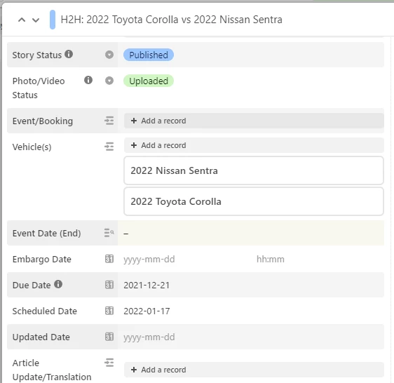
or the slightly less ugly version:
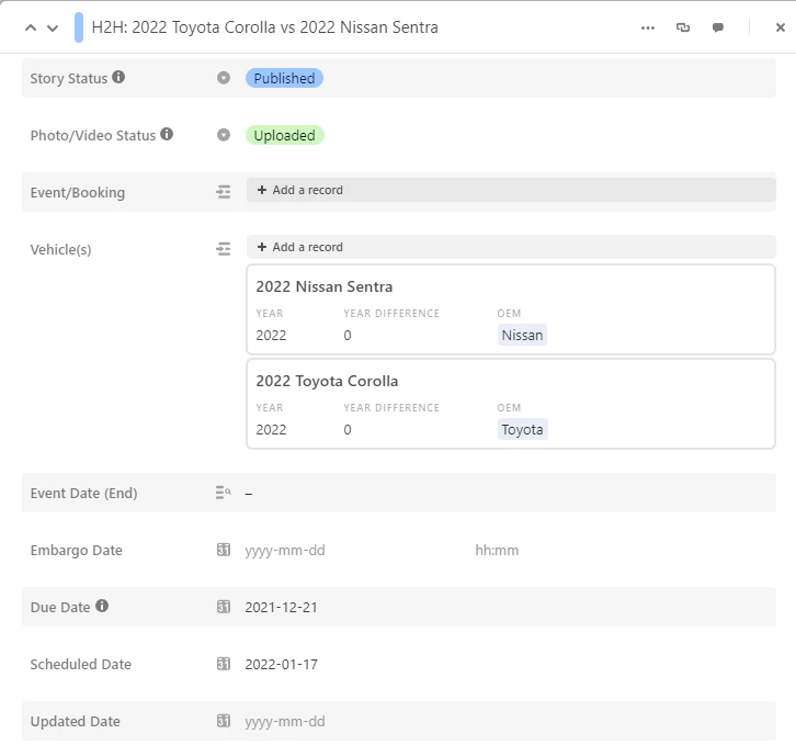
The stylesheet has several options for you to dial in the appreance that you want. Note that I’ve cobbled this together over the course of the workday so I haven’t been able to test it extensively or figured out what to do with all the variables (or figured out a good way to restore the original one-column layout), but I’ve added notes throughout the file to explain what each bit of CSS does.
Jan 27, 2022 02:12 AM
@Jordan_Scott1
Airtable should hire this guy, because he has done in one day what $2 billion in funding at Airtable apparently couldn’t do.
Jan 27, 2022 01:32 PM
Thanks for this excellent resource, @Andy_Lin1!
I found an unexpected behavior and thought you might want to know about it: The additions to fix the expanded records modal also have an impact on the popups in Timeline view:
From what I can tell, it’s doubling up the icons and changing the radius on the ‘remove link’ button on linked records.
Again, thanks. This is a great tool and I appreciate you sharing it with everyone!
Jan 27, 2022 05:56 PM
Thanks for the report! I’ll have to dig into it a bit (we don’t use the timeline view in our base so this was a blind spot for me). I’m planning on overhauling the stylesheet this weekend if I have time to add more variables and make it easier to customize (and also make sure I’m actually targeting the correct elements and not just what looks correct).
In the meantime, I’ve updated the sheet (still at the same URL) to add a way to emulate the previous view:
The screenshot includes the style options you should turn on:
Hopefully it doesn’t break anything else…
Feb 15, 2022 01:03 PM
This is fantastic @Andy_Lin1 - thank you so much!
Has anyone had any success getting this userscript to work in Fluid.app? I can get the script to work in Chrome but I use Airtable interfaces in Fluid, a SSB, which supports userscripts.
Feb 15, 2022 01:19 PM
Glad you like it!
I don’t use Fluid myself, but I’m guessing that it doesn’t support the CSS preprocessor language I used (Stylus, which is not related to the browser extension)?
Since you have it working in Chrome, you can grab the compiled CSS with DevTools.
In any Airtable view, open DevTools and click on the Elements tab, look for a style with class ‘stylus’, for me it was at the end, right before the </html>
tag):
You can then copy and paste the CSS into the Userstyles (not Userscript) section of Fluid.
Feb 15, 2022 04:54 PM
That worked - thanks again @Andy_Lin1
Sep 10, 2024 09:52 PM
@Andy_Lin1 Your css is really good! wondering if it can be tweaked to color specific columns a specific color in the css code?